Case Media
Case Notes
This page keeps the media, full prompt, and original source together so you can inspect the result first and decide whether the prompt is worth copying, saving, or comparing.
Case Insights
To make this page easier to search, cite, and reuse later, the case is also broken down into practical guidance about usage, visual cues, and prompt structure.
Best Fit Scenarios
- Use this as a portrait & photography benchmark when you need a fast style baseline before rewriting your own prompt.
- It is especially helpful if your target overlaps with Portrait, Cinematic, Fashion and you want to judge the image result before tuning wording.
- Keep it as a control sample when you compare nearby prompt variants one variable at a time.
Visual Signals To Notice
- The clearest style signals here are Portrait, Cinematic, Fashion, so those should usually stay in your first rewrite.
- Focus on framing, light direction, pose, and the distance between subject and camera.
- This case keeps 2 media outputs, which makes it easier to check whether the style remains stable across multiple results.
How The Prompt Is Structured
- The prompt reads as a long, highly specified prompt, which is useful when you want to judge how much specificity this direction needs.
- Its keyword cluster is centered on Portrait, Cinematic, Fashion, so you can usually keep that cluster while swapping subject, camera, layout, or copy details.
- A practical rewrite path is: keep the outcome, keep the strongest style cues, then replace only the subject and environment blocks.
Good Follow-up Questions
- What changes first if you keep Portrait, Cinematic, Fashion but switch the subject matter?
- Which part of the result comes from section-level structure (Portrait & Photography) versus tag-level style cues?
- Which related cases in the same section give you a cleaner or more extreme variation of the same direction?
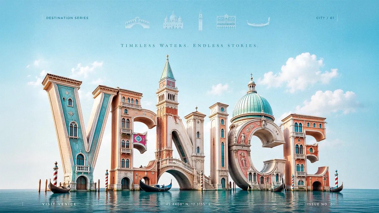
Full Prompt
Create a 3:2 premium 3D typography-based travel poster for [CITY], using luxury editorial destination advertising fused with realistic sculptural letterform architecture. The city name “[CITY]” must be the dominant subject, occupying most of the canvas. Build the letters as large, realistic, three-dimensional sculptural forms made from glossy painted material, polished ceramic, soft plaster, carved stone, sunlit architectural surfaces, or city-adaptive materials. Each letter should physically transform into the city’s identity: landmarks, skyline silhouettes, arches, towers, domes, bridges, windows, balconies, cultural patterns, coastal forms, or street details must grow directly out of the letterforms. Landmarks should feel architecturally integrated, not pasted behind or around the word. A tower may rise from a vertical stem, a bridge may connect two letters, a dome may form the curve of a rounded letter, rooftops may shape the top edges, and windows or ornamental details may be embedded into the letter faces. Use a low-angle three-quarter camera view so the typography feels monumental, cinematic, premium, and friendly. Place the 3D city-name sculpture slightly low in the frame, filling the central and lower portions of the poster, with generous negative space above. At the top header, add a refined horizontal row of faded landmark symbols related to the city: tiny vector icons, or translucent architectural glyphs. Keep them very soft, elegant, and secondary, like premium magazine header details. Add each landmark name below its icon. Keep all faded and premium. Remove any visible sun from the top-left corner. Use bright natural daylight with a soft key light from the upper-left, gentle fill light, clean highlights, subtle ambient occlusion, and soft contact shadows beneath the letters. The lighting should feel cheerful, fresh, and editorial, not dark or overly cinematic. Use a bright city-adaptive palette based on [CITY]: coastal cities use aqua, coral, cream, and sunny yellow; historic cities use warm stone, terracotta, olive, and soft sky blue; tropical cities use turquoise, mango, palm green, and white; mountain cities use alpine blue, meadow green, snow white, and golden warmth; nightlife cities use violet, cyan, peach, and amber. Keep colors clean, optimistic, premium, and controlled. Add subtle editorial text elements to improve the poster: small uppercase header text such as “DESTINATION SERIES”, a tiny location code like “CITY / 01”, delicate vertical divider lines, a minimal footer line such as “VISIT [CITY]”, and small microtype coordinates or issue number near the bottom edge. These text elements must remain quiet and secondary so the large 3D city name stays the hero. Background should be clean and spacious with a soft sky gradient, delicate clouds, or abstract color field only. Do not place extra landmarks in the background; all major city identity must come from the typography itself, except the faded symbolic header row. Style: premium editorial travel advertising, luxury magazine cover, realistic 3D typographic sculpture, bright modern optimism, cheerful wanderlust, cultural identity, clean art direction. Negative prompt: avoid generic travel posters, separate landmark collages, landmarks pasted behind text, flat typography, cluttered backgrounds, visible sun in the top-left corner, excessive icons, dark cinematic lighting, muddy colors, cheap souvenir aesthetics, unreadable city name, distorted letters, random gradients, noisy textures, stock-template layouts, and overdecorated tourist graphics.