Case Media
Case Notes
This page keeps the media, full prompt, and original source together so you can inspect the result first and decide whether the prompt is worth copying, saving, or comparing.
Case Insights
To make this page easier to search, cite, and reuse later, the case is also broken down into practical guidance about usage, visual cues, and prompt structure.
Best Fit Scenarios
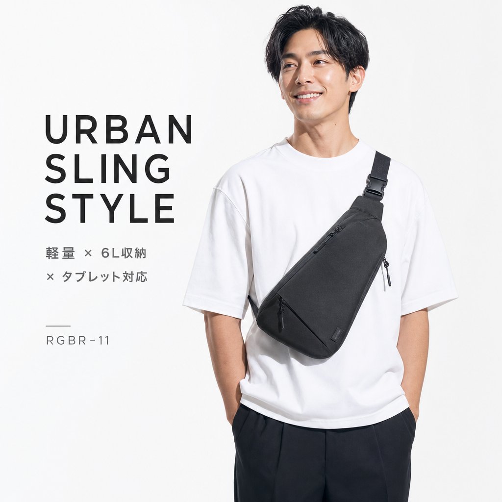
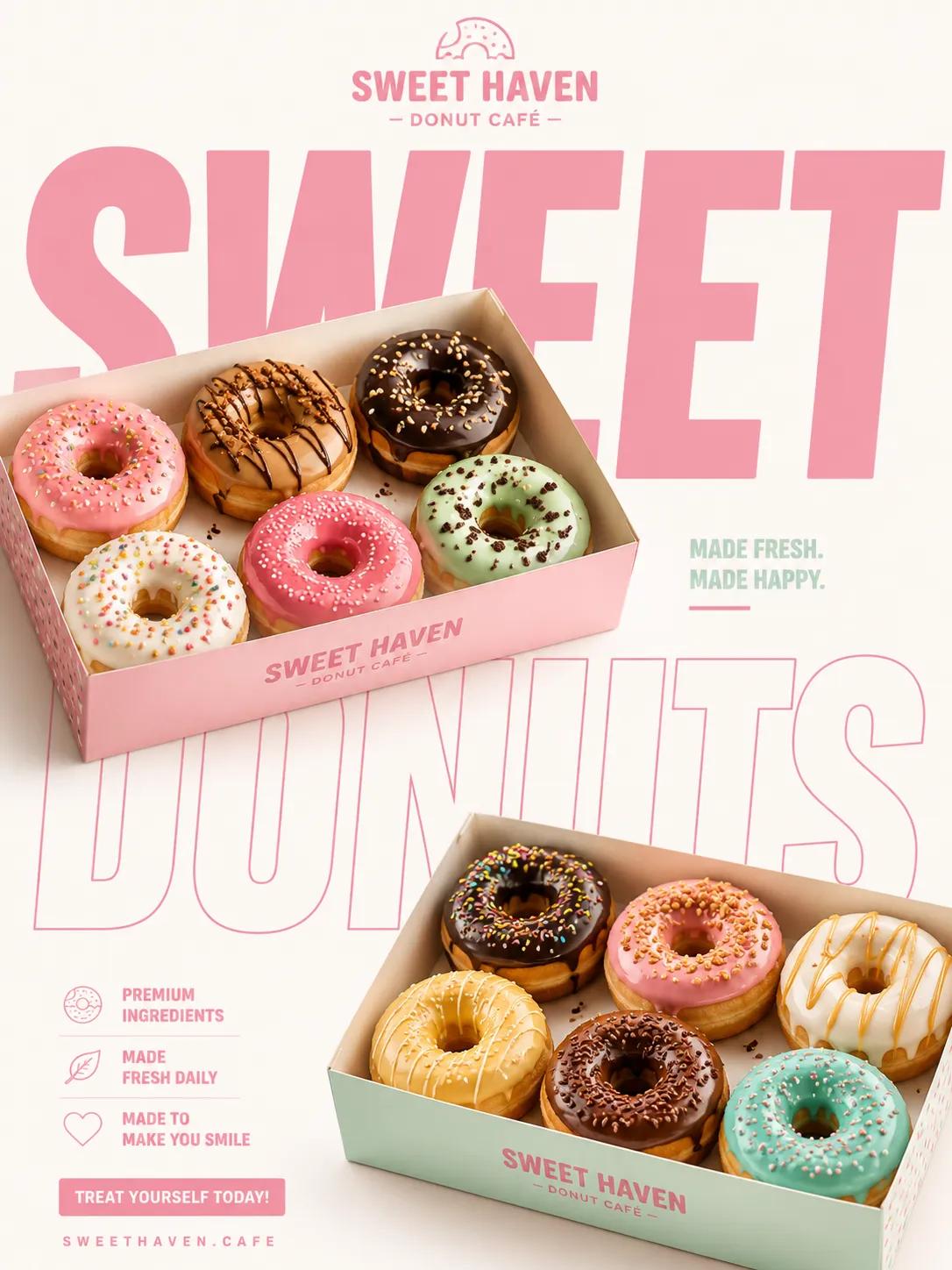
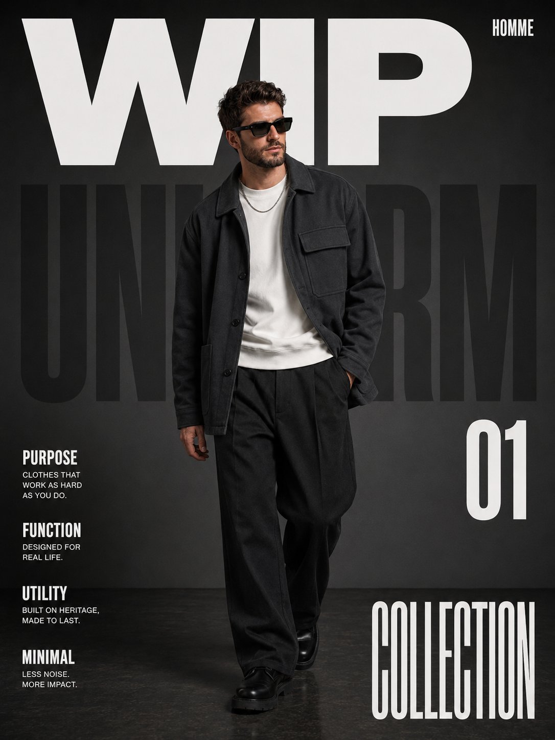
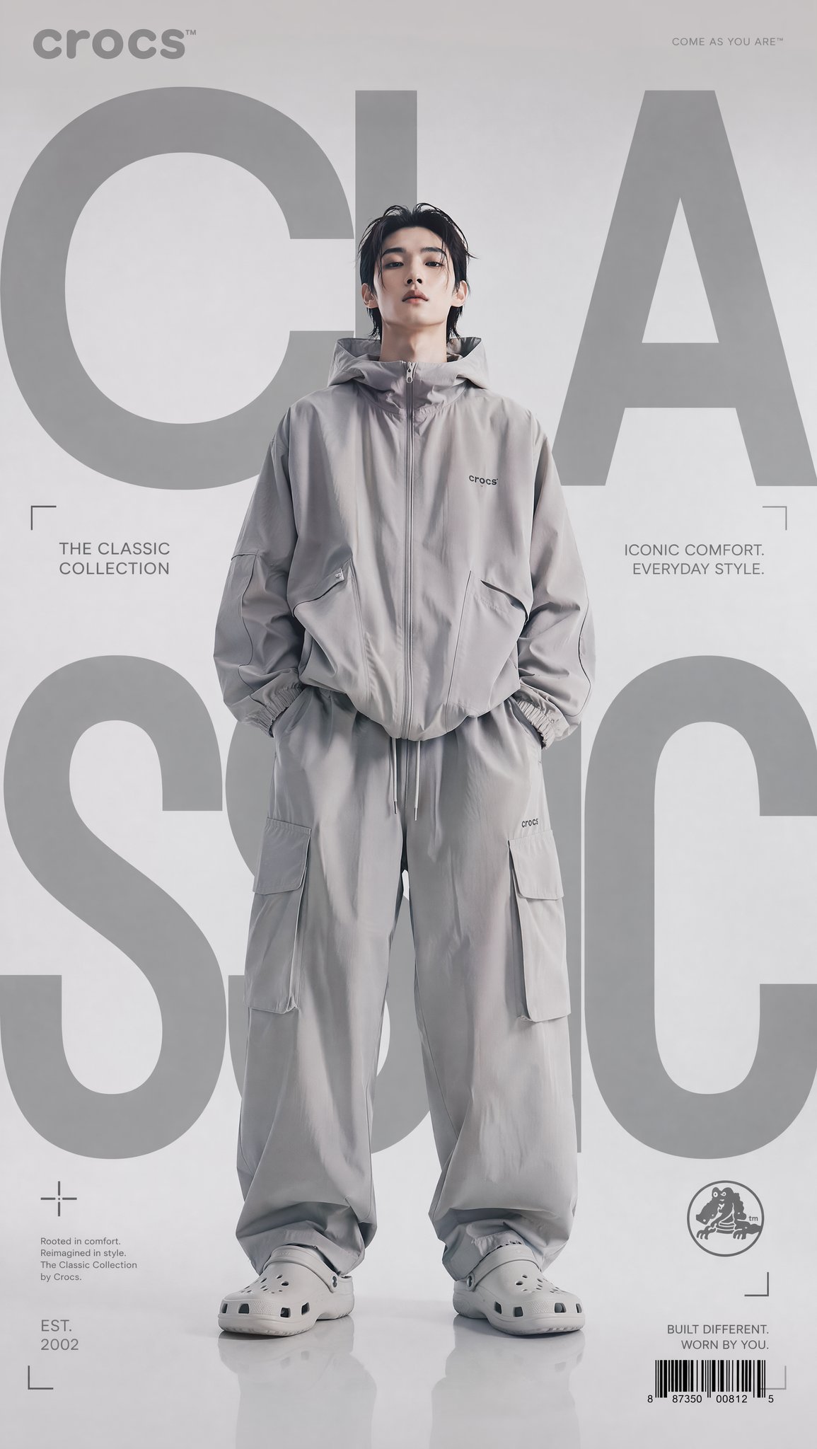
- Use this as a portrait & photography benchmark when you need a fast style baseline before rewriting your own prompt.
- It is especially helpful if your target overlaps with Portrait, Fashion, Poster and you want to judge the image result before tuning wording.
- Keep it as a control sample when you compare nearby prompt variants one variable at a time.
Visual Signals To Notice
- The clearest style signals here are Portrait, Fashion, Poster, so those should usually stay in your first rewrite.
- Focus on framing, light direction, pose, and the distance between subject and camera.
- This case keeps 2 media outputs, which makes it easier to check whether the style remains stable across multiple results.
How The Prompt Is Structured
- The prompt reads as a long, highly specified prompt, which is useful when you want to judge how much specificity this direction needs.
- Its keyword cluster is centered on Portrait, Fashion, Poster, so you can usually keep that cluster while swapping subject, camera, layout, or copy details.
- A practical rewrite path is: keep the outcome, keep the strongest style cues, then replace only the subject and environment blocks.
Good Follow-up Questions
- What changes first if you keep Portrait, Fashion, Poster but switch the subject matter?
- Which part of the result comes from section-level structure (Portrait & Photography) versus tag-level style cues?
- Which related cases in the same section give you a cleaner or more extreme variation of the same direction?
Full Prompt
Please create a high-quality “Conceptual Narrative Minimal Logo” based on the following user inputs: [Brand Name / Project Name] [Subtitle / Product Name] [Industry / Category] [Brand Positioning] [Core Concept] [Metaphorical Motif] [Emotional Tone] [Primary Color] [Accent Color] [Aspect Ratio] 【User Input】 Brand Name / Project Name: [__________] Subtitle / Product Name: [__________] Industry / Category: [creative studio / visual lab / editorial project / independent fashion label / art space / publishing / architecture / music label / cultural brand / experimental project / etc.] Brand Positioning: [__________] Core Concept: [dream / control / distance / isolation / orbit / freedom / structure / memory / narrative / imagination / tension / future / etc.] Metaphorical Motif: [astronaut / orbit / rabbit ears / silhouette / marionette / box / thread / moon / hand / geometric structure / void / object / etc.] Emotional Tone: [quiet / restrained / poetic / cold / experimental / mysterious / intelligent / futuristic / minimal / conceptual / etc.] Primary Color: [black / white / gray / dark brown / charcoal / etc.] Accent Color: [small amount of red / muted red / subtle highlight / none] Aspect Ratio: [1:1 / 4:3 / 3:2] 【Creative Goal】 Design a “Conceptual Narrative Minimal Logo”. This is not a conventional commercial logo, not a decorative badge, and not a generic geometric icon. The goal is to create a logo that feels like a small visual idea: minimal, quiet, and concept-driven. The result should express the idea of “less is more”: less decoration, more meaning; less noise, more concept; less visual clutter, more narrative tension. 【Core Definition】 This type of logo should use: - a very small number of visual elements, - a strong sense of negative space, - a clear symbolic or metaphorical relationship, - restrained typography, - and a subtle narrative or conceptual layer. It should feel like a logo that belongs to an independent creative studio, an art-directed brand, an experimental project, or a design-led identity system. 【Essential Principles】 1. The logo must be minimal, but not empty. 2. The graphic must be simple, but not generic. 3. The symbol should carry metaphor, implication, or conceptual meaning. 4. The composition should use a lot of breathing room and negative space. 5. The logo should feel quiet, intentional, and art-directed. 6. Typography should be restrained, intelligent, and carefully placed. 7. The overall design should feel like a small visual statement, not a loud advertisement. 8. Avoid unnecessary decoration. 【Graphic Direction】 Create a minimal symbolic graphic, or a small narrative visual scene, based on the [Core Concept] and [Metaphorical Motif]. The graphic may include: - a simplified human silhouette, - a symbolic object, - a surreal relationship between a figure and a structure, - a small orbit or trajectory, - an abstract device-like form, - a geometric scene with narrative implication, - a metaphorical composition that suggests an idea rather than directly illustrating it. The graphic should: 1. be simple and highly distilled; 2. avoid excessive detail; 3. carry symbolic or poetic meaning; 4. suggest a story, relation, or emotional state; 5. feel conceptual rather than merely decorative. 【Typography Direction】 Typography must be minimal and controlled. Requirements: 1. The brand name should be clear and readable. 2. Typography should feel calm, modern, and deliberate. 3. It can be uppercase, small caps, narrow sans serif, or another restrained modern style. 4. Text should support the symbol, not overpower it. 5. The relationship between text and graphic should feel intentional and curated. 6. Subtitle / secondary text may be added in a very small amount if needed. 7. Avoid overly expressive, playful, or loud type. 【Composition Direction】 The overall composition should emphasize stillness and space. Requirements: 1. Use a lot of empty space. 2. Keep the main logo relatively small within the frame. 3. The symbol can sit left, center, or right, but the overall balance must feel refined. 4. The composition should feel like an identity presentation or a gallery-like display. 5. Small annotations, thin lines, or subtle structural alignments may be used if helpful. 6. Avoid making it feel like a poster, sticker sheet, or advertisement. 【Color Direction】 Keep the palette restrained. Recommended approach: - black, white, gray, charcoal, or deep neutral tones as the main palette; - optionally add a very small amount of red, muted red, or another subtle accent color; - the accent color should function as a point of tension, cut, orbit, line, or signal; - never let the accent color dominate the design; - avoid rich gradients and high-saturation color schemes. 【Mood & Aesthetic】 The final logo should feel: - minimal - conceptual - narrative - poetic - restrained - intelligent - art-directed - independent - experimental - less-is-more 【What to Avoid】 Please strictly avoid: 1. generic corporate logos; 2. decorative badge logos; 3. cute mascot logos; 4. overly geometric abstract marks with no meaning; 5. heavy ornament; 6. crowded compositions; 7. poster-like layouts; 8. colorful or noisy designs; 9. anything that feels generic, loud, or commercially over-explained. 【Output Requirement】 Generate one high-quality “Conceptual Narrative Minimal Logo” that communicates a clear idea through minimal form, strong negative space, and a quiet but meaningful symbolic gesture. The final result should feel like: a logo with a story, a symbol with tension, and a visual identity built on the principle that less is more.