Case Media
Case Notes
This page keeps the media, full prompt, and original source together so you can inspect the result first and decide whether the prompt is worth copying, saving, or comparing.
Case Insights
To make this page easier to search, cite, and reuse later, the case is also broken down into practical guidance about usage, visual cues, and prompt structure.
Best Fit Scenarios
- Use this as a portrait & photography benchmark when you need a fast style baseline before rewriting your own prompt.
- It is especially helpful if your target overlaps with Portrait, Fashion, Poster and you want to judge the image result before tuning wording.
- Keep it as a control sample when you compare nearby prompt variants one variable at a time.
Visual Signals To Notice
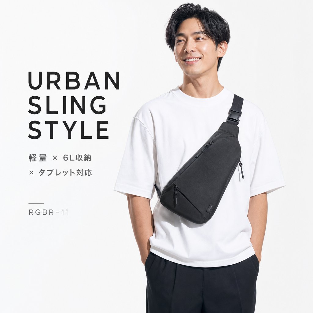
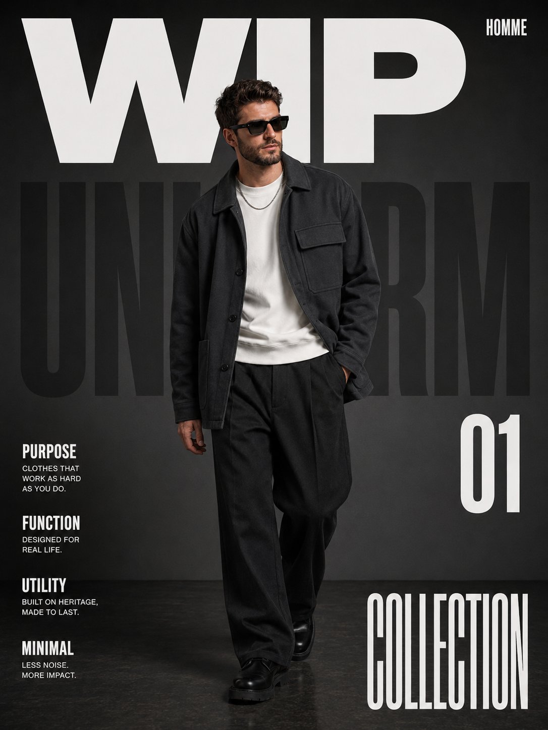
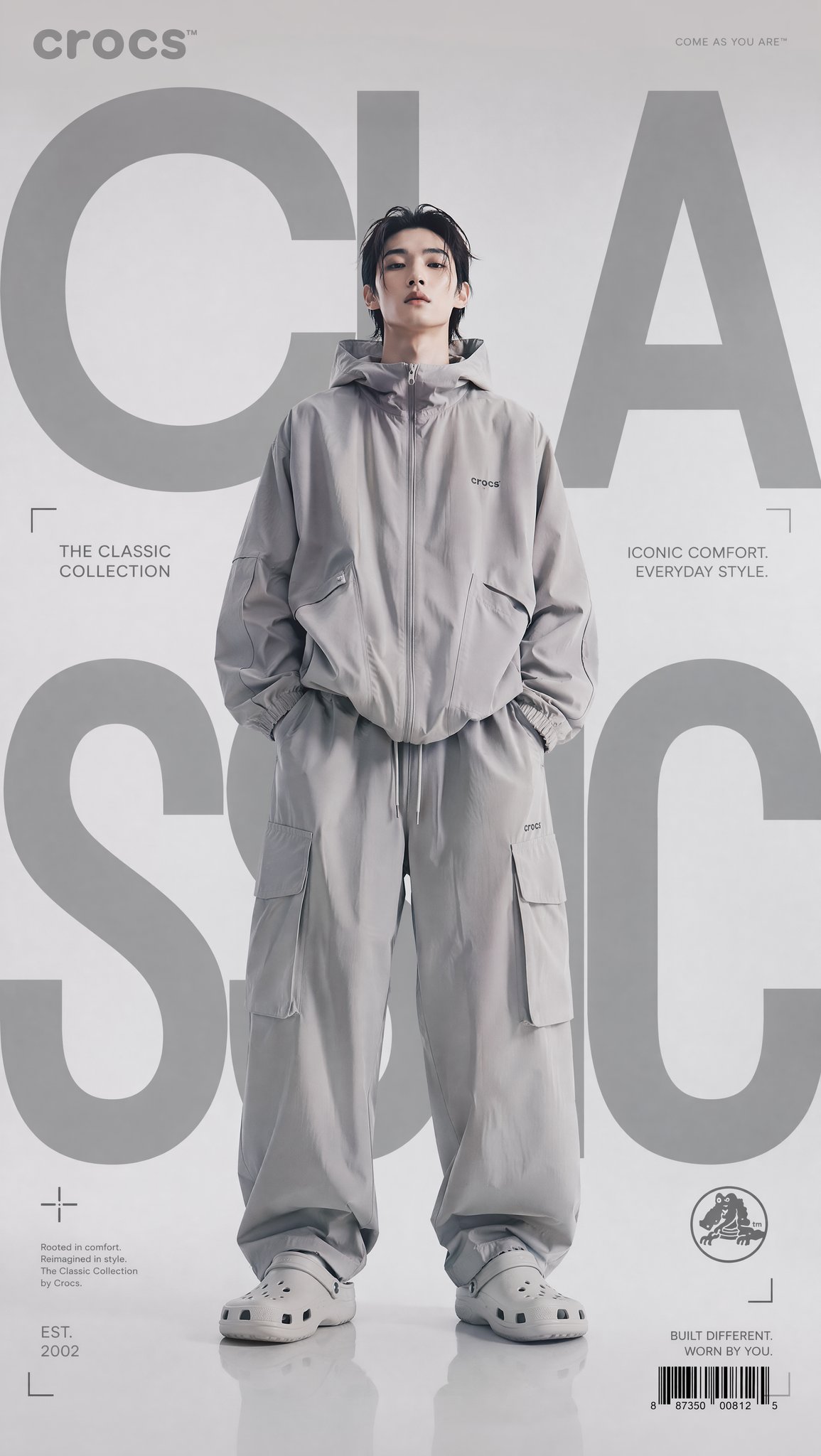
- The clearest style signals here are Portrait, Fashion, Poster, so those should usually stay in your first rewrite.
- Focus on framing, light direction, pose, and the distance between subject and camera.
- This case keeps 2 media outputs, which makes it easier to check whether the style remains stable across multiple results.
How The Prompt Is Structured
- The prompt reads as a long, highly specified prompt, which is useful when you want to judge how much specificity this direction needs.
- Its keyword cluster is centered on Portrait, Fashion, Poster, so you can usually keep that cluster while swapping subject, camera, layout, or copy details.
- A practical rewrite path is: keep the outcome, keep the strongest style cues, then replace only the subject and environment blocks.
Good Follow-up Questions
- What changes first if you keep Portrait, Fashion, Poster but switch the subject matter?
- Which part of the result comes from section-level structure (Portrait & Photography) versus tag-level style cues?
- Which related cases in the same section give you a cleaner or more extreme variation of the same direction?
Full Prompt
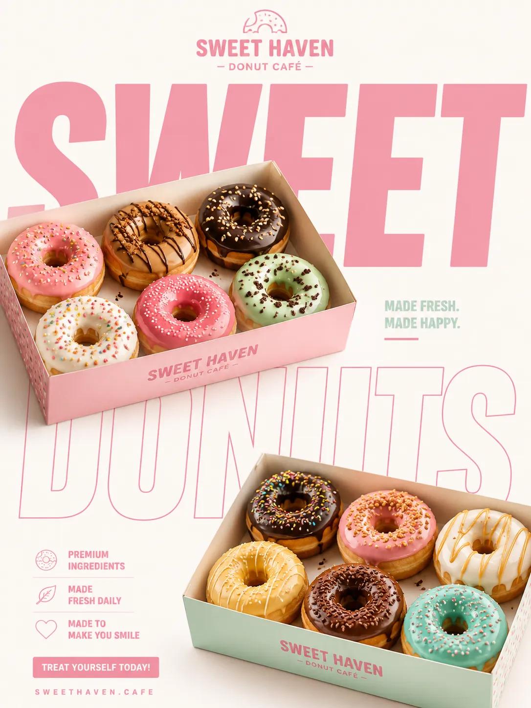
A premium fast-food advertising poster promoting [PRODUCT TYPE / FOOD ITEM / FMCG PRODUCT] using oversized editorial typography, clean commercial composition, and modern minimal branding aesthetics. STYLE & ART DIRECTION: Minimal commercial advertising aesthetics, high-end FMCG campaign design, editorial fast-food branding visuals, modern social-media poster composition, clean studio advertising style, Pinterest-trending food campaign aesthetics, premium Behance-style typography poster, bold geometric branding system, minimal product-focused commercial design, high-contrast editorial food photography. MAIN SUBJECT: Two premium trays/containers of [PRODUCT], placed diagonally across the composition, crispy detailed food texture, professional commercial food styling, studio-shot realism, dynamic asymmetrical positioning, premium FMCG presentation quality, high-detail texture rendering, appetizing commercial appearance. LAYOUT & COMPOSITION: Maintain the SAME composition structure as the reference: brand logo centered at top, upper tray positioned diagonally in upper-left area, lower tray positioned diagonally in lower-right area, oversized typography integrated behind and between products, large cropped letters extending outside frame, strong negative space balance, editorial asymmetrical composition, clean visual rhythm, dynamic zig-zag eye movement, premium spacing hierarchy. TYPOGRAPHY: Extra-bold geometric sans-serif typography, oversized cropped text composition, mix of solid-fill and outline typography, large-scale editorial lettering, minimal wording with maximum visual impact, modern FMCG typography hierarchy, clean contemporary branding style, typography functioning as compositional element. DEPTH & LIGHTING: Professional commercial studio lighting, soft realistic shadows, clean overhead illumination, high-detail texture enhancement, crispy surface highlights, premium food-photography depth, minimal soft-gray shadow casting, luxury advertising lighting style. EXTRA DESIGN DETAILS: Minimal clean background, subtle paper-tray branding graphics, high-end packaging design, editorial poster balance, strong whitespace usage, premium commercial realism, modern social-media campaign aesthetics, minimal graphic clutter, sharp product separation, clean advertising finish. COLOR PALETTE: Primary brand color dominance, high-contrast warm food tones, clean white/light-gray background, minimal controlled palette, brand-consistent typography colors, bold modern color blocking. QUALITY: Ultra high-resolution commercial rendering, 8K premium advertising quality, Behance-level campaign presentation, Pinterest-trending FMCG aesthetics, professional editorial composition, luxury commercial poster realism, high-end typography integration, award-winning advertising art direction.