Case Media
Case Notes
This page keeps the media, full prompt, and original source together so you can inspect the result first and decide whether the prompt is worth copying, saving, or comparing.
Case Insights
To make this page easier to search, cite, and reuse later, the case is also broken down into practical guidance about usage, visual cues, and prompt structure.
Best Fit Scenarios
- Use this as a portrait & photography benchmark when you need a fast style baseline before rewriting your own prompt.
- It is especially helpful if your target overlaps with Portrait, Poster, Screenshot and you want to judge the image result before tuning wording.
- Keep it as a control sample when you compare nearby prompt variants one variable at a time.
Visual Signals To Notice
- The clearest style signals here are Portrait, Poster, Screenshot, so those should usually stay in your first rewrite.
- Focus on framing, light direction, pose, and the distance between subject and camera.
- This case keeps 2 media outputs, which makes it easier to check whether the style remains stable across multiple results.
How The Prompt Is Structured
- The prompt reads as a long, highly specified prompt, which is useful when you want to judge how much specificity this direction needs.
- Its keyword cluster is centered on Portrait, Poster, Screenshot, so you can usually keep that cluster while swapping subject, camera, layout, or copy details.
- A practical rewrite path is: keep the outcome, keep the strongest style cues, then replace only the subject and environment blocks.
Good Follow-up Questions
- What changes first if you keep Portrait, Poster, Screenshot but switch the subject matter?
- Which part of the result comes from section-level structure (Portrait & Photography) versus tag-level style cues?
- Which related cases in the same section give you a cleaner or more extreme variation of the same direction?
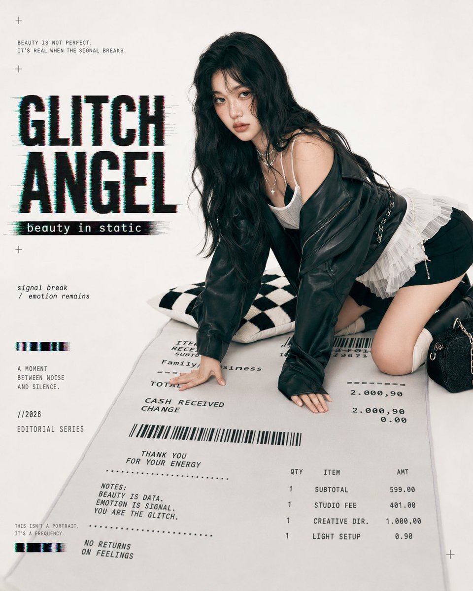
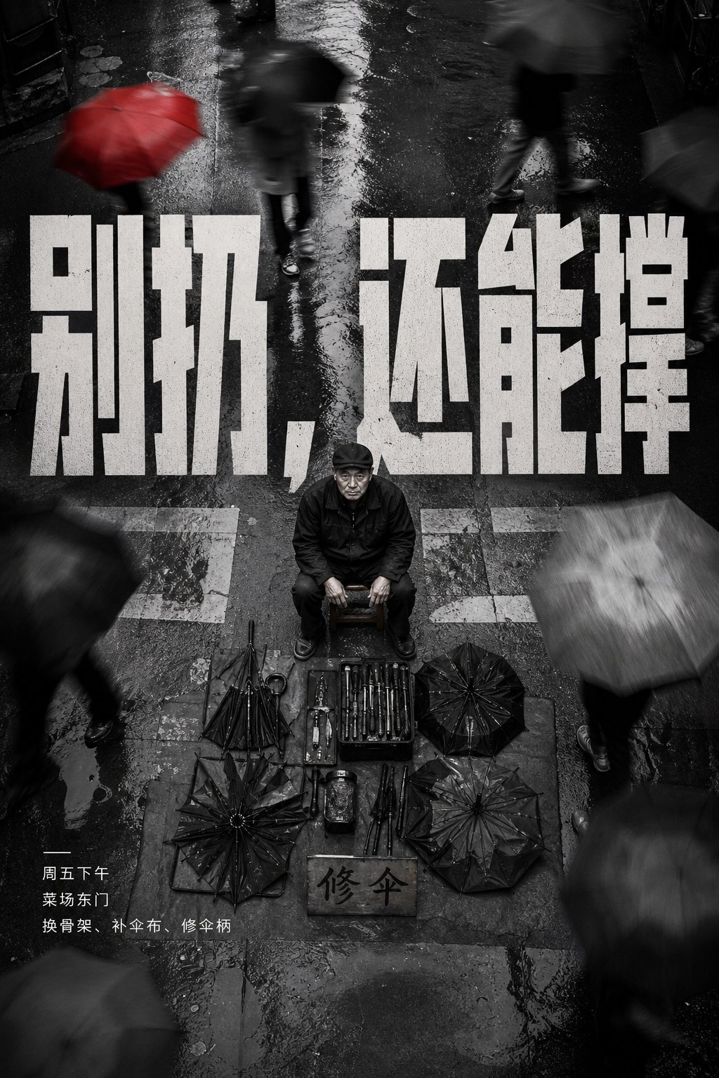
Full Prompt
Generate a top-down street contrast poster based on specific thematic content: the camera looks down from a high place, ground texture and pedestrian movement form a grayscale background, the main subject is located at the core position of the image, clear, static, with a formal or calm posture, while other surrounding people or objects have obvious motion blur. An oversized theme-derived highlighted title spans above or behind the main subject, the font is compressed and heavy, forming a planar conflict with the ground perspective. Colors maintain the relationship of a monochromatic street photography base, a single theme highlighted text, and a small amount of high-brightness small text descriptions; the mood is cold, rebellious, and emphasizes difference. The layout should make the main subject look like they are surrounded by the world's flow but not swallowed by it; failure symptoms are a lack of top-down order or the highlighted title becoming an ordinary banner. —————— Store Promotion: Vertical 3:4, looking down at the entrance of a commercial street, crowds passing in front of a hair salon sign forming a blurred band, an adult customer wearing a black hairdressing cape stands in the center, the hairstyle silhouette is clear. Main Text: Big title says 'Today Change a Head', small text says 'Pre-cut consultation 0 yuan / Weekdays 12:00-18:00 / Take side profile photo first upon arrival'. Actual Use: Suitable for posting on Moments or Dazhong Dianping cover, the subject must be attractive but maintain public promotion standards.