Case Media
Case Notes
This page keeps the media, full prompt, and original source together so you can inspect the result first and decide whether the prompt is worth copying, saving, or comparing.
Case Insights
To make this page easier to search, cite, and reuse later, the case is also broken down into practical guidance about usage, visual cues, and prompt structure.
Best Fit Scenarios
- Use this as a portrait & photography benchmark when you need a fast style baseline before rewriting your own prompt.
- It is especially helpful if your target overlaps with Portrait, Poster, Typography and you want to judge the image result before tuning wording.
- Keep it as a control sample when you compare nearby prompt variants one variable at a time.
Visual Signals To Notice
- The clearest style signals here are Portrait, Poster, Typography, so those should usually stay in your first rewrite.
- Focus on framing, light direction, pose, and the distance between subject and camera.
- This case keeps one primary output, so the first image should be treated as the main visual reference.
How The Prompt Is Structured
- The prompt reads as a long, highly specified prompt, which is useful when you want to judge how much specificity this direction needs.
- Its keyword cluster is centered on Portrait, Poster, Typography, so you can usually keep that cluster while swapping subject, camera, layout, or copy details.
- A practical rewrite path is: keep the outcome, keep the strongest style cues, then replace only the subject and environment blocks.
Good Follow-up Questions
- What changes first if you keep Portrait, Poster, Typography but switch the subject matter?
- Which part of the result comes from section-level structure (Portrait & Photography) versus tag-level style cues?
- Which related cases in the same section give you a cleaner or more extreme variation of the same direction?
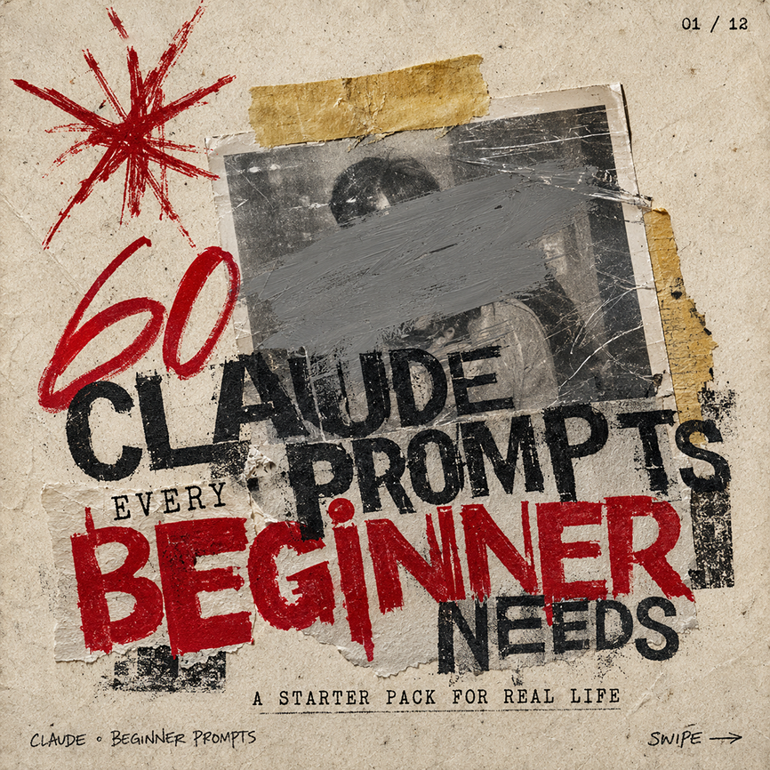
Full Prompt
Create a square gritty social media carousel cover poster on aged beige paper with a distressed photocopy/zine aesthetic. The composition has 1 central black-and-white taped photograph, scratched and worn, with a wide gray paint smear obscuring the face; 2 pieces of yellowed masking tape hold it down, one horizontal strip at the top and one torn vertical strip on the right edge. Add 1 large hand-drawn red starburst scribble in the upper left, and use rough stamped typography layered over torn paper scraps. The main headline reads “{argument name="headline text" default="CLAUDE PROMPTS"}” in huge distressed black uppercase letters across the center, partially overlapping the photo. Add the small word “EVERY” above the bottom headline, then a massive red stamped word “{argument name="emphasis word" default="BEGINNER"}” across the lower middle, followed by “NEEDS” in black on the lower right. Include the subtitle “{argument name="subtitle text" default="A STARTER PACK FOR REAL LIFE"}” centered near the bottom in small typewriter-style uppercase letters. Add tiny handwritten footer text “{argument name="footer label" default="CLAUDE • BEGINNER PROMPTS"}” at bottom left, “SWIPE →” at bottom right, and a small page indicator “{argument name="page indicator" default="01 / 12"}” in the top right. Use a limited palette of dirty beige, black ink, gray paint, and deep red, with torn edges, ink smudges, rough halftone texture, scratches, tape shadows, and imperfect alignment; make it feel like an underground punk flyer repurposed as a bold AI prompt carousel thumbnail.