Case Media
Case Notes
This page keeps the media, full prompt, and original source together so you can inspect the result first and decide whether the prompt is worth copying, saving, or comparing.
Case Insights
To make this page easier to search, cite, and reuse later, the case is also broken down into practical guidance about usage, visual cues, and prompt structure.
Best Fit Scenarios
- Use this as a portrait & photography benchmark when you need a fast style baseline before rewriting your own prompt.
- It is especially helpful if your target overlaps with Portrait, Fashion, Minimal and you want to judge the image result before tuning wording.
- Keep it as a control sample when you compare nearby prompt variants one variable at a time.
Visual Signals To Notice
- The clearest style signals here are Portrait, Fashion, Minimal, so those should usually stay in your first rewrite.
- Focus on framing, light direction, pose, and the distance between subject and camera.
- This case keeps one primary output, so the first image should be treated as the main visual reference.
How The Prompt Is Structured
- The prompt reads as a long, highly specified prompt, which is useful when you want to judge how much specificity this direction needs.
- Its keyword cluster is centered on Portrait, Fashion, Minimal, so you can usually keep that cluster while swapping subject, camera, layout, or copy details.
- A practical rewrite path is: keep the outcome, keep the strongest style cues, then replace only the subject and environment blocks.
Good Follow-up Questions
- What changes first if you keep Portrait, Fashion, Minimal but switch the subject matter?
- Which part of the result comes from section-level structure (Portrait & Photography) versus tag-level style cues?
- Which related cases in the same section give you a cleaner or more extreme variation of the same direction?
Full Prompt
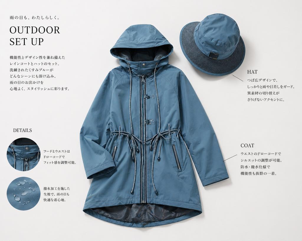
Create a clean, high-end Japanese fashion catalog page on a soft warm light-gray background, featuring a coordinated rainwear set laid flat as a product editorial. The central focus is 1 women's hooded raincoat in a muted dusty blue tone, shown front-facing and neatly arranged with sleeves slightly bent inward. The coat is mid-thigh length with a full front zipper, snap-button storm placket details near the collar, a large structured hood, adjustable drawcords at both the hood and waist, two vertical zip pockets, subtle seam construction, and a slightly longer curved back hem with a darker inner lining visible at the bottom opening. Above and to the right, place 1 matching wide-brim rain hat in the same dusty blue, angled slightly, with a darker contrasting brim underside and a small black tag on the crown. Use soft diffused studio lighting with gentle realistic shadows to give a premium product-photography look. Add editorial typography and callouts around the products in a minimalist Japanese layout. In the upper left, place a small Japanese tagline reading "雨の日も、わたしらしく。" above a large serif English headline reading "OUTDOOR SET UP". Beneath it, add a short vertical block of Japanese body copy describing the stylish functional raincoat-and-hat set. In the lower left, add a serif subheading "DETAILS" with 2 circular inset detail photos stacked vertically: the top circle shows a close-up of the hood and front fastening area with drawcord hardware; the bottom circle shows water droplets beading on the blue waterproof fabric. To the right of each circle, place short Japanese explanatory text. On the right side of the page, add 2 product callout labels in serif English with thin leader lines: "HAT" near the upper-right hat with a short Japanese description below, and "COAT" near the lower-right side of the coat with a short Japanese description below. Keep the layout airy and balanced, with elegant negative space, refined magazine styling, realistic garment textures, and a modern outdoor-luxury aesthetic.