Case Media
Case Notes
This page keeps the media, full prompt, and original source together so you can inspect the result first and decide whether the prompt is worth copying, saving, or comparing.
Case Insights
To make this page easier to search, cite, and reuse later, the case is also broken down into practical guidance about usage, visual cues, and prompt structure.
Best Fit Scenarios
- Use this as a portrait & photography benchmark when you need a fast style baseline before rewriting your own prompt.
- It is especially helpful if your target overlaps with Portrait, Fashion, Minimal and you want to judge the image result before tuning wording.
- Keep it as a control sample when you compare nearby prompt variants one variable at a time.
Visual Signals To Notice
- The clearest style signals here are Portrait, Fashion, Minimal, so those should usually stay in your first rewrite.
- Focus on framing, light direction, pose, and the distance between subject and camera.
- This case keeps one primary output, so the first image should be treated as the main visual reference.
How The Prompt Is Structured
- The prompt reads as a long, highly specified prompt, which is useful when you want to judge how much specificity this direction needs.
- Its keyword cluster is centered on Portrait, Fashion, Minimal, so you can usually keep that cluster while swapping subject, camera, layout, or copy details.
- A practical rewrite path is: keep the outcome, keep the strongest style cues, then replace only the subject and environment blocks.
Good Follow-up Questions
- What changes first if you keep Portrait, Fashion, Minimal but switch the subject matter?
- Which part of the result comes from section-level structure (Portrait & Photography) versus tag-level style cues?
- Which related cases in the same section give you a cleaner or more extreme variation of the same direction?
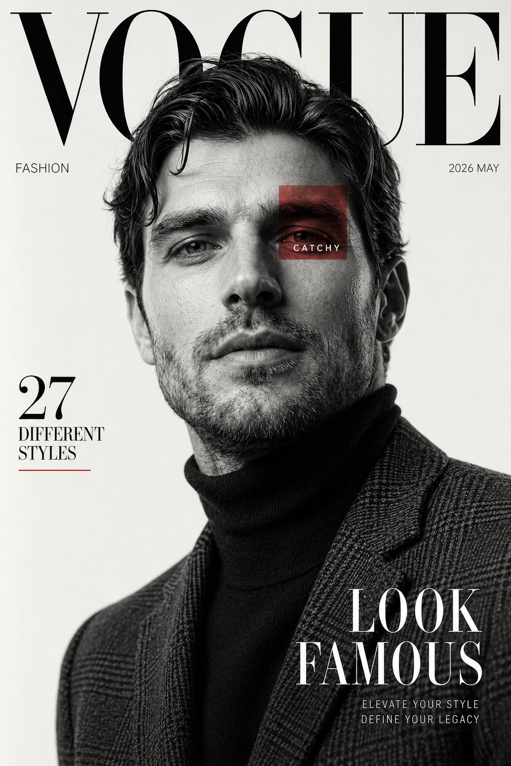
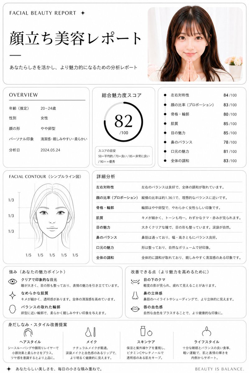
Full Prompt
Using REFERENCE_0, turn the uploaded portrait into a clean, premium Japanese aesthetic analysis dashboard titled {argument name="headline text" default="顔立ち美容レポート"}. Keep the same photo as the source image, including the face blur/censor, and place it in a rounded card at the top right. Reformat the output as a white editorial report page with thin gray borders, black typography, and a luxury beauty-consultation layout. Add these 8 report sections: 1) top header with small English text "FACIAL BEAUTY REPORT ✦", the large Japanese title, and the subtitle "あなたらしさを活かし、より魅力的になるための分析レポート"; 2) an OVERVIEW box listing exactly 5 rows: 年齢(推定) 20–24歳, 性別 女性, 顔の形 やや卵型, パーソナル印象 清潔感・親しみやすい・柔らかい, 分析日 2024.05.24; 3) a total score box labeled 総合魅力度スコア with a circular gauge showing {argument name="total score" default="82"}/100 and a small score guide reading 50=平均的 / 70=良い / 85=非常に良い / 90+=優秀; 4) a metrics box with exactly 7 bullet scores: 左右対称性 84/100, 顔の比率(プロポーション) 83/100, 骨格・輪郭 80/100, 肌質 85/100, 目の魅力 85/100, 鼻のバランス 78/100, 口元の魅力 81/100, 全体の調和 83/100; 5) a FACIAL CONTOUR(シンプルライン図) panel showing a simplified line-art face diagram with the blurred face area masked and measurement guides labeled exactly 1/3, 1/3, 1/3 vertically and 1/5 repeated 5 times along the bottom; 6) a 詳細分析 section with exactly 8 rows matching the metrics above and short explanatory Japanese comments; 7) a strengths box titled 強み(あなたの魅力ポイント) with exactly 3 icon-led items: クリアで印象的な目元, なめらかな肌質, バランスの取れた輪郭; 8) an improvements box titled 改善できる点(より魅力を高めるために) with exactly 3 icon-led items: 目の下のクマ, 鼻の立体感, 唇の血色感; 9) a final recommendation row titled 身だしなみ・スタイル改善提案 with exactly 4 columns labeled ヘアスタイル, メイク, スキンケア, ライフスタイル, each with a simple black line icon and short Japanese advice. Add a small footer line on the bottom right reading {argument name="footer text" default="BEAUTY IS BALANCE."}. Overall style: minimalist clinic report, balanced grid layout, soft shadows, rounded panels, black and gray only, highly legible Japanese magazine design.