Case Media
Case Notes
This page keeps the media, full prompt, and original source together so you can inspect the result first and decide whether the prompt is worth copying, saving, or comparing.
Case Insights
To make this page easier to search, cite, and reuse later, the case is also broken down into practical guidance about usage, visual cues, and prompt structure.
Best Fit Scenarios
- Use this as a model & community benchmark when you need a fast style baseline before rewriting your own prompt.
- It is especially helpful if your target overlaps with 35mm, Poster, Typography and you want to judge the image result before tuning wording.
- Keep it as a control sample when you compare nearby prompt variants one variable at a time.
Visual Signals To Notice
- The clearest style signals here are 35mm, Poster, Typography, so those should usually stay in your first rewrite.
- This kind of case is strongest when you watch deltas: what changed, what broke, and which prompt choice caused that shift.
- This case keeps 2 media outputs, which makes it easier to check whether the style remains stable across multiple results.
How The Prompt Is Structured
- The prompt reads as a long, highly specified prompt, which is useful when you want to judge how much specificity this direction needs.
- Its keyword cluster is centered on 35mm, Poster, Typography, so you can usually keep that cluster while swapping subject, camera, layout, or copy details.
- A practical rewrite path is: keep the outcome, keep the strongest style cues, then replace only the subject and environment blocks.
Good Follow-up Questions
- What changes first if you keep 35mm, Poster, Typography but switch the subject matter?
- Which part of the result comes from section-level structure (Model & Community) versus tag-level style cues?
- Which related cases in the same section give you a cleaner or more extreme variation of the same direction?
Full Prompt
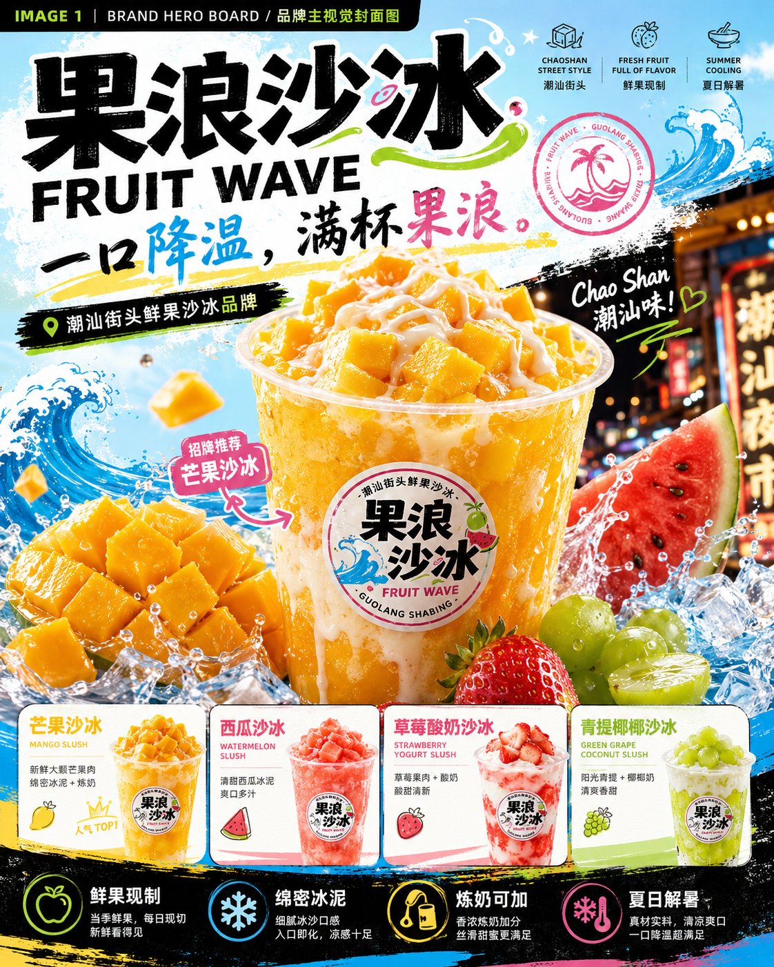
Please generate a set of "FRUIT WAVE 果浪沙冰" summer fresh fruit slushy brand visual proposal images. Note: This is a continuous set of 4 brand visual proposal images, but each one must be generated independently. Do not merge them; do not use a four-grid layout. The 4 images must maintain the same brand system: brand name, font, color palette, cup stickers, wave graphics, fruit elements, and street summer vibe must all be unified. Brand Name: 果浪沙冰 English Name: FRUIT WAVE Brand Type: Chaoshan street fresh fruit slushy brand / Young people's summer fresh-made dessert brand Brand Positioning: Turning Chaoshan street fresh fruit slushies into higher aesthetic, more branded summer fresh-made desserts. Slogan: One sip to cool down, a full cup of fruit wave. Core Keywords: Fresh fruit made on the spot, dense slush, condensed milk adds points, summer heat relief, young and trendy, street night market, bright and colorful, cool and delicious, real ingredients. Visual Style: High-saturation fruit colors, summer refreshing feel, street trendy feel, Chaoshan night market check-in vibe, fresh fruit realism. The visuals should be fresh, cool, sweet, bright, freshly made, photogenic, and appetizing. Primary Colors: Mango yellow, watermelon pink, lime green, condensed milk white, icy light blue, deep charcoal gray. Auxiliary Graphics: Blue ocean waves, ice crystals, water droplets, splash graphics, fruit slices, condensed milk dripping lines, handwritten graffiti, circular brand seal. Core Products: Mango Slush / MANGO SLUSH Watermelon Slush / WATERMELON SLUSH Strawberry Yogurt Slush / STRAWBERRY YOGURT SLUSH Green Grape Coconut Slush / GREEN GRAPE COCONUT SLUSH Double Fruit Slush / DOUBLE FRUIT SLUSH Condensed Milk Peanut Slush / CONDENSED MILK PEANUT SLUSH Product Requirements: Transparent cups as the core visual carrier, with a "FRUIT WAVE 果浪沙冰" circular sticker on the cup body. Inside the cup, one should see dense slush, fruit granules, real fruit pieces, condensed milk topping, and a cool icy feel. Do not make it look like ordinary milk tea; highlight fresh fruit slushy, slush, condensed milk, and summer heat relief. Aspect Ratio: Vertical 4:5. Overall Requirements: Sufficient information, sense of design, brand proposal feel, not empty, not crude. Chinese and English titles should be clear, and typography must be professional. The overall look should be like a complete brand visual proposal rather than ordinary posters. IMAGE 1 | BRAND HERO BOARD / Brand Visual Hero Cover Image Generate a brand visual hero cover image. The visual should immediately convey "youth, fresh fruit, summer, heat relief, Chaoshan street slushy." Layout: Top displays large title "果浪沙冰 / FRUIT WAVE" and slogan "一口降温,满杯果浪。" Center features a huge Mango Slush as the main visual, transparent cup, brand sticker, mango slush, mango chunks, condensed milk topping, ice cube splashes, blue waves, fruit splashes. Bottom displays 4 main flavor small cards: Mango Slush, Watermelon Slush, Strawberry Yogurt Slush, Green Grape Coconut Slush. Add selling point icons: Freshly made with real fruit, dense slush, condensed milk available, summer heat relief. Visuals should be high-saturation, cool, strong fresh fruit feel, with street summer impact. IMAGE 2 | IDENTITY SYSTEM BOARD / Brand Identity System Board Generate a brand identity system board. Show the Logo, colors, fonts, icons, stickers, auxiliary graphics, and flavor system for "FRUIT WAVE 果浪沙冰." Layout: Top displays brand name, English name, slogan, and small product visuals. Middle displays in modular style: 01 Brand Identity: Chinese logo, English logo, circular brand seal. 02 Color System: Mango yellow, watermelon pink, lime green, condensed milk white, icy light blue, deep charcoal gray. 03 Typography System: Chinese title font, body text font, English font. 04 Icon System: Mango, watermelon, strawberry, green grape, condensed milk, ice cubes, waves, double-mix. 05 Sticker Labels: Freshly made with real fruit, dense slush, condensed milk adds points, double-mix recommendation, summer limited, real ingredients. 06 Auxiliary Graphics: Blue ocean waves, ice crystals, water droplets, splashes, condensed milk dripping, colorful graffiti. Bottom displays 6 flavor cards: Mango, Watermelon, Strawberry Yogurt, Green Grape Coconut, Double Fruit Slush, Condensed Milk Peanut Slush. Visuals should be like a brand system proposal board, information-rich but clear and organized. IMAGE 3 | PRODUCT & PACKAGING BOARD / Product and Packaging Application Board Generate a product and packaging application board. Show how this brand translates into a real, sellable product system. Layout: Top displays 4 main slushy products: Mango Slush, Watermelon Slush, Strawberry Yogurt Slush, Green Grape Coconut Slush. Each cup is transparent, has a unified brand sticker, contains slush, fruit granules, fruit pieces, condensed milk, and a cool icy feel. Middle displays packaging applications: Cup stickers, sealing film, packaging bags, paper bags, menu boards, ordering stickers, brand cards. Bottom displays product matrix: Mango Slush, Watermelon Slush, Strawberry Yogurt Slush, Green Grape Coconut Slush, Double Fruit Slush, Condensed Milk Peanut Slush. Add core selling points: Freshly made with real fruit, dense with no ice crystals, condensed milk available, double-mix as you like, summer late-night snack recommendation. Bottom-most displays topping recommendations: Condensed milk, peanut bits, coconut jelly, raisins. Visuals should feel like real sellable products, with a sense of packaging and strong product appeal, making people want to buy at a glance. IMAGE 4 | CAMPAIGN & SPACE BOARD / Communication and Space Application Board Generate a communication and space application board. Show the effect of "FRUIT WAVE 果浪沙冰" entering real streets, night markets, pop-ups, social media, and brand materials. Layout: Top displays brand name, English name, slogan, and small brand icons. Left large scene: Chaoshan night market slushy stall / roadside shop / flagship store. Signboard says "FRUIT WAVE 果浪沙冰," featuring an ordering window, fresh fruit display, transparent cup slushies, night market lighting, young customers or staff, embodying the street life of summer nights. Top right: Summer pop-up stall with awning, menu, lightboxes, fresh fruit, and product display. Middle right: Two advertising posters, copy can be "Real fresh fruit, real icy cool," "Summer calls for a slushy," "One sip to cool down, a full cup of fruit wave." Bottom left: 3-4 social media vertical posters, including new arrivals, popular TOPs, double fruit CP recommendations, summer night heat relief buddies. Bottom right: Brand touchpoints including paper bags, napkins, coasters, stickers, ordering cards, takeout bags. Bottom displays application scene icons: Chaoshan night market, street shop, fresh fruit stall, summer pop-up, youth community. Visuals should have a sense of space, communication, and storytelling, highlighting summer nights, streets, fruit stalls, young people, and a sense of cooling down.