Case Media
Case Notes
This page keeps the media, full prompt, and original source together so you can inspect the result first and decide whether the prompt is worth copying, saving, or comparing.
Case Insights
To make this page easier to search, cite, and reuse later, the case is also broken down into practical guidance about usage, visual cues, and prompt structure.
Best Fit Scenarios
- Use this as a model & community benchmark when you need a fast style baseline before rewriting your own prompt.
- It is especially helpful if your target overlaps with Fashion, Poster, Typography and you want to judge the image result before tuning wording.
- Keep it as a control sample when you compare nearby prompt variants one variable at a time.
Visual Signals To Notice
- The clearest style signals here are Fashion, Poster, Typography, so those should usually stay in your first rewrite.
- This kind of case is strongest when you watch deltas: what changed, what broke, and which prompt choice caused that shift.
- This case keeps one primary output, so the first image should be treated as the main visual reference.
How The Prompt Is Structured
- The prompt reads as a long, highly specified prompt, which is useful when you want to judge how much specificity this direction needs.
- Its keyword cluster is centered on Fashion, Poster, Typography, so you can usually keep that cluster while swapping subject, camera, layout, or copy details.
- A practical rewrite path is: keep the outcome, keep the strongest style cues, then replace only the subject and environment blocks.
Good Follow-up Questions
- What changes first if you keep Fashion, Poster, Typography but switch the subject matter?
- Which part of the result comes from section-level structure (Model & Community) versus tag-level style cues?
- Which related cases in the same section give you a cleaner or more extreme variation of the same direction?
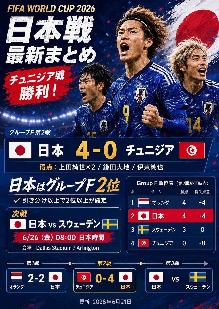
Full Prompt
Goal: Create a dramatic Japanese sports-news extra edition graphic about {argument name="event title" default="FIFA WORLD CUP 2026"}, styled like a viral social media match-summary poster after Japan defeats Tunisia 4–0. Canvas: Vertical 3:4 poster, dark navy stadium background with bright floodlights along the lower horizon, red and blue confetti, grunge paint textures, high contrast, energetic tabloid/sports-news design. Main image: Show exactly 3 Japanese male soccer players in blue Japan national-team jerseys, running and celebrating. The center player is largest, wearing number 9, fist clenched; the left player is smaller and partly behind him, wearing number 15; the right player is partly cropped, wearing number 14. Place a large Japanese flag brushstroke circle behind the players on the upper right. Use realistic sports photography lighting, wind-swept hair, intense expressions, but do not use real player likenesses. Layout and text: At top left, place a small gold English title: {argument name="event title" default="FIFA WORLD CUP 2026"}. Under it, use huge distressed white Japanese newspaper-style headline text: {argument name="main Japanese headline" default="日本戦\n最新まとめ"}. Add a red brushstroke callout below with bold white Japanese text: {argument name="red callout text" default="チュニジア戦\n勝利!"}. Keep the typography bold, condensed, slightly rough, with drop shadows and angled paint-stroke accents. Score block: In the center, create one large navy scoreboard bar with exactly 2 national flags, Japan on the left and Tunisia on the right. Include Japanese team names and a large yellow score: {argument name="main score line" default="日本 4-0 チュニジア"}. Above it place the group-stage label in Japanese, and below it add scorers in smaller text: {argument name="scorers line" default="得点:上田綺世×2 / 鎌田大地 / 伊東純也"}. Lower information area: Add a large handwritten-style white and yellow Japanese statement saying Japan is in 2nd place in Group F, with a smaller note underneath saying a draw or better secures second place or higher. Create exactly 2 middle panels: left panel for the next match, showing Japan vs Sweden with Japan and Sweden flags, date/time, and venue; right panel for the Group F standings. Standings table: The standings panel must have exactly 4 rows, ranked 1 to 4: Netherlands, Japan, Sweden, Tunisia. Include each country flag, team name in Japanese, points, and goal difference. Use dark navy cells, a red highlight row for Japan, white text, and yellow accents. Bottom match timeline: Create exactly 3 rectangular match cards connected by a thin timeline with dots, labeled match 1, match 2, match 3. Card 1 shows Netherlands 2–2 Japan with both flags. Card 2 is highlighted and shows Tunisia 0–4 Japan with both flags. Card 3 shows Japan vs Sweden with both flags. Add a small update date centered at the bottom. Visual style: Modern Japanese sports newspaper extra, bold editorial layout, navy/red/white/yellow palette, realistic players combined with graphic overlays, sharp borders, glowing stadium light, paint splashes, distressed textures, celebratory urgency. Make all text crisp and legible, no watermarks, no logos other than generic national flags and a generic Japan crest.