Case Media

Case Notes
This page keeps the media, full prompt, and original source together so you can inspect the result first and decide whether the prompt is worth copying, saving, or comparing.
Case Insights
To make this page easier to search, cite, and reuse later, the case is also broken down into practical guidance about usage, visual cues, and prompt structure.
Best Fit Scenarios
- Use this as a model & community benchmark when you need a fast style baseline before rewriting your own prompt.
- It is especially helpful if your target overlaps with Portrait, Fashion, Minimal and you want to judge the image result before tuning wording.
- Keep it as a control sample when you compare nearby prompt variants one variable at a time.
Visual Signals To Notice
- The clearest style signals here are Portrait, Fashion, Minimal, so those should usually stay in your first rewrite.
- This kind of case is strongest when you watch deltas: what changed, what broke, and which prompt choice caused that shift.
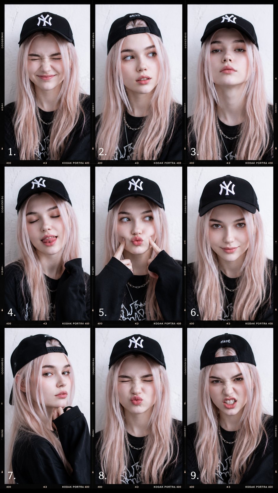
- This case keeps one primary output, so the first image should be treated as the main visual reference.
How The Prompt Is Structured
- The prompt reads as a long, highly specified prompt, which is useful when you want to judge how much specificity this direction needs.
- Its keyword cluster is centered on Portrait, Fashion, Minimal, so you can usually keep that cluster while swapping subject, camera, layout, or copy details.
- A practical rewrite path is: keep the outcome, keep the strongest style cues, then replace only the subject and environment blocks.
Good Follow-up Questions
- What changes first if you keep Portrait, Fashion, Minimal but switch the subject matter?
- Which part of the result comes from section-level structure (Model & Community) versus tag-level style cues?
- Which related cases in the same section give you a cleaner or more extreme variation of the same direction?
Full Prompt
Create a clean educational photography lighting tutorial infographic in a minimalist editorial style. The layout should be a vertical comparison chart with 3 columns and 7 rows. Top headers: Left column: Indoors Middle column: Indoors Right column: Outdoors Include a small note near the outdoor header: no reflective surfaces and also a note saying NO CEILING OUTDOORS. Each row should compare a different flash lighting method. Show the same female model in black-and-white portrait photos with the same pose across the chart, standing near a plain wall, wearing a simple top, medium-length dark hair, realistic expression, classic studio portrait look. Row 1: DIRECT Left panel: a simple technical lighting diagram showing direct flash aimed at the subject. Middle panel: indoor result with hard direct flash and a sharp shadow on the wall. Right panel: outdoor result with even harder shadow and stronger contrast. Row 2: BOUNCE Left panel: lighting diagram showing flash bouncing off the ceiling. Middle panel: indoor portrait with softer upward bounced light and a gentler wall shadow. Right panel: text note instead of photo saying "NO CEILING OUTDOORS". Row 3: LUMIQUEST Left panel: lighting diagram for LumiQuest style bounced/diffused flash. Middle panel: indoor portrait with soft but directional light. Right panel: outdoor portrait with darker, more defined shadow. Row 4: OMNIBOUNCE Left panel: lighting diagram showing flash scattered in multiple directions. Middle panel: indoor portrait with diffused, room-filled light and softer shadow. Right panel: outdoor portrait with stronger contrast and shadow because there are no reflective surfaces. Row 5: THROUGH AN UMBRELLA Left panel: diagram showing flash shooting through a translucent umbrella toward the subject. Middle panel: indoor portrait with broad, soft light and smooth shadows. Right panel: outdoor portrait with soft light on subject but still a noticeable shadow behind. Row 6: OFF AN UMBRELLA Left panel: diagram showing flash reflected off a white umbrella. Middle panel: indoor portrait with soft reflected light and balanced contrast. Right panel: outdoor portrait with more contrast and deeper background shadow. Row 7: THROUGH A SOFT BOX Left panel: diagram showing a rectangular softbox aimed at the subject. Middle panel: indoor portrait with very soft, even professional lighting. Right panel: outdoor portrait with soft directional lighting and a more visible shadow than indoors. Design style: monochrome / black and white clean instructional infographic thin black borders around each panel light gray background in diagram panels simple line art technical diagrams with arrows showing light paths realistic portrait photography in the example panels neat typography, all caps row labels magazine quality educational reference sheet balanced spacing and grid alignment high clarity, easy to understand, professional tutorial layout.