Case Media
Case Notes
This page keeps the media, full prompt, and original source together so you can inspect the result first and decide whether the prompt is worth copying, saving, or comparing.
Case Insights
To make this page easier to search, cite, and reuse later, the case is also broken down into practical guidance about usage, visual cues, and prompt structure.
Best Fit Scenarios
- Use this as a model & community benchmark when you need a fast style baseline before rewriting your own prompt.
- It is especially helpful if your target overlaps with Typography, Infographic, Comparison and you want to judge the image result before tuning wording.
- Keep it as a control sample when you compare nearby prompt variants one variable at a time.
Visual Signals To Notice
- The clearest style signals here are Typography, Infographic, Comparison, so those should usually stay in your first rewrite.
- This kind of case is strongest when you watch deltas: what changed, what broke, and which prompt choice caused that shift.
- This case keeps one primary output, so the first image should be treated as the main visual reference.
How The Prompt Is Structured
- The prompt reads as a long, highly specified prompt, which is useful when you want to judge how much specificity this direction needs.
- Its keyword cluster is centered on Typography, Infographic, Comparison, so you can usually keep that cluster while swapping subject, camera, layout, or copy details.
- A practical rewrite path is: keep the outcome, keep the strongest style cues, then replace only the subject and environment blocks.
Good Follow-up Questions
- What changes first if you keep Typography, Infographic, Comparison but switch the subject matter?
- Which part of the result comes from section-level structure (Model & Community) versus tag-level style cues?
- Which related cases in the same section give you a cleaner or more extreme variation of the same direction?
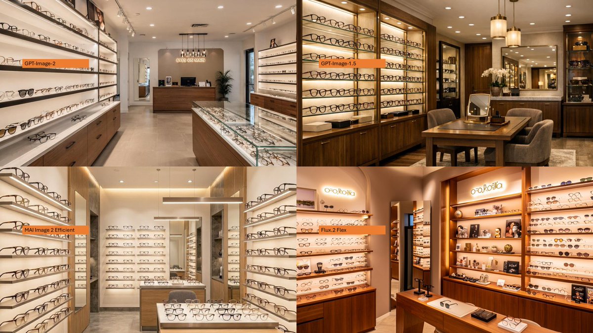
Full Prompt
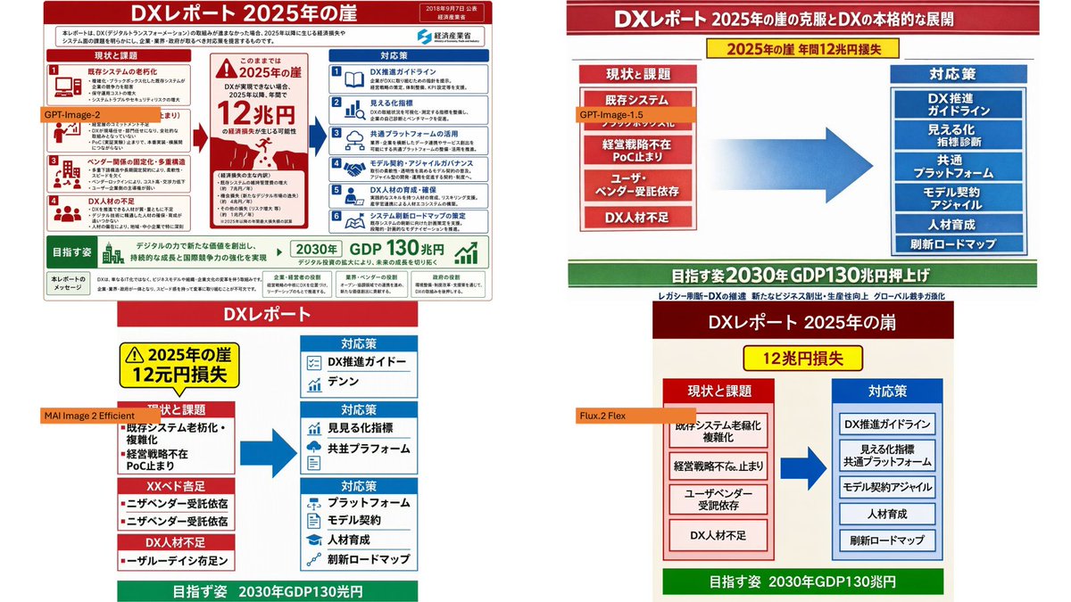
Using the provided reference image as a loose layout inspiration for a model-comparison graphic, replace the Japanese DX infographic with a clean 2×2 comparison collage of photorealistic eyeglasses store interiors. Create exactly 4 panels: top-left labeled {argument name="first model label" default="GPT-Image-2"}, top-right labeled {argument name="second model label" default="GPT-Image-1.5"}, bottom-left labeled {argument name="third model label" default="MAI Image 2 Efficient"}, and bottom-right labeled {argument name="fourth model label" default="Flux.2 Flex"}. Each panel should show a different upscale optical boutique interior filled with wall displays of eyeglass frames, glass counters, warm lighting, wood cabinetry, mirrors, and showroom depth. Use small horizontal orange label bars with black text near the left side of each panel. Make the final image a wide 16:9 collage with thin panel boundaries, no extra explanatory text, no Japanese report content, and no watermark.