Case Media
Case Notes
This page keeps the media, full prompt, and original source together so you can inspect the result first and decide whether the prompt is worth copying, saving, or comparing.
Case Insights
To make this page easier to search, cite, and reuse later, the case is also broken down into practical guidance about usage, visual cues, and prompt structure.
Best Fit Scenarios
- Use this as a model & community benchmark when you need a fast style baseline before rewriting your own prompt.
- It is especially helpful if your target overlaps with Typography, Infographic, Vertical and you want to judge the image result before tuning wording.
- Keep it as a control sample when you compare nearby prompt variants one variable at a time.
Visual Signals To Notice
- The clearest style signals here are Typography, Infographic, Vertical, so those should usually stay in your first rewrite.
- This kind of case is strongest when you watch deltas: what changed, what broke, and which prompt choice caused that shift.
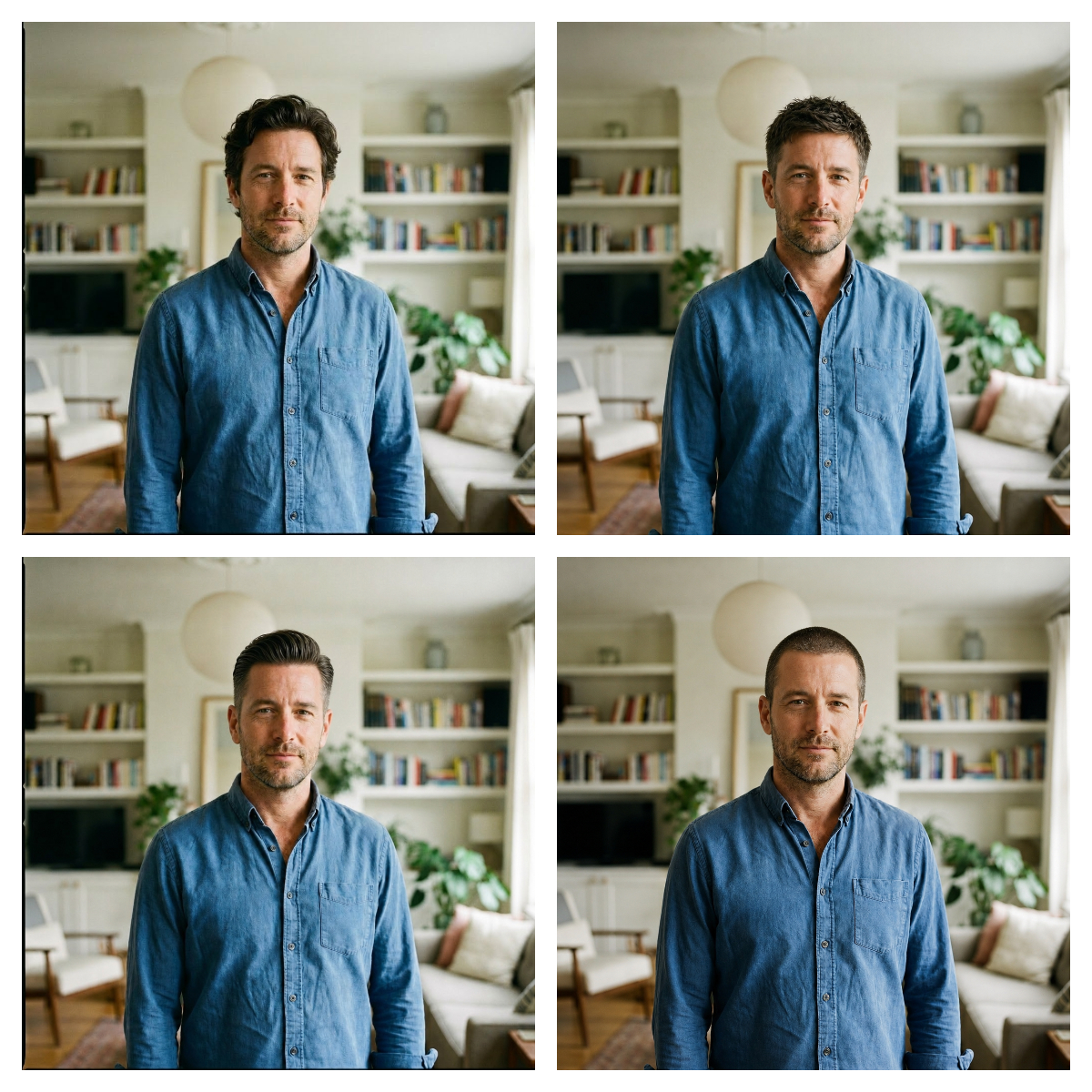
- This case keeps one primary output, so the first image should be treated as the main visual reference.
How The Prompt Is Structured
- The prompt reads as a long, highly specified prompt, which is useful when you want to judge how much specificity this direction needs.
- Its keyword cluster is centered on Typography, Infographic, Vertical, so you can usually keep that cluster while swapping subject, camera, layout, or copy details.
- A practical rewrite path is: keep the outcome, keep the strongest style cues, then replace only the subject and environment blocks.
Good Follow-up Questions
- What changes first if you keep Typography, Infographic, Vertical but switch the subject matter?
- Which part of the result comes from section-level structure (Model & Community) versus tag-level style cues?
- Which related cases in the same section give you a cleaner or more extreme variation of the same direction?
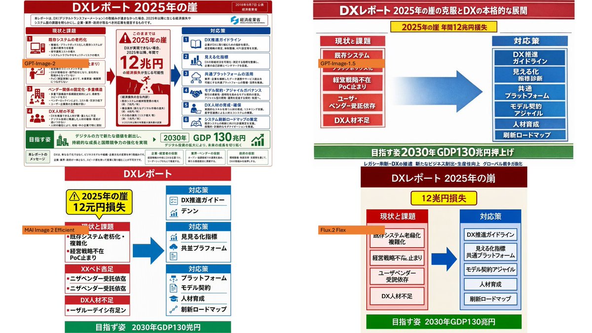
Full Prompt
Using the provided reference image as the source infographic, create a 16:9 white-background comparison collage showing how different image models reproduce the same Japanese DX Report infographic. Layout: Arrange exactly 4 discrete panels in a 2×2-style collage: top-left, top-right, bottom-left, bottom-right. Keep generous white spacing between panels. Panels: 1. Top-left: show a mostly faithful smaller copy of the reference infographic, preserving the dense Japanese text, red/blue/green government-report layout, central “2025 cliff / 12 trillion yen loss” warning, left-side issues, right-side countermeasures, and bottom 2030 GDP goal. Add an orange label reading {argument name="top left model label" default="GPT-Image-2"} over the left-middle area. 2. Top-right: create a cleaner simplified ponchi-e style version of the same content with a red title bar, a yellow warning strip, a red stacked “current issues” box on the left, a large blue arrow in the center, a blue stacked “countermeasures” box on the right, and a green goal bar at the bottom. Add an orange label reading {argument name="top right model label" default="GPT-Image-1.5"} near the left issue box. 3. Bottom-left: create a more distorted simplified vertical version with a red “DX Report” header, yellow warning box, red issue blocks on the left, blue countermeasure boxes on the right, a large blue arrow, and green bottom goal bar. Add an orange label reading {argument name="bottom left model label" default="MAI Image 2 Efficient"} across the left side. 4. Bottom-right: create a simplified beige-background version with a dark red header, yellow “12 trillion yen loss” warning, red issue column, blue countermeasure column, large blue arrow, and green bottom goal bar. Add an orange label reading {argument name="bottom right model label" default="Flux.2 Flex"} near the left issue column. Content to preserve conceptually: the comparison should clearly reference {argument name="report topic" default="DX Report 2025 cliff"}, with the same core flow from current problems to countermeasures and the 2030 GDP growth target. Make the top-left panel the most accurate and dense; make the other three panels visibly more simplified and less text-faithful, as a model-comparison visual. Constraints: Use exactly 4 panels and exactly 4 orange model labels. Keep the Japanese infographic style readable where possible, with no extra watermark or unrelated objects.