Case Media
Case Notes
This page keeps the media, full prompt, and original source together so you can inspect the result first and decide whether the prompt is worth copying, saving, or comparing.
Case Insights
To make this page easier to search, cite, and reuse later, the case is also broken down into practical guidance about usage, visual cues, and prompt structure.
Best Fit Scenarios
- Use this as a model & community benchmark when you need a fast style baseline before rewriting your own prompt.
- It is especially helpful if your target overlaps with Cinematic, Fashion, Typography and you want to judge the image result before tuning wording.
- Keep it as a control sample when you compare nearby prompt variants one variable at a time.
Visual Signals To Notice
- The clearest style signals here are Cinematic, Fashion, Typography, so those should usually stay in your first rewrite.
- This kind of case is strongest when you watch deltas: what changed, what broke, and which prompt choice caused that shift.
- This case keeps one primary output, so the first image should be treated as the main visual reference.
How The Prompt Is Structured
- The prompt reads as a long, highly specified prompt, which is useful when you want to judge how much specificity this direction needs.
- Its keyword cluster is centered on Cinematic, Fashion, Typography, so you can usually keep that cluster while swapping subject, camera, layout, or copy details.
- A practical rewrite path is: keep the outcome, keep the strongest style cues, then replace only the subject and environment blocks.
Good Follow-up Questions
- What changes first if you keep Cinematic, Fashion, Typography but switch the subject matter?
- Which part of the result comes from section-level structure (Model & Community) versus tag-level style cues?
- Which related cases in the same section give you a cleaner or more extreme variation of the same direction?
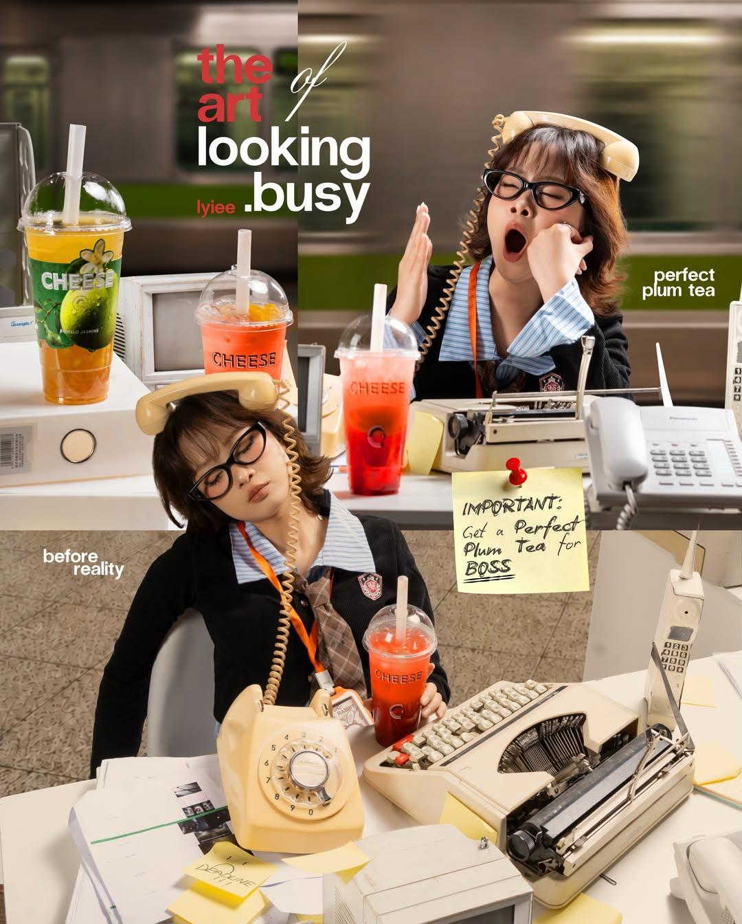
Full Prompt
A highly detailed retro office-themed commercial photography collage, split-screen composition showing the contrast between “looking busy” and reality. Young Asian office worker with short messy hair and black glasses, wearing a vintage corporate uniform with ID badge. In the top scene, she appears overwhelmed and busy, yawning while holding a beige rotary telephone receiver, surrounded by ringing desk phones, a typewriter, paperwork, sticky notes, and colorful fruit teas on a cluttered desk. Motion-blurred train passing outside large office windows creates a fast-paced urban atmosphere. In the bottom scene, the same worker is secretly asleep at her desk with the phone balanced on her head, holding a bright red plum tea, surrounded by retro office equipment from the 1980s–1990s. Warm cinematic lighting, soft shadows, shallow depth of field, realistic product placement, magazine advertisement layout, playful corporate humor, vibrant colors, professional commercial photography, ultra-realistic, sharp focus, lifestyle branding campaign, high-end editorial design, typography space, 4k quality, nostalgic office aesthetic, candid storytelling. Negative Prompt: low quality, blurry face, extra fingers, duplicate objects, distorted hands, bad anatomy, watermark, logo artifacts, overexposed lighting, cropped head, unrealistic proportions, CGI look, cartoon style, text errors, messy composition, low resolution.