Case Media
Case Notes
This page keeps the media, full prompt, and original source together so you can inspect the result first and decide whether the prompt is worth copying, saving, or comparing.
Case Insights
To make this page easier to search, cite, and reuse later, the case is also broken down into practical guidance about usage, visual cues, and prompt structure.
Best Fit Scenarios
- Use this as a model & community benchmark when you need a fast style baseline before rewriting your own prompt.
- It is especially helpful if your target overlaps with Typography, Infographic, Vertical and you want to judge the image result before tuning wording.
- Keep it as a control sample when you compare nearby prompt variants one variable at a time.
Visual Signals To Notice
- The clearest style signals here are Typography, Infographic, Vertical, so those should usually stay in your first rewrite.
- This kind of case is strongest when you watch deltas: what changed, what broke, and which prompt choice caused that shift.
- This case keeps one primary output, so the first image should be treated as the main visual reference.
How The Prompt Is Structured
- The prompt reads as a long, highly specified prompt, which is useful when you want to judge how much specificity this direction needs.
- Its keyword cluster is centered on Typography, Infographic, Vertical, so you can usually keep that cluster while swapping subject, camera, layout, or copy details.
- A practical rewrite path is: keep the outcome, keep the strongest style cues, then replace only the subject and environment blocks.
Good Follow-up Questions
- What changes first if you keep Typography, Infographic, Vertical but switch the subject matter?
- Which part of the result comes from section-level structure (Model & Community) versus tag-level style cues?
- Which related cases in the same section give you a cleaner or more extreme variation of the same direction?
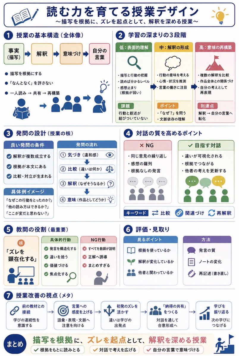
Full Prompt
Using REFERENCE_0 and REFERENCE_1 as messy handwritten study-note sources, convert the content into a clean vertical Japanese educational infographic for quick sharing with teachers. Preserve the core topic about designing reading lessons for narrative texts, but organize it visually instead of reproducing the notebook pages. Create a polished white-background layout with navy section headers, rounded cards, simple flat icons, arrows, checkmarks, and color-coded boxes. Add the main title {argument name="headline text" default="読む力を育てる授業デザイン"} and subtitle {argument name="subtitle text" default="〜描写を根拠に、ズレを起点として、解釈を深める授業〜"}. Structure the infographic into exactly 7 numbered sections plus a final summary band: 1) lesson basic structure with four steps labeled 事実(描写)→ 解釈 → 意味づけ → 自分の言葉, 2) three stages of learning depth labeled 低:表面的理解, 中:解釈の形成, 高:意味の再構築, 3) question design with good-question conditions, question flow, and concrete example prompts, 4) points for improving dialogue quality with two comparison cards labeled NG and 目指す対話 plus keyword chips 比較, 関連づけ, 再解釈, 5) the teacher’s most important role centered on making “ズレ” visible with cards for concrete actions and NG actions, 6) assessment and observation with two cards labeled 見るポイント and 方法, and 7) meta viewpoints for lesson improvement shown as five connected cards: 前の教材との接続, 言葉への感度を上げる, 初発のズレを活かす, 「納得の共有」をつくる, 学びを振り返る. End with a prominent summary statement {argument name="summary statement" default="描写を根拠に、ズレを起点として、解釈を深める授業"} and three check items: 根拠をもとに読みとる, 対話で考えを広げる, 自分の言葉で意味づける. Make the result look like a professionally designed Japanese teaching handout, not a photo of notes.