Case Media
Case Notes
This page keeps the media, full prompt, and original source together so you can inspect the result first and decide whether the prompt is worth copying, saving, or comparing.
Case Insights
To make this page easier to search, cite, and reuse later, the case is also broken down into practical guidance about usage, visual cues, and prompt structure.
Best Fit Scenarios
- Use this as a model & community benchmark when you need a fast style baseline before rewriting your own prompt.
- It is especially helpful if your target overlaps with Portrait, Poster, Illustration and you want to judge the image result before tuning wording.
- Keep it as a control sample when you compare nearby prompt variants one variable at a time.
Visual Signals To Notice
- The clearest style signals here are Portrait, Poster, Illustration, so those should usually stay in your first rewrite.
- This kind of case is strongest when you watch deltas: what changed, what broke, and which prompt choice caused that shift.
- This case keeps one primary output, so the first image should be treated as the main visual reference.
How The Prompt Is Structured
- The prompt reads as a long, highly specified prompt, which is useful when you want to judge how much specificity this direction needs.
- Its keyword cluster is centered on Portrait, Poster, Illustration, so you can usually keep that cluster while swapping subject, camera, layout, or copy details.
- A practical rewrite path is: keep the outcome, keep the strongest style cues, then replace only the subject and environment blocks.
Good Follow-up Questions
- What changes first if you keep Portrait, Poster, Illustration but switch the subject matter?
- Which part of the result comes from section-level structure (Model & Community) versus tag-level style cues?
- Which related cases in the same section give you a cleaner or more extreme variation of the same direction?
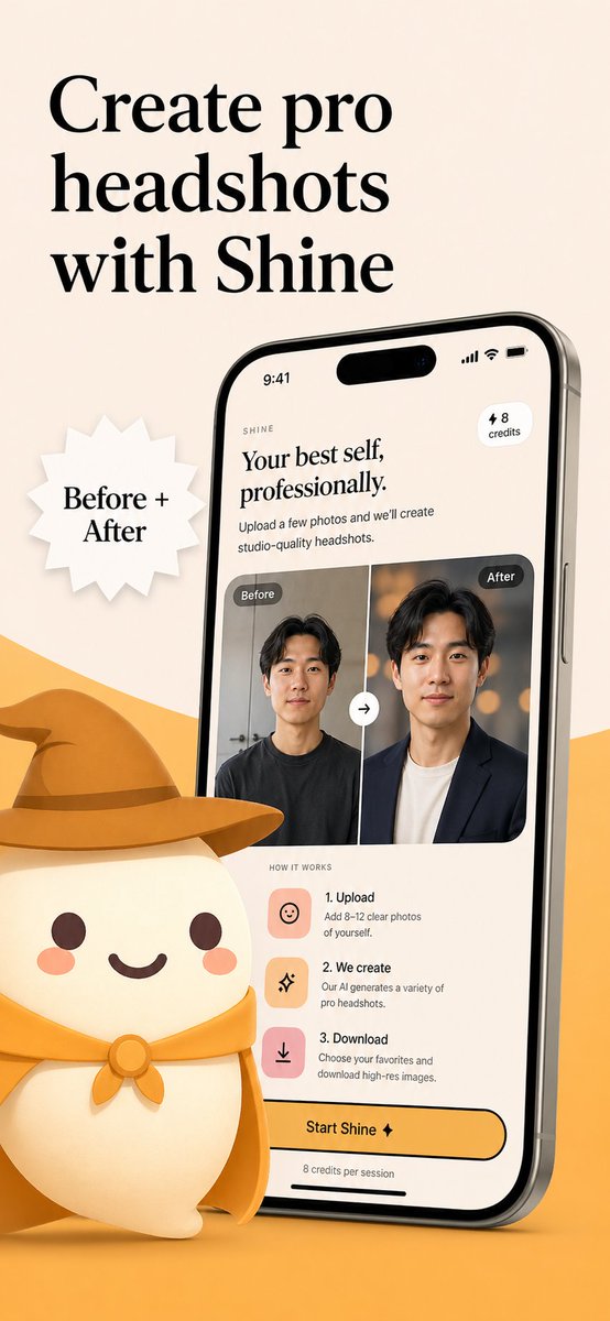
Full Prompt
Create a polished App Store promotional poster for an AI headshot app called {argument name="app name" default="Shine"}, in a warm minimalist brand style. Use a vertical smartphone screenshot ad layout on a soft beige background with a curved golden-yellow shape rising from the bottom edge. Place a large elegant black serif headline in the upper left, split across 3 lines, reading {argument name="headline text" default="Create pro headshots with Shine"}. Add a white jagged starburst badge to the left-center with black serif text reading {argument name="badge text" default="Before + After"}. On the right side, show a large angled modern smartphone mockup, slightly tilted left, with thin metallic edges and a realistic screen. The phone display should show the app interface for AI-generated professional headshots. At the top of the screen, include a small wordmark reading SHINE, a large serif subheadline saying "Your best self, professionally.", supporting body text saying "Upload a few photos and we’ll create studio-quality headshots.", a small rounded pill in the upper right that says "⚡ 8 credits", and an iPhone-style status bar showing 9:41. In the middle of the phone screen, show a before-and-after comparison card with 2 portrait panels side by side, each labeled exactly once: 1 left label "Before" and 1 right label "After". The left portrait is a casual man in a dark T-shirt against a plain indoor background; the right portrait is the same man transformed into a professional headshot wearing a dark blazer over a light shirt with a warm studio bokeh background. Put a circular swap arrow button centered between the 2 panels. Below that, include a "HOW IT WORKS" section with exactly 3 steps arranged vertically: 1) "1. Upload" with the text "Add 8–12 clear photos of yourself.", 2) "2. We create" with the text "Our AI generates a variety of pro headshots.", 3) "3. Download" with the text "Choose your favorites and download high-res images." Give each step a rounded square pastel icon tile in peach or pink tones. Near the bottom of the phone screen, add a large rounded yellow CTA button reading {argument name="button text" default="Start Shine ✦"}, and beneath it small text saying "8 credits per session". In the lower left foreground, place a cute stylized white mascot character with a rounded body, tiny arms, blush cheeks, dot eyes, and a smiling mouth, wearing a golden-yellow cowboy hat and matching neckerchief; the oversized hat should extend toward the center and overlap the base area in front of the phone. Use soft 3D illustration for the mascot, premium UI design for the phone screen, consistent beige-and-gold branding, subtle shadows, clean spacing, and a refined startup-marketing aesthetic.