Case Media
Case Notes
This page keeps the media, full prompt, and original source together so you can inspect the result first and decide whether the prompt is worth copying, saving, or comparing.
Case Insights
To make this page easier to search, cite, and reuse later, the case is also broken down into practical guidance about usage, visual cues, and prompt structure.
Best Fit Scenarios
- Use this as a character design benchmark when you need a fast style baseline before rewriting your own prompt.
- It is especially helpful if your target overlaps with Poster, Illustration, Character and you want to judge the image result before tuning wording.
- Keep it as a control sample when you compare nearby prompt variants one variable at a time.
Visual Signals To Notice
- The clearest style signals here are Poster, Illustration, Character, so those should usually stay in your first rewrite.
- Look at silhouette, costume language, mood styling, and whether the character reads clearly at a glance.
- This case keeps one primary output, so the first image should be treated as the main visual reference.
How The Prompt Is Structured
- The prompt reads as a long, highly specified prompt, which is useful when you want to judge how much specificity this direction needs.
- Its keyword cluster is centered on Poster, Illustration, Character, so you can usually keep that cluster while swapping subject, camera, layout, or copy details.
- A practical rewrite path is: keep the outcome, keep the strongest style cues, then replace only the subject and environment blocks.
Good Follow-up Questions
- What changes first if you keep Poster, Illustration, Character but switch the subject matter?
- Which part of the result comes from section-level structure (Character Design) versus tag-level style cues?
- Which related cases in the same section give you a cleaner or more extreme variation of the same direction?
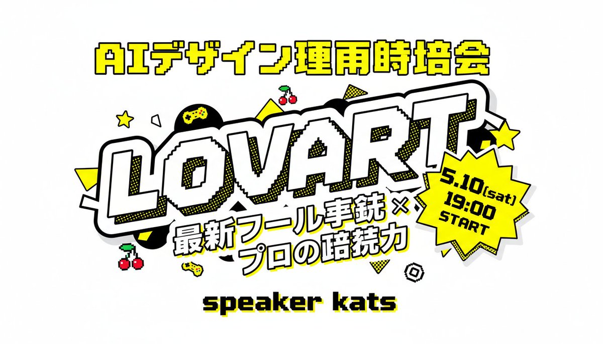
Full Prompt
A bold Japanese event thumbnail poster on a light gray background in a retro arcade pop-art style. Center the composition around a huge diagonal wordmark reading “LOVART” in oversized white block letters with thick black outline, chunky 3D feel, subtle pixel-stepped inner edges, and yellow halftone shadow accents. Above it, place one line of large Japanese header text in bright yellow with black outline: “AIデザイン運用時培会”. Below the main wordmark, add a two-line Japanese subtitle in heavy white lettering with black outline and slight tilt: “最新ツール実銃 ×” on the first line and “プロの暗続力” on the second line. At the lower center, place a pixel-style black text label with a yellow drop shadow reading “speaker kats”. On the right side overlapping the main logo, add a bright yellow jagged starburst badge with thick black outline containing 3 stacked lines of black text: “5.10(sat)”, “19:00”, “START”. Decorate the layout with exactly 12 playful gaming-style accent icons and shapes scattered around the logo: 2 yellow five-point stars, 2 pairs of red cherries with green stems, 2 small yellow game controllers, 1 black circle with a yellow gamepad symbol inside, 2 solid yellow triangles, 1 yellow dotted triangle, 1 white outlined polygon, and 1 small black-and-white spiral square. Use a high-contrast palette of yellow, black, white, and light gray, with thick outlines, sticker-like layering, comic halftone dots, and crisp readable Japanese typography.