Case Media
Case Notes
This page keeps the media, full prompt, and original source together so you can inspect the result first and decide whether the prompt is worth copying, saving, or comparing.
Case Insights
To make this page easier to search, cite, and reuse later, the case is also broken down into practical guidance about usage, visual cues, and prompt structure.
Best Fit Scenarios
- Use this as a character design benchmark when you need a fast style baseline before rewriting your own prompt.
- It is especially helpful if your target overlaps with Illustration, Character, City Visual and you want to judge the image result before tuning wording.
- Keep it as a control sample when you compare nearby prompt variants one variable at a time.
Visual Signals To Notice
- The clearest style signals here are Illustration, Character, City Visual, so those should usually stay in your first rewrite.
- Look at silhouette, costume language, mood styling, and whether the character reads clearly at a glance.
- This case keeps 2 media outputs, which makes it easier to check whether the style remains stable across multiple results.
How The Prompt Is Structured
- The prompt reads as a long, highly specified prompt, which is useful when you want to judge how much specificity this direction needs.
- Its keyword cluster is centered on Illustration, Character, City Visual, so you can usually keep that cluster while swapping subject, camera, layout, or copy details.
- A practical rewrite path is: keep the outcome, keep the strongest style cues, then replace only the subject and environment blocks.
Good Follow-up Questions
- What changes first if you keep Illustration, Character, City Visual but switch the subject matter?
- Which part of the result comes from section-level structure (Character Design) versus tag-level style cues?
- Which related cases in the same section give you a cleaner or more extreme variation of the same direction?
Full Prompt
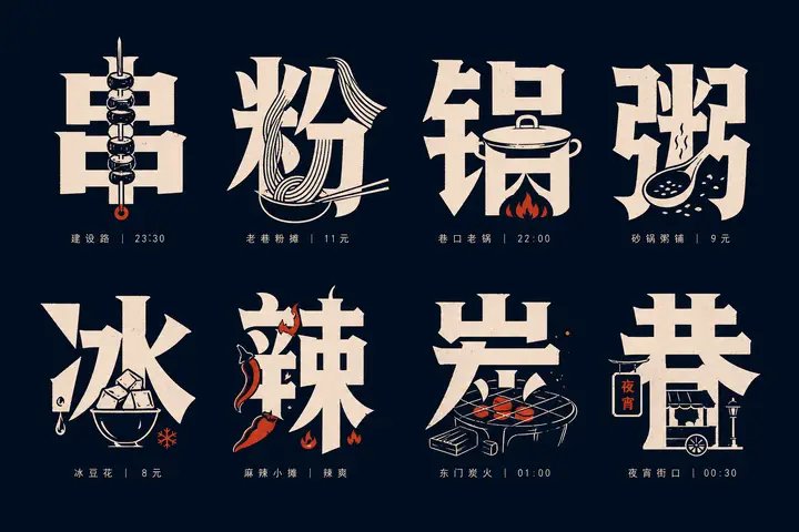
Generate a set of text-graphic integrated glyph icon systems based on any theme: each unit features a large-scale Chinese core character as the main visual. The glyphs maintain readability, weight, hard edges, with a slight sense of manual cutting. Key shapes derived from the theme are embedded inside strokes, replace partial strokes, or are hidden in negative space gaps, allowing the viewer to read the character first and then discover the object within the character, forming a moment where "character meaning and graphic complement each other." The overall layout uses a neat matrix arrangement with stable spacing between units. Beneath each character, tiny auxiliary text is configured, serving only indexing and rhythmic functions; the font weight is light, spacing is tight, alignment is restrained, and it does not compete with the main character. The graphic language consists of high-contrast silhouettes, simplified line engraving, partial line drawing, and solid block surfaces. Embedded objects must fit the stroke flow, appearing both as illustrations and as part of the character, avoiding an independent sticker feel; the complexity of each unit is similar, but the embedding methods must vary, creating a collection-album style of information density and recognition fun. Colors are extracted from the theme's own materials, emotions, and cultural signals, mapped only as character relationships: a large-area, low-brightness pure background provides support, high-brightness main information colors are responsible for glyph and graphic identification, and a small amount of theme accent colors are used only for key details or rhythmic points; maintain clear color scales, clean boundaries, controlled saturation, and calm, precise emotions. Even if the theme requires dark or vivid colors, maintain optical cleanliness, sharp edges, and background transparency, avoiding dirty grays, aging effects, smoke, or mud-colored overlays. The finished product should look like a systematically designed set of themed typeface specimens, combining text readability, graphic memory points, and a compact, orderly layout rhythm. —————— Target: Vertical 3:4, a "Rainy Day Commute Tips" for property or company groups, main characters can be "伞 (Umbrella), 滑 (Slippery), 迟 (Late), 鞋 (Shoes), 车 (Vehicle), 门 (Door)".