Case Media
Case Notes
This page keeps the media, full prompt, and original source together so you can inspect the result first and decide whether the prompt is worth copying, saving, or comparing.
Case Insights
To make this page easier to search, cite, and reuse later, the case is also broken down into practical guidance about usage, visual cues, and prompt structure.
Best Fit Scenarios
- Use this as a character design benchmark when you need a fast style baseline before rewriting your own prompt.
- It is especially helpful if your target overlaps with Cinematic, Fashion, Poster and you want to judge the image result before tuning wording.
- Keep it as a control sample when you compare nearby prompt variants one variable at a time.
Visual Signals To Notice
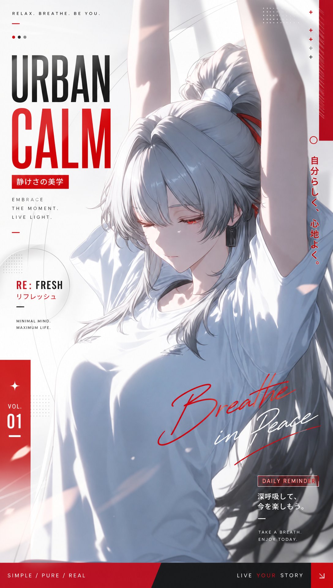
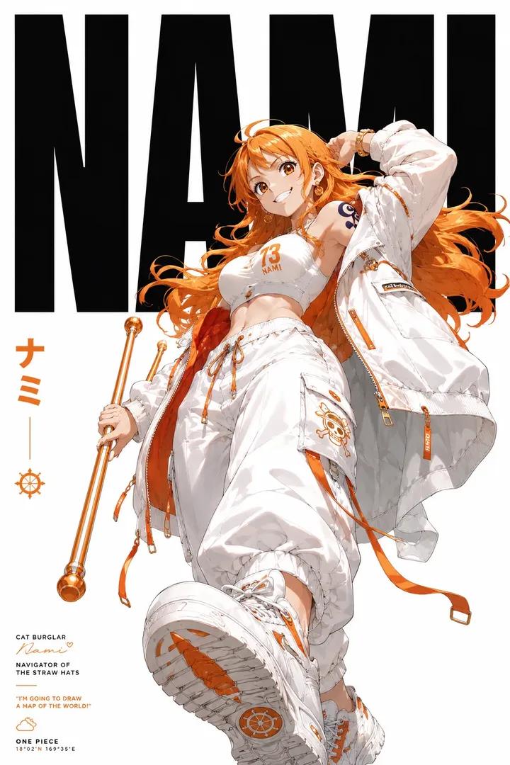
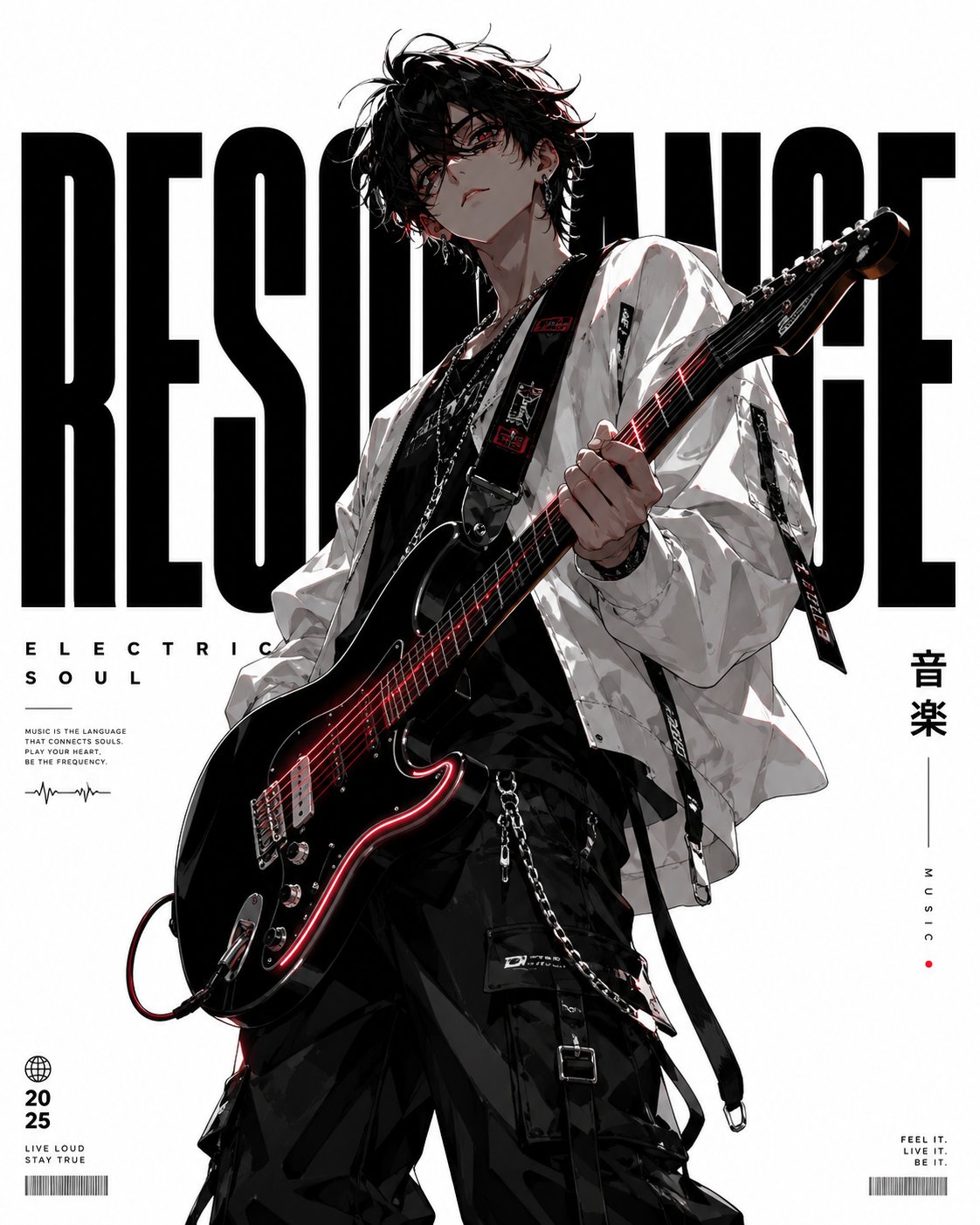
- The clearest style signals here are Cinematic, Fashion, Poster, so those should usually stay in your first rewrite.
- Look at silhouette, costume language, mood styling, and whether the character reads clearly at a glance.
- This case keeps 2 media outputs, which makes it easier to check whether the style remains stable across multiple results.
How The Prompt Is Structured
- The prompt reads as a long, highly specified prompt, which is useful when you want to judge how much specificity this direction needs.
- Its keyword cluster is centered on Cinematic, Fashion, Poster, so you can usually keep that cluster while swapping subject, camera, layout, or copy details.
- A practical rewrite path is: keep the outcome, keep the strongest style cues, then replace only the subject and environment blocks.
Good Follow-up Questions
- What changes first if you keep Cinematic, Fashion, Poster but switch the subject matter?
- Which part of the result comes from section-level structure (Character Design) versus tag-level style cues?
- Which related cases in the same section give you a cleaner or more extreme variation of the same direction?
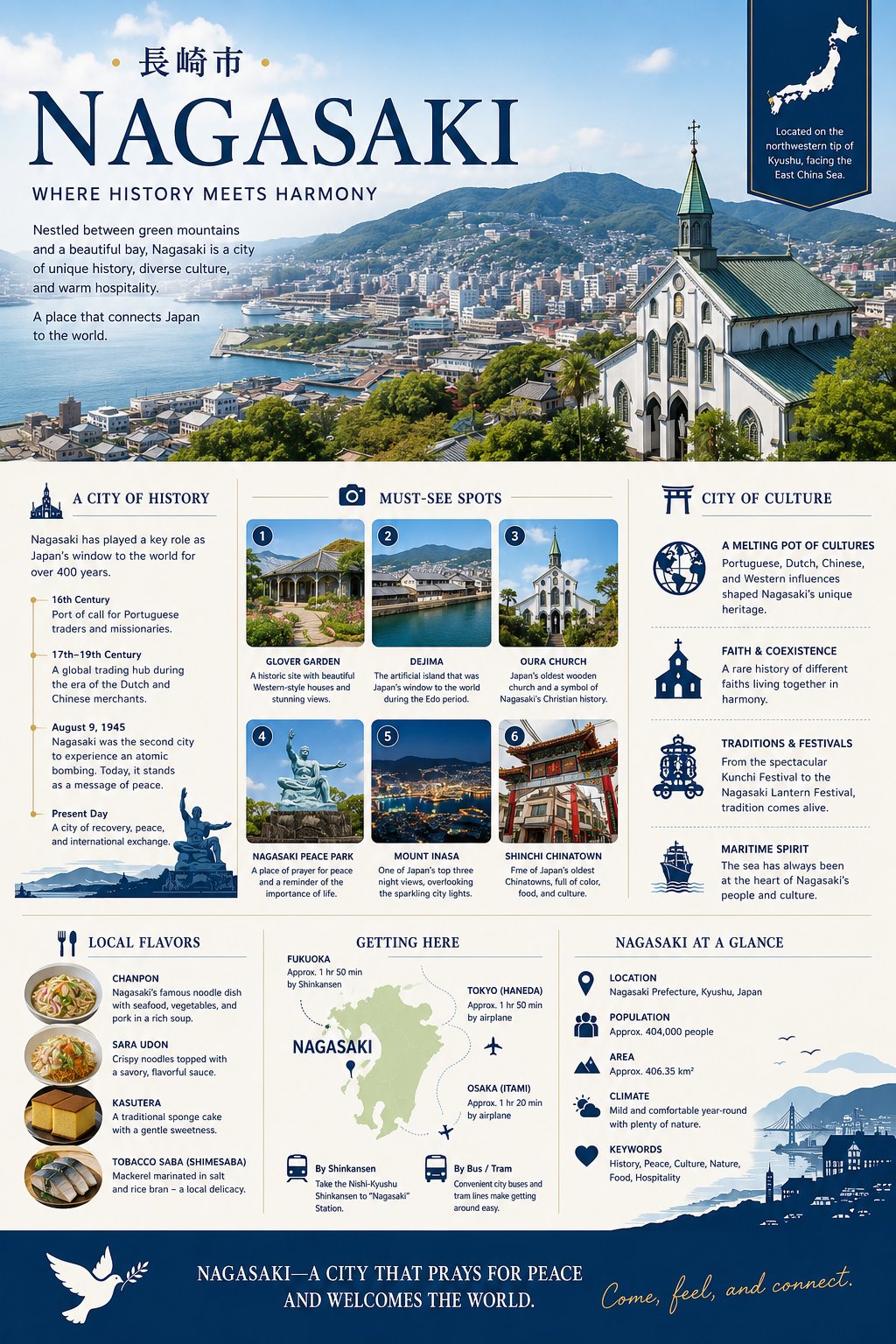
Full Prompt
A highly detailed Japanese tourism infographic poster for the city of Nagasaki in elegant modern editorial design style. Vertical A4 travel brochure layout with a sophisticated navy blue and cream color palette, combining cinematic photography, clean typography, icons, maps, and structured magazine-style sections. Top hero section features a breathtaking panoramic aerial view of Nagasaki harbor surrounded by lush green mountains under a bright blue sky with soft clouds. In the foreground stands a beautiful historic white church with a green copper roof overlooking the city. Large elegant serif typography reads “NAGASAKI” with Japanese characters above it and the tagline “WHERE HISTORY MEETS HARMONY.” Professional tourism-board aesthetic with luxury travel magazine quality. The infographic is divided into multiple clean sections with thin divider lines and balanced spacing: • “A CITY OF HISTORY” timeline section with historical milestones, illustrated icons, and short descriptive text blocks. • “MUST-SEE SPOTS” grid containing six rounded-corner travel photos with numbered labels and captions featuring scenic gardens, harbor views, churches, peace statues, mountain night views, and Chinatown streets. • “CITY OF CULTURE” section with elegant blue line-art icons and cultural descriptions about multicultural heritage, festivals, coexistence, and maritime traditions. • “LOCAL FLAVORS” section displaying close-up food photography in circular frames featuring noodle dishes, sponge cake, and seafood delicacies with short descriptions. • “GETTING HERE” section with a soft green illustrated regional map of Kyushu and airplane/train transport icons connected with dotted route lines. • “NAGASAKI AT A GLANCE” section with minimal infographic icons showing location, population, climate, and keywords. Bottom footer section uses a dark navy banner with a white dove illustration and inspirational tourism slogan in elegant typography. Design style blends Japanese tourism advertising, premium infographic aesthetics, editorial travel magazine layout, clean vector icons, soft shadows, subtle gradients, precise alignment, and ultra-high-resolution print-ready composition.