Case Media
Case Notes
This page keeps the media, full prompt, and original source together so you can inspect the result first and decide whether the prompt is worth copying, saving, or comparing.
Case Insights
To make this page easier to search, cite, and reuse later, the case is also broken down into practical guidance about usage, visual cues, and prompt structure.
Best Fit Scenarios
- Use this as a character design benchmark when you need a fast style baseline before rewriting your own prompt.
- It is especially helpful if your target overlaps with Neon, Cinematic, Fashion and you want to judge the image result before tuning wording.
- Keep it as a control sample when you compare nearby prompt variants one variable at a time.
Visual Signals To Notice
- The clearest style signals here are Neon, Cinematic, Fashion, so those should usually stay in your first rewrite.
- Look at silhouette, costume language, mood styling, and whether the character reads clearly at a glance.
- This case keeps one primary output, so the first image should be treated as the main visual reference.
How The Prompt Is Structured
- The prompt reads as a medium-detail prompt with clear visual constraints, which is useful when you want to judge how much specificity this direction needs.
- Its keyword cluster is centered on Neon, Cinematic, Fashion, so you can usually keep that cluster while swapping subject, camera, layout, or copy details.
- A practical rewrite path is: keep the outcome, keep the strongest style cues, then replace only the subject and environment blocks.
Good Follow-up Questions
- What changes first if you keep Neon, Cinematic, Fashion but switch the subject matter?
- Which part of the result comes from section-level structure (Character Design) versus tag-level style cues?
- Which related cases in the same section give you a cleaner or more extreme variation of the same direction?
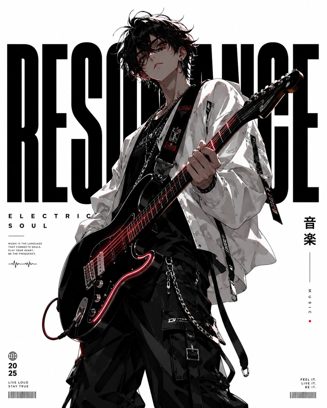
Full Prompt
A minimalist high-end graphic design anime poster featuring a stylish young guitarist with messy black hair and sharp eyes. The background is a crisp, solid stark white with dramatic negative space and premium editorial aesthetics. The character wears an oversized white bomber jacket, layered silver chains, and black cargo pants, posing confidently with an electric guitar. Low-angle perspective. Bold typography includes the word RESONANCE in large sans-serif and ELECTRIC SOUL in elegant font, with vertical Japanese text 音楽. Color palette: pure white, matte black, soft gray, with neon electric blue and crimson red accents. Clean vector-style anime illustration, sharp linework, cel shading, luxury poster composition, cinematic lighting, 8k resolution.