Case Media
Case Notes
This page keeps the media, full prompt, and original source together so you can inspect the result first and decide whether the prompt is worth copying, saving, or comparing.
Case Insights
To make this page easier to search, cite, and reuse later, the case is also broken down into practical guidance about usage, visual cues, and prompt structure.
Best Fit Scenarios
- Use this as a character design benchmark when you need a fast style baseline before rewriting your own prompt.
- It is especially helpful if your target overlaps with 35mm, Poster, Illustration and you want to judge the image result before tuning wording.
- Keep it as a control sample when you compare nearby prompt variants one variable at a time.
Visual Signals To Notice
- The clearest style signals here are 35mm, Poster, Illustration, so those should usually stay in your first rewrite.
- Look at silhouette, costume language, mood styling, and whether the character reads clearly at a glance.
- This case keeps 2 media outputs, which makes it easier to check whether the style remains stable across multiple results.
How The Prompt Is Structured
- The prompt reads as a long, highly specified prompt, which is useful when you want to judge how much specificity this direction needs.
- Its keyword cluster is centered on 35mm, Poster, Illustration, so you can usually keep that cluster while swapping subject, camera, layout, or copy details.
- A practical rewrite path is: keep the outcome, keep the strongest style cues, then replace only the subject and environment blocks.
Good Follow-up Questions
- What changes first if you keep 35mm, Poster, Illustration but switch the subject matter?
- Which part of the result comes from section-level structure (Character Design) versus tag-level style cues?
- Which related cases in the same section give you a cleaner or more extreme variation of the same direction?
Full Prompt
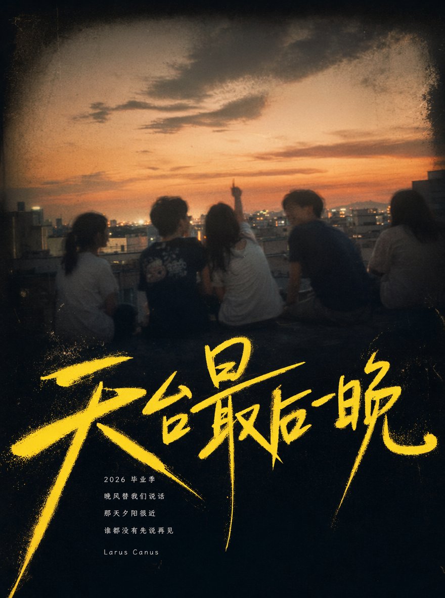
[Main Title]: Fill in a graduation season handwritten main title, for example: Last Night on the Rooftop / Wind Passing the Playground / Light in the Empty Classroom / Leaving Names by the Seaside [Photo Scene]: Fill in a youth memory scene, for example: Campus Rooftop at Dusk / Evening Playground / Empty Classroom After School / Farewell at School Gate / Seaside Sunset / Street Corner After Evening Study [Background Color]: Deep Black / Deep Blue-Gray / Deep Dark Green / Deep Sea Blue-Gray [Title Color]: Fluorescent Yellow / Light Blue-White / Purple-Pink / Magenta / Warm White [Lyrics Phrases]: Fill in 2–4 lines of original youth-feeling short phrases [Signature]: Fill in your signature, for example: Larus Canus [Ratio]: Vertical 3:4 Generate a vertical 3:4 「Graduation Season Handwritten」 youth memory poster. The overall layout adopts a "title-dominant graduation memory poster" format, do not scatter small text in the four corners, do not place information in the top-left, top-right, bottom-left, or bottom-right. The core of the image is: a large area of blurred youth photos + extra large handwritten title + small lyrics information area below the title. The background uses a dark gradient of the [Background Color], and the overall texture has the quality of an old photo album, a youth playlist cover, a graduation commemorative book, and a retro film poster. Place a large area of blurred youth photos from the middle-upper part to the middle, occupying about 55%–65% of the screen. The photo content is [Photo Scene], and the image should have a sense of graduation season, campus, summer, dusk, evening breeze, friends, farewell, and nostalgia. Figures can be back views, running, chatting, looking back, watching the sunset, walking across the playground, standing by the window, or looking into the distance; the faces of the figures do not need to be clear. The photo texture should be like low-resolution CCD, old phone photos, or retro film photos, retaining soft focus, motion blur, film grain, vignetting, slight fading, and a sense of time afterimages. The edges of the photo should be slightly softened and dissolved, naturally blending into the dark background, not like a hard rectangular frame. Superimpose an extra-large Chinese handwritten title in the lower-middle part of the image: [Main Title]. The title must be the first visual focus of the entire image, using a rough, free, messy, and speedy Chinese handwritten brush font, in the color [Title Color]. The strokes should have dry brush texture, frayed edges, "flying white" effects, thickness variations, pressure marks, and elongated endings; it should not look like a standard computer font and should not be too neat. Part of the title overlaps the lower edge of the photo, and part extends into the dark background, forming a strong visual impact. Auxiliary text is concentrated below the main title, forming a small "lyrics information area," do not scatter it in the four corners. The information area uses extremely small white or light gray-white thin characters, being restrained, low-key, and having a sense of breathing. Content includes: 2026 Graduation Season [Lyrics Phrases] [Signature] Overall style: Youth playlist cover, graduation season poster, low-resolution film photo, handwritten font experiment, old album memory, campus memories, summer farewell feeling. The image should have emotion, a sense of air, and nostalgia, but not a commercial template feel. Avoid: Four corners filled with text, QR codes, obvious commercial logos, high-definition studio shots, overly clear faces, cartoon illustration style, travel promotional poster feel, regular printed fonts, template website style, or an overly refined advertising feel.