Case Media
Case Notes
This page keeps the media, full prompt, and original source together so you can inspect the result first and decide whether the prompt is worth copying, saving, or comparing.
Case Insights
To make this page easier to search, cite, and reuse later, the case is also broken down into practical guidance about usage, visual cues, and prompt structure.
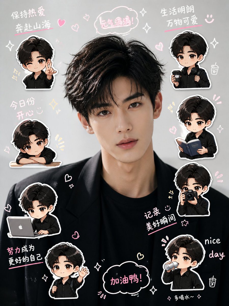
Best Fit Scenarios
- Use this as a character design benchmark when you need a fast style baseline before rewriting your own prompt.
- It is especially helpful if your target overlaps with Poster, Character, Typography and you want to judge the image result before tuning wording.
- Keep it as a control sample when you compare nearby prompt variants one variable at a time.
Visual Signals To Notice
- The clearest style signals here are Poster, Character, Typography, so those should usually stay in your first rewrite.
- Look at silhouette, costume language, mood styling, and whether the character reads clearly at a glance.
- This case keeps one primary output, so the first image should be treated as the main visual reference.
How The Prompt Is Structured
- The prompt reads as a long, highly specified prompt, which is useful when you want to judge how much specificity this direction needs.
- Its keyword cluster is centered on Poster, Character, Typography, so you can usually keep that cluster while swapping subject, camera, layout, or copy details.
- A practical rewrite path is: keep the outcome, keep the strongest style cues, then replace only the subject and environment blocks.
Good Follow-up Questions
- What changes first if you keep Poster, Character, Typography but switch the subject matter?
- Which part of the result comes from section-level structure (Character Design) versus tag-level style cues?
- Which related cases in the same section give you a cleaner or more extreme variation of the same direction?
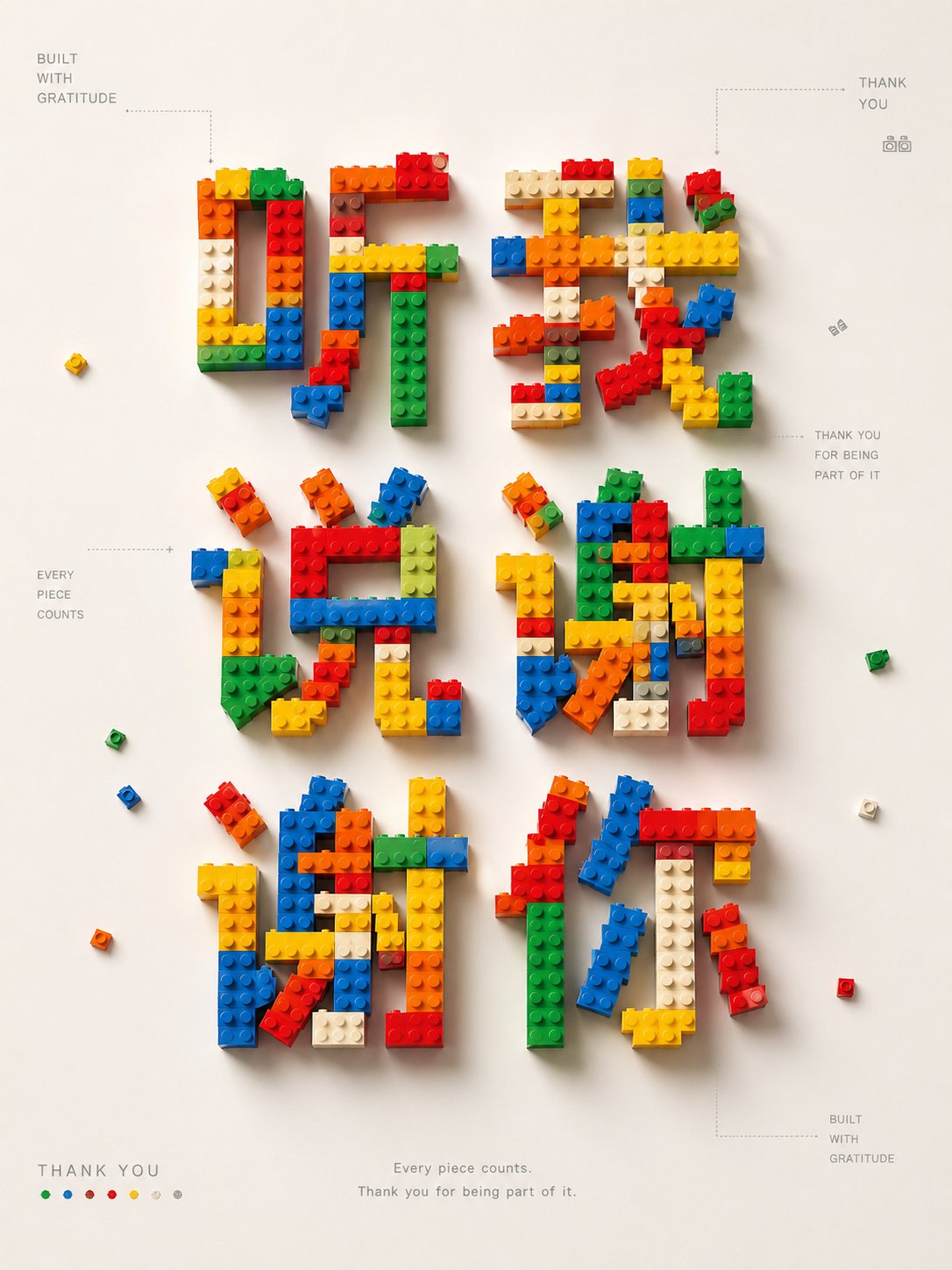
Full Prompt
Generate a high-completion "LEGO-style font concept poster". Core task: Based on the [Theme/Text] input by the user, design an original "LEGO brick-style font" and turn the theme into a poster with clear conceptual logic. Image requirements: - With the theme text as the core, use brick particles, studs, and assembly modules to form the main title - Do not use any official LEGO logos or brand elements, only create a "brick style" - The font should look like it is assembled from real plastic bricks: modular, geometric, clear thickness, with studs and shadows - Automatically generate a core visual metaphor based on the theme's meaning - The image should simultaneously display: main title, conceptual graphic, font system, module structure, partial samples - Can include small glyph samples, assembly steps, module descriptions, color legends, thin line annotations - The overall look should be like a design exhibition poster / font research poster / concept board, rather than a children's toy advertisement Visual style: High-end, clean, lots of white space, grid layout, infographic logic, modern design sense. Background mainly in off-white, light gray, warm white. Main colors automatically selected based on the theme, can use brick colors like red, yellow, blue, green, black, etc. Soft lighting, realistic plastic texture, clean shadows, exquisite details. Composition: Automatically choose horizontal or vertical format based on the theme. The main title must be eye-catching, occupying the visual center of the image. Conceptual graphics and fonts echo each other. Display font samples and module system at the bottom or side. Overall layout is clear, orderly, with a collectible poster feel. Text processing: If the theme is in Chinese, key characters can be made in brick font, and the rest of the text can be supplemented with modern sans-serif. If the theme is long, automatically extract core keywords to highlight the parts with the most visual tension. Text in the poster should be small but precise, do not fill it up. [Theme] Input here: 旺铺出租 Aspect ratio 2:1