Case Media
Case Notes
This page keeps the media, full prompt, and original source together so you can inspect the result first and decide whether the prompt is worth copying, saving, or comparing.
Case Insights
To make this page easier to search, cite, and reuse later, the case is also broken down into practical guidance about usage, visual cues, and prompt structure.
Best Fit Scenarios
- Use this as a character design benchmark when you need a fast style baseline before rewriting your own prompt.
- It is especially helpful if your target overlaps with Poster, Illustration, Character and you want to judge the image result before tuning wording.
- Keep it as a control sample when you compare nearby prompt variants one variable at a time.
Visual Signals To Notice
- The clearest style signals here are Poster, Illustration, Character, so those should usually stay in your first rewrite.
- Look at silhouette, costume language, mood styling, and whether the character reads clearly at a glance.
- This case keeps one primary output, so the first image should be treated as the main visual reference.
How The Prompt Is Structured
- The prompt reads as a long, highly specified prompt, which is useful when you want to judge how much specificity this direction needs.
- Its keyword cluster is centered on Poster, Illustration, Character, so you can usually keep that cluster while swapping subject, camera, layout, or copy details.
- A practical rewrite path is: keep the outcome, keep the strongest style cues, then replace only the subject and environment blocks.
Good Follow-up Questions
- What changes first if you keep Poster, Illustration, Character but switch the subject matter?
- Which part of the result comes from section-level structure (Character Design) versus tag-level style cues?
- Which related cases in the same section give you a cleaner or more extreme variation of the same direction?
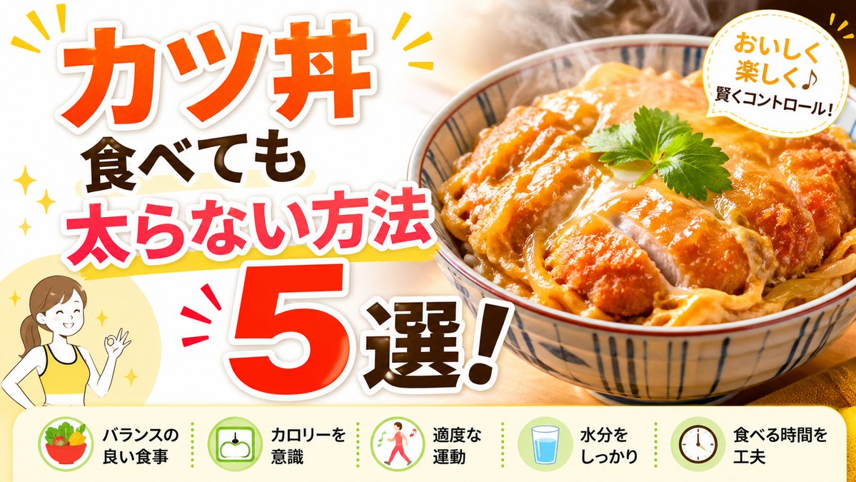
Full Prompt
Create a bright, high-impact Japanese YouTube thumbnail about diet-friendly eating, in a clean split composition. The left half is a white background filled with oversized bold Japanese headline text stacked vertically and diagonally for maximum readability: the top line says "カツ丼" in huge vivid orange with a thick white outline and soft drop shadow, below it "食べても" in dark brown, then "太らない方法" in hot pink with a white outline and a yellow underline swoosh, and at the bottom a gigantic red-orange "5" with white outline next to "選!" in dark brown with a white outline. Add small yellow sparkle accents and comic-style emphasis marks around the headline. In the lower left corner, place a simple flat illustration of 1 smiling woman from the waist up wearing a yellow tank top, brown hair tied back in a ponytail, making an OK hand gesture, set over a pale yellow circle. The right half shows a close-up, appetizing katsudon bowl photographed in warm light: 1 ceramic bowl with blue vertical stripe patterns, filled with sliced golden-brown breaded pork cutlet over egg and onion on rice, glossy sauce, visible steam rising, and 1 small green herb leaf garnish on top. In the upper right corner, add 1 white circular badge with a dotted yellow border containing the Japanese text "おいしく楽しく♪ 賢くコントロール!" in a friendly handwritten style, with yellow accent marks around the badge. Along the entire bottom, include a pale cream horizontal information strip with 5 circular icons and 5 labels separated evenly from left to right: 1 salad bowl icon with the text "バランスの良い食事", 1 scale icon with "カロリーを意識", 1 walking person icon with "適度な運動", 1 glass of water icon with "水分をしっかり", and 1 clock icon with "食べる時間を工夫". Use a glossy commercial thumbnail aesthetic, warm food photography, thick outlined typography, cheerful health-themed colors, and strong contrast optimized for social media click-through.