Case Media

Case Notes
This page keeps the media, full prompt, and original source together so you can inspect the result first and decide whether the prompt is worth copying, saving, or comparing.
Case Insights
To make this page easier to search, cite, and reuse later, the case is also broken down into practical guidance about usage, visual cues, and prompt structure.
Best Fit Scenarios
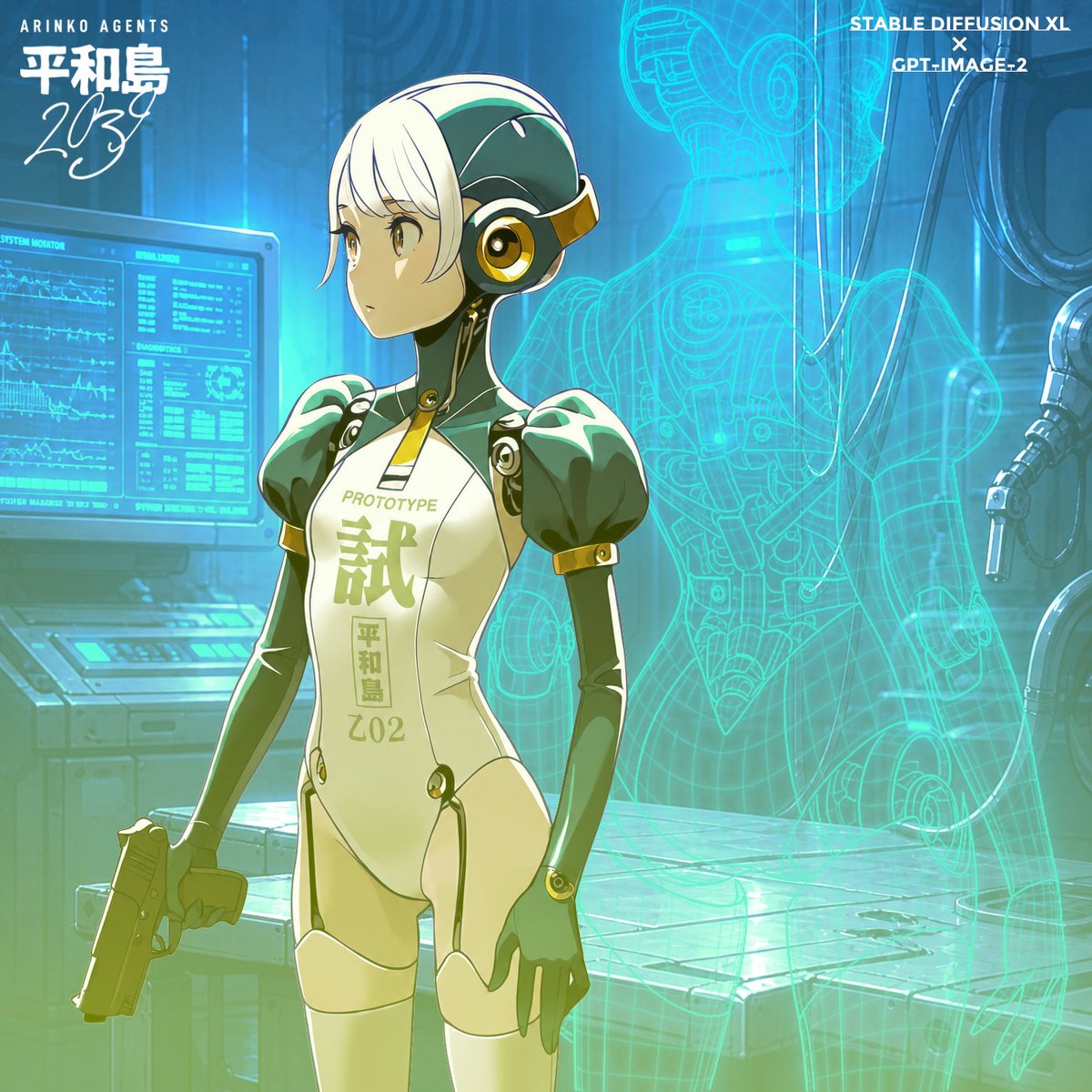
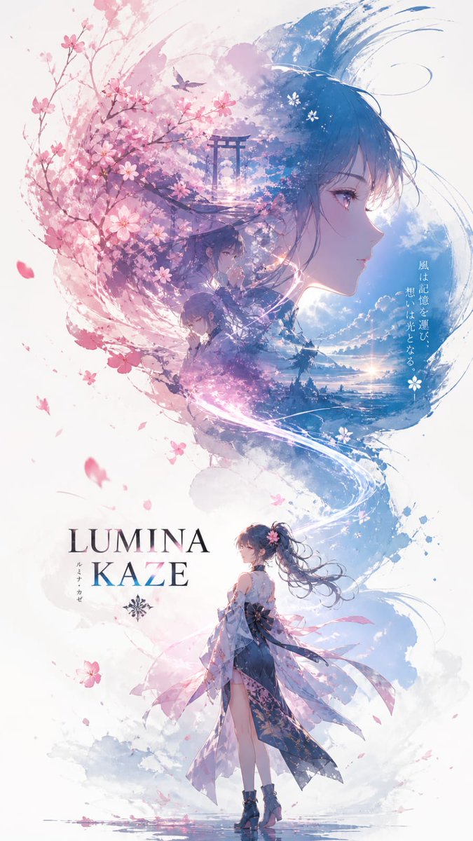
- Use this as a character design benchmark when you need a fast style baseline before rewriting your own prompt.
- It is especially helpful if your target overlaps with Cinematic, Poster, Character and you want to judge the image result before tuning wording.
- Keep it as a control sample when you compare nearby prompt variants one variable at a time.
Visual Signals To Notice
- The clearest style signals here are Cinematic, Poster, Character, so those should usually stay in your first rewrite.
- Look at silhouette, costume language, mood styling, and whether the character reads clearly at a glance.
- This case keeps one primary output, so the first image should be treated as the main visual reference.
How The Prompt Is Structured
- The prompt reads as a long, highly specified prompt, which is useful when you want to judge how much specificity this direction needs.
- Its keyword cluster is centered on Cinematic, Poster, Character, so you can usually keep that cluster while swapping subject, camera, layout, or copy details.
- A practical rewrite path is: keep the outcome, keep the strongest style cues, then replace only the subject and environment blocks.
Good Follow-up Questions
- What changes first if you keep Cinematic, Poster, Character but switch the subject matter?
- Which part of the result comes from section-level structure (Character Design) versus tag-level style cues?
- Which related cases in the same section give you a cleaner or more extreme variation of the same direction?
Full Prompt
A cinematic character promotional poster of [SUBJECT], vertical composition (9:16), designed with a refined East-Asian ink aesthetic and high-end visual storytelling. STRUCTURE: Top-heavy hierarchical layout. The upper half features a large, highly recognizable silhouette of [SUBJECT]'s head / face / mask / upper body, forming a bold, iconic primary shape. The silhouette should be instantly identifiable. The middle-lower section contains the full-body version of [SUBJECT] as a secondary subject, standing in a stable pose or subtle action stance, forming the visual core. COMPOSITION STYLE: Inside the large silhouette and around the character, use double exposure and collage storytelling. Integrate multiple elements: - key scenes related to [SUBJECT] - symbolic imagery and environment - small narrative figures and interactions - supporting visual motifs Blend everything seamlessly using clouds, mist, ink diffusion, and negative space. VISUAL FLOW: Create a continuous flowing visual path from top to bottom, connecting: - upper silhouette - inner collage elements - full-body subject Ensure smooth eye guidance and compositional cohesion. SIDE ELEMENTS: Add balanced supporting elements on left and right sides to create tension, depth, and spatial variation. STYLE & ATMOSPHERE: - Large areas of negative space - Ink-wash diffusion edges, soft fading, subtle fragmentation - Eastern aesthetic: balance of emptiness and detail - Calm, premium, restrained, cinematic tone QUALITY: Ultra-detailed, high resolution, layered depth, soft lighting, atmospheric perspective, cohesive series-style design. OUTPUT: 9:16 aspect ratio, poster-ready composition.