Case Media
Case Notes
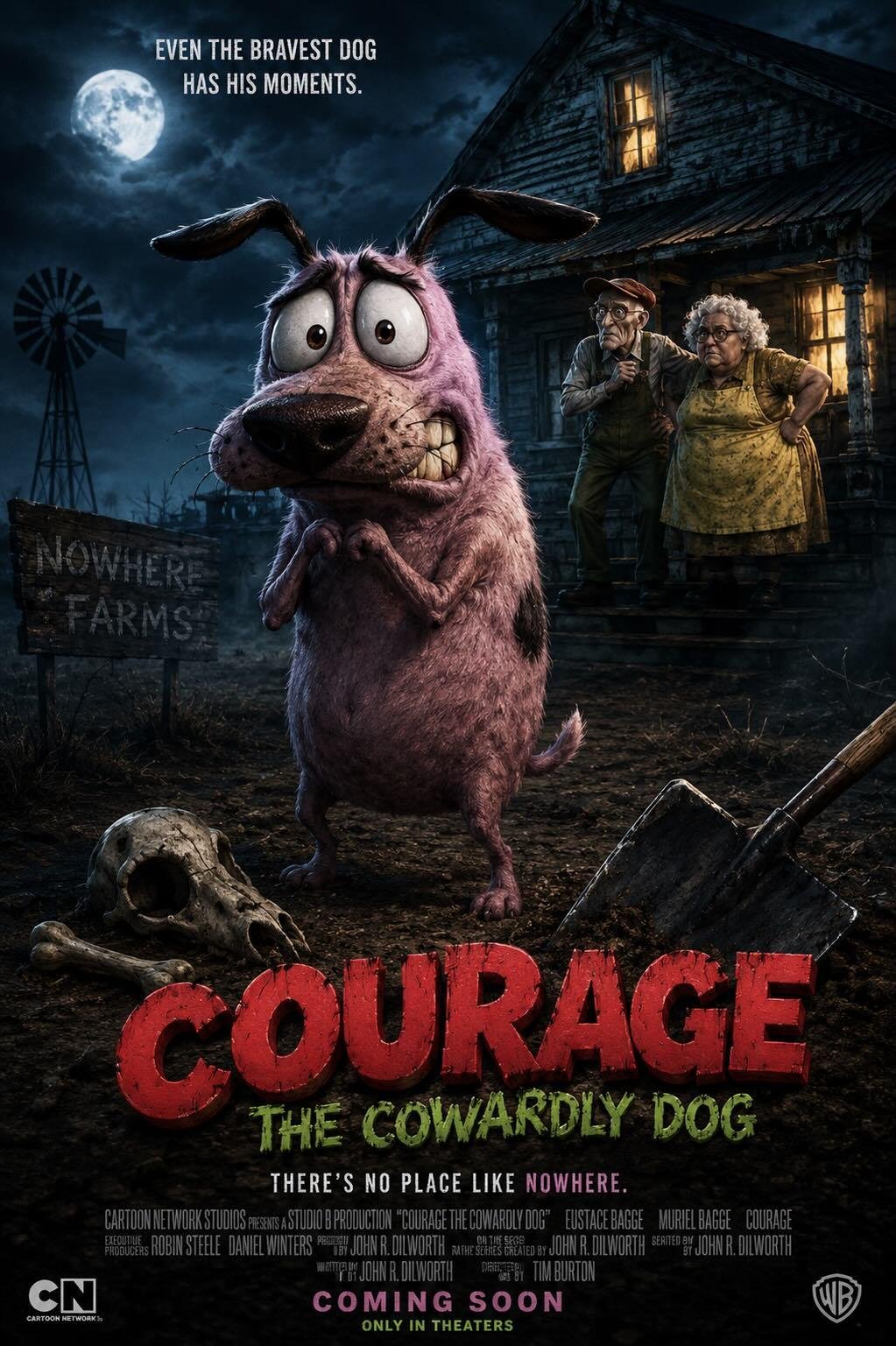
This page keeps the media, full prompt, and original source together so you can inspect the result first and decide whether the prompt is worth copying, saving, or comparing.
Case Insights
To make this page easier to search, cite, and reuse later, the case is also broken down into practical guidance about usage, visual cues, and prompt structure.
Best Fit Scenarios
- Use this as a character design benchmark when you need a fast style baseline before rewriting your own prompt.
- It is especially helpful if your target overlaps with 35mm, Portrait, Cinematic and you want to judge the image result before tuning wording.
- Keep it as a control sample when you compare nearby prompt variants one variable at a time.
Visual Signals To Notice
- The clearest style signals here are 35mm, Portrait, Cinematic, so those should usually stay in your first rewrite.
- Look at silhouette, costume language, mood styling, and whether the character reads clearly at a glance.
- This case keeps 2 media outputs, which makes it easier to check whether the style remains stable across multiple results.
How The Prompt Is Structured
- The prompt reads as a long, highly specified prompt, which is useful when you want to judge how much specificity this direction needs.
- Its keyword cluster is centered on 35mm, Portrait, Cinematic, so you can usually keep that cluster while swapping subject, camera, layout, or copy details.
- A practical rewrite path is: keep the outcome, keep the strongest style cues, then replace only the subject and environment blocks.
Good Follow-up Questions
- What changes first if you keep 35mm, Portrait, Cinematic but switch the subject matter?
- Which part of the result comes from section-level structure (Character Design) versus tag-level style cues?
- Which related cases in the same section give you a cleaner or more extreme variation of the same direction?
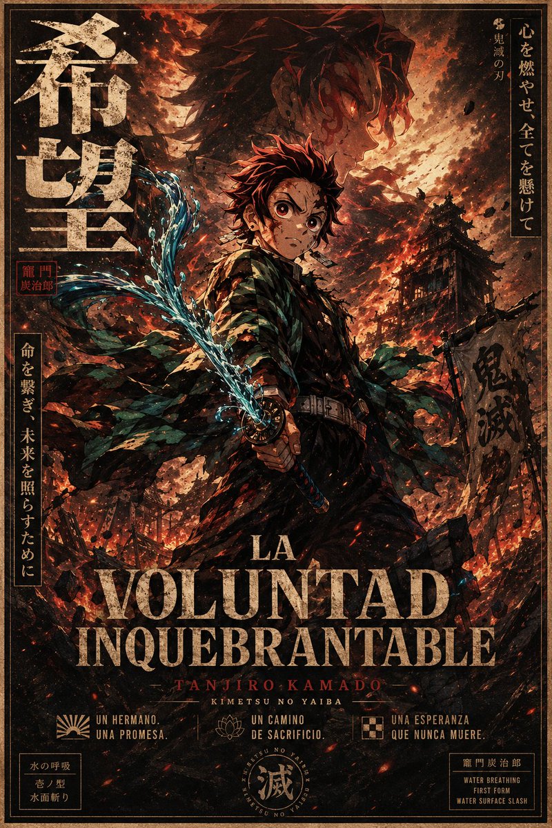
Full Prompt
Goal: Create a gritty vertical anime movie poster for {argument name="character name" default="Tanjiro Kamado"}, inspired by dark shonen fantasy and Demon Slayer aesthetics, with a ruined battlefield atmosphere, dramatic flames, water breathing effects, and distressed vintage typography. Canvas: Tall poster, 2:3 aspect ratio, full bleed, with a thin double-line tan border and aged paper texture. Use a high-detail painterly manga style with rough ink lines, film grain, soot, scratches, ember particles, and warm orange-black contrast. Main subject: Center a teenage swordsman in a dark uniform and green-black checkered haori, standing in a powerful three-quarter pose. He has spiky burgundy-black hair, hanafuda-style earrings, and an intense heroic silhouette. His face area is covered by a plain medium-brown rectangular censor block, while the hair, ears, neck, and body remain visible. He grips a katana with both hands near his waist, angled diagonally upward to the left. The blade is wrapped in bright turquoise-blue water energy, with one distinct curling water slash sweeping from the lower center toward the upper left. The haori should look torn and windblown, with many ragged pieces flowing outward. Background: A burning demon-slaying battlefield at night. Show a large ghostly profile portrait of the same swordsman in the smoky sky behind him, facing right, with glowing reddish highlights. Include one ruined Japanese pagoda/building on the right midground, one tattered vertical banner on the right with dark calligraphy, collapsing wooden structures and rubble along the bottom, flying ash, black debris, sparks, and red-orange fire clouds. The overall mood is apocalyptic, heroic, and tragic. Typography and layout: Make the design look like a Japanese theatrical poster mixed with a Spanish title treatment. Include exactly these visible text groups: 1. Large vertical Japanese title on the upper left: 「希望」, distressed cream ink. 2. Small red seal stamp beside the left title with Japanese characters resembling 「竈門 炭治郎」. 3. Vertical Japanese text box on the upper right: 「心を燃やせ 全てを懸けて」 with a smaller line 「鬼滅の刃」. 4. Vertical Japanese text box on the lower left: 「命を繋ぎ、未来を照らすために」. 5. Dark calligraphy on the right banner: 「鬼滅」. 6. Main Spanish title across the lower third, huge distressed serif capitals: {argument name="main title" default="LA VOLUNTAD INQUEBRANTABLE"}. Put “LA” smaller above “VOLUNTAD”, and “INQUEBRANTABLE” below. 7. Red small-credit line under the title: {argument name="credit name" default="TANJIRO KAMADO"}. 8. Small white subtitle under that: {argument name="series subtitle" default="KIMETSU NO YAIBA"}. 9. Bottom row contains exactly three icon-caption blocks: left sunburst icon with “UN HERMANO. UNA PROMESA.”, center lotus icon with “UN CAMINO DE SACRIFICIO.”, right checker-square icon with “UNA ESPERANZA QUE NUNCA MUERE.” 10. Bottom-left small boxed technique label with Japanese text and English meaning: 「水の呼吸 / 壱ノ型 / 水面斬り」. 11. Bottom-center circular seal emblem containing the large kanji 「滅」 and tiny ring text. 12. Bottom-right small boxed technique label: 「竈門炭治郎」 and “WATER BREATHING / FIRST FORM / WATER SURFACE SLASH”. Color and style: Use a limited palette of burnt orange, black, charcoal, muted cream, dark green, blood red, and electric cyan water highlights. Typography should be weathered, cracked, and partially eroded. Keep the composition dense and cinematic, with strong backlighting and high contrast. Constraints: No modern objects, no clean vector look, no extra characters, no extra icons beyond the three bottom icon-caption blocks, no additional title text beyond the listed groups, and keep all Japanese text decorative but legible where possible.