Case Media
Case Notes
This page keeps the media, full prompt, and original source together so you can inspect the result first and decide whether the prompt is worth copying, saving, or comparing.
Case Insights
To make this page easier to search, cite, and reuse later, the case is also broken down into practical guidance about usage, visual cues, and prompt structure.
Best Fit Scenarios
- Use this as a character design benchmark when you need a fast style baseline before rewriting your own prompt.
- It is especially helpful if your target overlaps with Neon, Portrait, Fashion and you want to judge the image result before tuning wording.
- Keep it as a control sample when you compare nearby prompt variants one variable at a time.
Visual Signals To Notice
- The clearest style signals here are Neon, Portrait, Fashion, so those should usually stay in your first rewrite.
- Look at silhouette, costume language, mood styling, and whether the character reads clearly at a glance.
- This case keeps 2 media outputs, which makes it easier to check whether the style remains stable across multiple results.
How The Prompt Is Structured
- The prompt reads as a long, highly specified prompt, which is useful when you want to judge how much specificity this direction needs.
- Its keyword cluster is centered on Neon, Portrait, Fashion, so you can usually keep that cluster while swapping subject, camera, layout, or copy details.
- A practical rewrite path is: keep the outcome, keep the strongest style cues, then replace only the subject and environment blocks.
Good Follow-up Questions
- What changes first if you keep Neon, Portrait, Fashion but switch the subject matter?
- Which part of the result comes from section-level structure (Character Design) versus tag-level style cues?
- Which related cases in the same section give you a cleaner or more extreme variation of the same direction?
Full Prompt
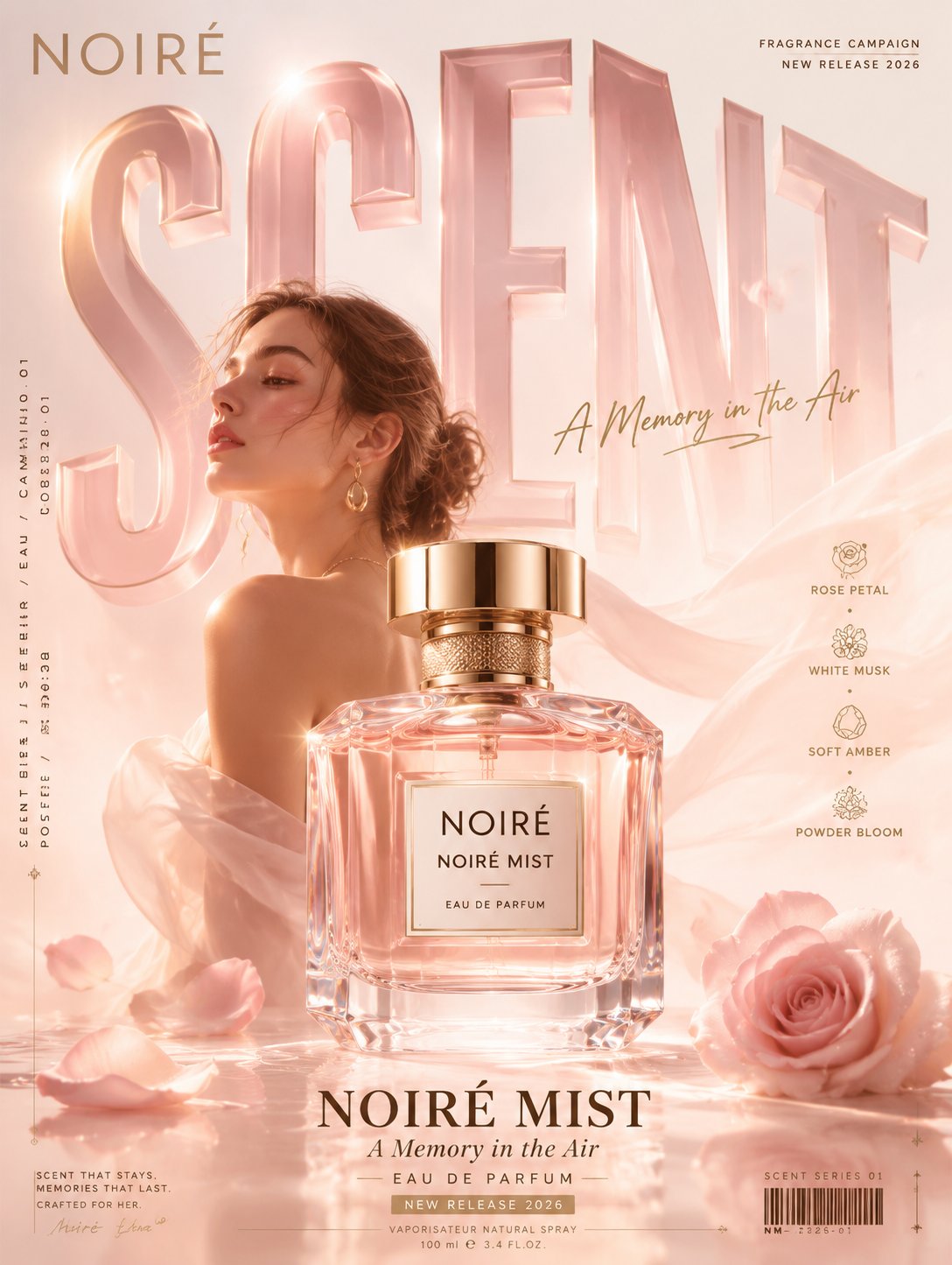
[Subject]: [Product Type] New Product Promotion Poster [Brand Name]: [Brand Name] [Product Name]: [Product Name] [Main Title Large Text]: [e.g., SCENT / TIME / SOUND / EXPLORE] [Subtitle]: [A short slogan] [Main Color Tone]: [Main Color + Secondary Color + Accent Color] [Person Type]: [Whether characters are needed / Male Model / Female Model / Outdoor Character / Trendy Character] [Scene Atmosphere]: [e.g., Scent Space / Time Tunnel / Sound Wave Track / Mountain Path Terrain] [Functional Selling Points]: [Selling Point 1], [Selling Point 2], [Selling Point 3], [Selling Point 4] [Aspect Ratio]: Portrait 3:4 Please generate a 3:4 portrait high-definition commercial advertising poster, a single image, no collages, no multi-grid layouts. This is a product promotion poster for an original fictional brand; do not include real brand logos. The overall style is "Product Promotion Mega Typography Perspective Poster." The image should look like a formally released Brand Campaign main visual, with a sense of commercial advertising, strong layout design, product launch feel, visual impact, and a complete information system. The core subject of the image is [Product Name]. The product must be clear, exquisite, and like a hero product in an advertisement, located in the foreground or slightly below the center of the image. The product material must be realistic, the structure complete, and details well-defined; it cannot be too small or blurred. Based on the product type, include appropriate characters or usage scenarios, such as female models, male models, trendy characters, outdoor characters, user actions, or emotional atmospheres. Characters must be realistic and natural with high-end poses to strengthen the brand temperament, but they must not steal the spotlight from the product subject. The main title [Main Title Large Text] must become the core visual skeleton of the image, using oversized bold sans-serif fonts, occupying the main space of the image. The text should not be a mere title but become the spatial structure of the scene, transforming into background walls, ground runways, roads, ramps, time tunnels, sound wave tracks, scent spaces, mountain terrains, perspective installations, or brand main symbols. The product, characters, and giant title must exist within the same spatial logic, forming real foreground-background relationships, occlusion, contact shadows, and perspective depth. The image must include a complete formal poster information system; it cannot be too empty or look like a simple stock image. Place the [Brand Name] in the top left corner and campaign text in the top right corner, such as NEW RELEASE / PRODUCT CAMPAIGN / SERIES 2026. Add vertical small text, product numbers, series numbers, or campaign numbers on the sides. Near the product, add 3-5 concise functional selling point labels, such as [Selling Point 1], [Selling Point 2], [Selling Point 3], [Selling Point 4]. At the bottom, set up a formal advertising information bar containing [Product Name], [Subtitle], release date, core parameters, small text credits, thin line dividers, and decorative barcodes or numbers. Small text can serve as design-oriented micro-typography; it is not required for every character to be perfectly readable, but the brand name, product name, and main title must be clear. The overall color scheme revolves around [Main Color Tone]. The background builds a corresponding atmosphere based on the theme, such as a minimalist fashion space, scent atomization space, metal mechanical space, music neon space, mountain outdoor space, snowy rock space, etc. Small amounts of light and shadow, mist, reflection, grain, wind sensation, atmospheric perspective, speed traces, or material refraction can be added to enhance the high-end feel, but avoid clutter and a cheap e-commerce feel. The image must be high-definition, sharp, with accurate perspective, realistic materials, and unified lighting. The overall look should be like a truly released Brand Campaign poster. Suitable for perfume, watches, headphones, digital products, outdoor clothing, sports brands, consumer brands, etc. Avoid: Collages, multi-image combinations, real brand logos, common stock photos, cheap e-commerce feel, cartoon style, cluttered background, product being too small, fake faces on characters, main title becoming a plain flat title, too few information areas.