Case Media
Case Notes
This page keeps the media, full prompt, and original source together so you can inspect the result first and decide whether the prompt is worth copying, saving, or comparing.
Case Insights
To make this page easier to search, cite, and reuse later, the case is also broken down into practical guidance about usage, visual cues, and prompt structure.
Best Fit Scenarios
- Use this as a character design benchmark when you need a fast style baseline before rewriting your own prompt.
- It is especially helpful if your target overlaps with Neon, Portrait, Fashion and you want to judge the image result before tuning wording.
- Keep it as a control sample when you compare nearby prompt variants one variable at a time.
Visual Signals To Notice
- The clearest style signals here are Neon, Portrait, Fashion, so those should usually stay in your first rewrite.
- Look at silhouette, costume language, mood styling, and whether the character reads clearly at a glance.
- This case keeps 2 media outputs, which makes it easier to check whether the style remains stable across multiple results.
How The Prompt Is Structured
- The prompt reads as a long, highly specified prompt, which is useful when you want to judge how much specificity this direction needs.
- Its keyword cluster is centered on Neon, Portrait, Fashion, so you can usually keep that cluster while swapping subject, camera, layout, or copy details.
- A practical rewrite path is: keep the outcome, keep the strongest style cues, then replace only the subject and environment blocks.
Good Follow-up Questions
- What changes first if you keep Neon, Portrait, Fashion but switch the subject matter?
- Which part of the result comes from section-level structure (Character Design) versus tag-level style cues?
- Which related cases in the same section give you a cleaner or more extreme variation of the same direction?
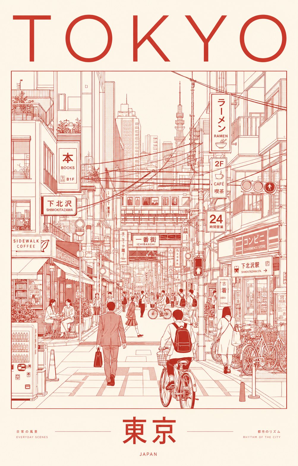
Full Prompt
Create an ultra-premium minimalist city portrait poster of TOKYO, capturing the quiet sophistication and organized chaos of everyday urban life through an architectural line-art illustration. Instead of highlighting famous landmarks, portray a lived-in neighborhood scene where daily routines define the city’s identity. Feature a dense yet elegant streetscape inspired by areas such as Shimokitazawa, Nakameguro, Kichijoji, Koenji, or a contemporary Tokyo side street filled with local character. SCENE The composition centers on a bustling pedestrian corridor lined with compact cafés, ramen counters, bookstores, convenience stores, bicycle parking, vending machines, rail infrastructure, utility poles, narrow storefronts, and layered Japanese signage. Residents naturally inhabit the scene: Office workers commuting Students crossing intersections Cyclists weaving through streets Café patrons sitting outdoors Shoppers carrying bags Locals waiting at crossings or transit stops The atmosphere should feel authentically Tokyo—efficient, stylish, human-scaled, and deeply urban. Large landmark structures may appear only as distant silhouettes integrated into the skyline, never as focal points. VISUAL STYLE Contemporary editorial illustration Precision architectural drawing Minimalist monoline artwork Swiss International Style poster design Japanese graphic design influence Museum-quality city branding aesthetic Clean vector rendering Geometric perspective construction Strong use of negative space Sophisticated visual hierarchy LINEWORK Extremely fine monoline strokes Technical illustration precision No sketchiness Dense urban detailing Organized rhythm of windows, cables, signs, bicycles, storefronts, railings, and street furniture Intricate composition that remains visually calm and readable COLOR CONCEPT Use a restrained two-color silkscreen system: One carefully selected ink color One contrasting paper/background color Choose colors that evoke Tokyo’s refined urban energy and contemporary design culture. Suggested palette: Deep vermilion ink on warm rice-paper ivory OR charcoal black ink on pale cream paper OR midnight indigo ink on soft off-white stock Avoid gradients, neon effects, multiple accent colors, or photographic lighting. TYPOGRAPHY Top: TOKYO Bottom: 東京 Typography should feel like a luxury design publication or cultural exhibition poster. Perfect kerning Clean editorial layout Modern sans-serif typography Authentic Japanese signage throughout the illustration No distorted or unreadable text MOOD Not a tourist destination. Not a postcard. A visual celebration of Tokyo’s everyday elegance, urban rhythm, design culture, and human-scale density. The poster should feel like it belongs in a contemporary art museum, premium travel journal, or international design exhibition. OUTPUT Vertical composition (4:5 or 2:3 ratio) Ultra-high-resolution 8K Print-ready poster design Crisp vector-quality rendering Exceptional detail retention Luxury city-brand campaign aesthetic