Case Media
Case Notes
This page keeps the media, full prompt, and original source together so you can inspect the result first and decide whether the prompt is worth copying, saving, or comparing.
Case Insights
To make this page easier to search, cite, and reuse later, the case is also broken down into practical guidance about usage, visual cues, and prompt structure.
Best Fit Scenarios
- Use this as a character design benchmark when you need a fast style baseline before rewriting your own prompt.
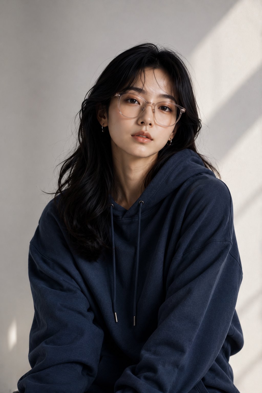
- It is especially helpful if your target overlaps with 35mm, Portrait, Fashion and you want to judge the image result before tuning wording.
- Keep it as a control sample when you compare nearby prompt variants one variable at a time.
Visual Signals To Notice
- The clearest style signals here are 35mm, Portrait, Fashion, so those should usually stay in your first rewrite.
- Look at silhouette, costume language, mood styling, and whether the character reads clearly at a glance.
- This case keeps 2 media outputs, which makes it easier to check whether the style remains stable across multiple results.
How The Prompt Is Structured
- The prompt reads as a long, highly specified prompt, which is useful when you want to judge how much specificity this direction needs.
- Its keyword cluster is centered on 35mm, Portrait, Fashion, so you can usually keep that cluster while swapping subject, camera, layout, or copy details.
- A practical rewrite path is: keep the outcome, keep the strongest style cues, then replace only the subject and environment blocks.
Good Follow-up Questions
- What changes first if you keep 35mm, Portrait, Fashion but switch the subject matter?
- Which part of the result comes from section-level structure (Character Design) versus tag-level style cues?
- Which related cases in the same section give you a cleaner or more extreme variation of the same direction?
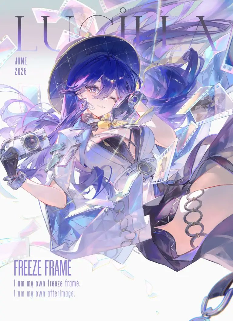
Full Prompt
Goal: Create a polished anime magazine-cover poster for {argument name="character name" default="LUCILA"}, themed around photography, film, and a dreamy frozen moment. Canvas: Vertical portrait poster, 3:4 aspect ratio, bright white-to-pale-lavender background, airy high-key lighting, pastel iridescent glow, soft cyan and violet highlights. Leave clean negative space in the lower left for the title text. Main subject: One dynamic anime girl floating diagonally across the page as if suspended midair. She has long flowing {argument name="hair color" default="deep indigo and violet"} hair with translucent purple strands sweeping dramatically to the right, luminous purple eyes, a confident playful smile, and a wink-like expression partly hidden by bangs. She wears a wide dark circular hat with a subtle starry interior, a futuristic white cropped jacket with pale blue translucent panels, black gloves, a black strappy top, a short dark skirt or shorts, thigh-high dark stockings, and silver ring accessories along one thigh. Her pose is energetic and foreshortened: one arm reaches forward holding a compact silver camera, the other hand is lifted near her face holding a small camera-like device or lens, while one leg extends toward the viewer on the right. Photography elements: Include exactly 1 prominent silver retro camera in her left hand, exactly 1 small lens/camera device near her face, exactly 1 large dangling circular chain ring near the lower right edge, and exactly 9 visible strips or fragments of photographic film floating around her. The film strips should be semi-transparent, glowing, and iridescent with cyan, pink, and lavender reflections, scattered around the top, sides, and center to create motion. Typography and text content: At the top, place an oversized elegant thin serif masthead reading {argument name="headline text" default="LUCILA"}, spanning nearly the full width in muted lavender-gray, partially behind the character and hair. On the upper left, add a small stacked date reading {argument name="date text" default="JUNE 2026"}. In the lower left, add a bold condensed sans-serif title reading {argument name="feature title" default="FREEZE FRAME"}. Below it, add exactly 2 smaller lines of text: “I am my own freeze frame.” and “I am my own afterimage.” Keep all typography lavender-purple, clean, and editorial. Visual style: High-detail Japanese gacha-game key visual, Wuthering Waves inspired, glossy cel-shaded illustration, delicate line art, luminous gradients, prism refractions, soft bloom, subtle motion blur in hair and film, intricate clothing details, pastel cyber-fashion aesthetic, magazine cover composition. Constraints: Use exactly one character, no extra people, no watermark, no logo other than the specified text, keep the background mostly white and uncluttered, preserve the readable English text, and make the final image look like a premium anime character poster rather than a realistic photograph.