Case Media
Case Notes
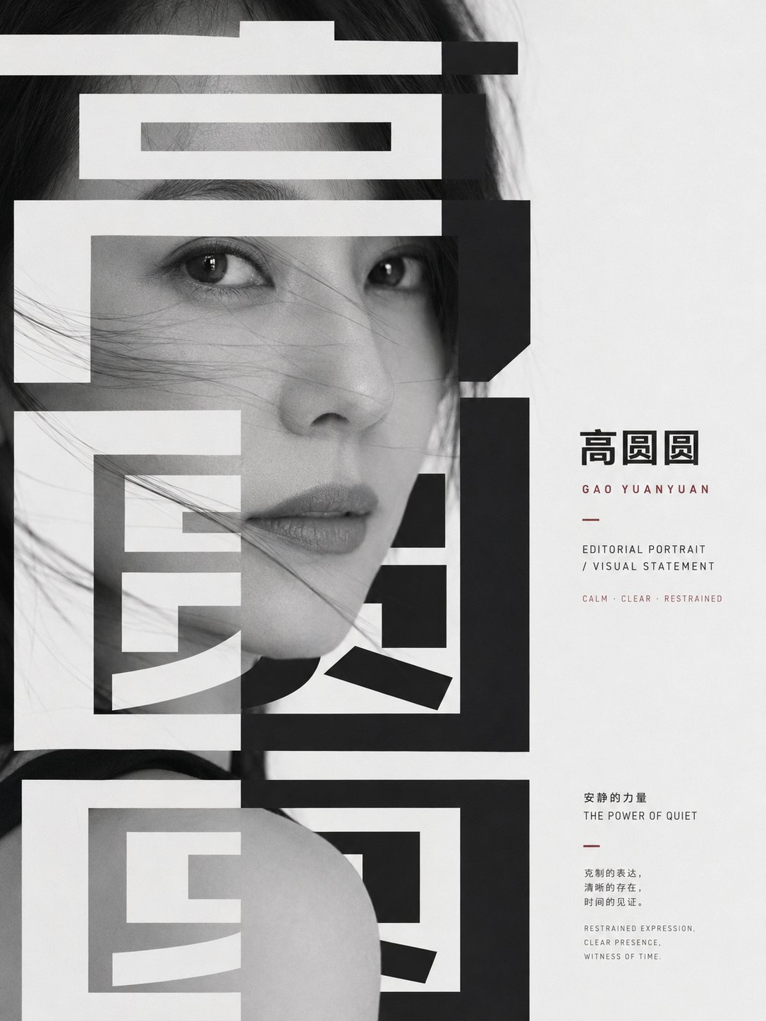
This page keeps the media, full prompt, and original source together so you can inspect the result first and decide whether the prompt is worth copying, saving, or comparing.
Case Insights
To make this page easier to search, cite, and reuse later, the case is also broken down into practical guidance about usage, visual cues, and prompt structure.
Best Fit Scenarios
- Use this as a character design benchmark when you need a fast style baseline before rewriting your own prompt.
- It is especially helpful if your target overlaps with Poster, Character, City Visual and you want to judge the image result before tuning wording.
- Keep it as a control sample when you compare nearby prompt variants one variable at a time.
Visual Signals To Notice
- The clearest style signals here are Poster, Character, City Visual, so those should usually stay in your first rewrite.
- Look at silhouette, costume language, mood styling, and whether the character reads clearly at a glance.
- This case keeps 2 media outputs, which makes it easier to check whether the style remains stable across multiple results.
How The Prompt Is Structured
- The prompt reads as a long, highly specified prompt, which is useful when you want to judge how much specificity this direction needs.
- Its keyword cluster is centered on Poster, Character, City Visual, so you can usually keep that cluster while swapping subject, camera, layout, or copy details.
- A practical rewrite path is: keep the outcome, keep the strongest style cues, then replace only the subject and environment blocks.
Good Follow-up Questions
- What changes first if you keep Poster, Character, City Visual but switch the subject matter?
- Which part of the result comes from section-level structure (Character Design) versus tag-level style cues?
- Which related cases in the same section give you a cleaner or more extreme variation of the same direction?
Full Prompt
Generate an image with a strong sense of graphic editing centered around any subject: the subject appears as a close-up realistic image's main form, magnified to be almost close to the viewer, partially cut off by boundaries, with the most emotional or representative details located at the visual center; the screen overlays a group of extremely bold and large title glyphs or subject symbols, making the glyphs both an information layer and a masking layer, with strokes passing through, pressing down on, and cutting through the main body, using white negative space and dark solid forms to create a tension between exposure and concealment. The primary reading order is to first see the weight of the huge abstract character blocks, then discover the key expressions, textures, or structures of the subject's main form within the gaps of the glyphs, leaving quiet empty spaces on the right or edges to place small amounts of body-text-style information, forming a rhythmic contrast between loud titles and whispered annotations. Colors are extracted from the subject's own materials, emotions, and narrative context, mapped into large areas of bright and clean background colors, clear dark structures, low-saturation image layers, and small areas of information emphasis colors; maintain high-brightness white space, calm and clear transparency, clean color gradations, and clear light-dark steps, dark colors must be clear and powerful, light colors must be airy and clean, avoiding dirty gray, smoky, retro yellowing, or turbid coverage. The overall texture should be like a mix between a serious publication and a public poster: black and white photographic feel or restrained image texture derived from the subject, hard-edged geometric glyphs, precise typography, tense white space, strong figure-ground relationship, ultimately allowing the subject to be reorganized by the textual structure into an oppressive yet sober, restrained, and memorable visual statement. Subject: Karen Mok. Aspect Ratio 16:9