Case Media
Case Notes
This page keeps the media, full prompt, and original source together so you can inspect the result first and decide whether the prompt is worth copying, saving, or comparing.
Case Insights
To make this page easier to search, cite, and reuse later, the case is also broken down into practical guidance about usage, visual cues, and prompt structure.
Best Fit Scenarios
- Use this as a character design benchmark when you need a fast style baseline before rewriting your own prompt.
- It is especially helpful if your target overlaps with Illustration, Character, Watercolor and you want to judge the image result before tuning wording.
- Keep it as a control sample when you compare nearby prompt variants one variable at a time.
Visual Signals To Notice
- The clearest style signals here are Illustration, Character, Watercolor, so those should usually stay in your first rewrite.
- Look at silhouette, costume language, mood styling, and whether the character reads clearly at a glance.
- This case keeps one primary output, so the first image should be treated as the main visual reference.
How The Prompt Is Structured
- The prompt reads as a medium-detail prompt with clear visual constraints, which is useful when you want to judge how much specificity this direction needs.
- Its keyword cluster is centered on Illustration, Character, Watercolor, so you can usually keep that cluster while swapping subject, camera, layout, or copy details.
- A practical rewrite path is: keep the outcome, keep the strongest style cues, then replace only the subject and environment blocks.
Good Follow-up Questions
- What changes first if you keep Illustration, Character, Watercolor but switch the subject matter?
- Which part of the result comes from section-level structure (Character Design) versus tag-level style cues?
- Which related cases in the same section give you a cleaner or more extreme variation of the same direction?
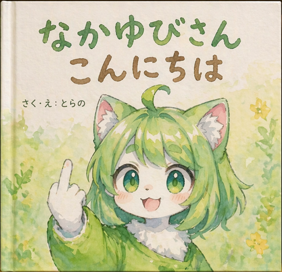
Full Prompt
A watercolor illustration of a children's picture book cover. The main subject is a {argument name="character appearance" default="cute furry kemonomimi girl with short green hair, cat ears, and green eyes"}. She is {argument name="action" default="smiling happily while holding up her middle finger"} with a white-furred hand. She wears a green garment with a fluffy white collar. The background features soft, painted green foliage and small yellow flowers on textured paper. At the top, large hand-drawn green Japanese text reads "{argument name="main title" default="なかゆびさん"}". Below it, brown Japanese text reads "{argument name="subtitle" default="こんにちは"}". On the middle-left, smaller black text reads "{argument name="author text" default="さく・え:とらの"}". The image has a visible book spine on the left edge, emphasizing the physical book format.