Case Media
Case Notes
This page keeps the media, full prompt, and original source together so you can inspect the result first and decide whether the prompt is worth copying, saving, or comparing.
Case Insights
To make this page easier to search, cite, and reuse later, the case is also broken down into practical guidance about usage, visual cues, and prompt structure.
Best Fit Scenarios
- Use this as a character design benchmark when you need a fast style baseline before rewriting your own prompt.
- It is especially helpful if your target overlaps with Neon, Fashion, Poster and you want to judge the image result before tuning wording.
- Keep it as a control sample when you compare nearby prompt variants one variable at a time.
Visual Signals To Notice
- The clearest style signals here are Neon, Fashion, Poster, so those should usually stay in your first rewrite.
- Look at silhouette, costume language, mood styling, and whether the character reads clearly at a glance.
- This case keeps 2 media outputs, which makes it easier to check whether the style remains stable across multiple results.
How The Prompt Is Structured
- The prompt reads as a long, highly specified prompt, which is useful when you want to judge how much specificity this direction needs.
- Its keyword cluster is centered on Neon, Fashion, Poster, so you can usually keep that cluster while swapping subject, camera, layout, or copy details.
- A practical rewrite path is: keep the outcome, keep the strongest style cues, then replace only the subject and environment blocks.
Good Follow-up Questions
- What changes first if you keep Neon, Fashion, Poster but switch the subject matter?
- Which part of the result comes from section-level structure (Character Design) versus tag-level style cues?
- Which related cases in the same section give you a cleaner or more extreme variation of the same direction?
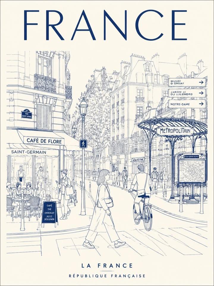
Full Prompt
Create a minimalist, ultra-high-resolution line art travel poster about [TOKYO], depicting the city as a stylish, everyday urban scene, not a tourist postcard. MAIN COMPOSITION: - The central composition features the city's most iconic street, intersection, alley, tramway, or pedestrian alley. - Foreground: Locals, commuters, cyclists, travelers, shoppers, students, and cafe patrons - People should naturally reflect the local lifestyle and trendy culture of the city - Background: filled with realistic local signage, cafes, restaurants, transit signs, shop windows, and architectural details - Attractions should seamlessly integrate into everyday life, rather than be exaggerated - Use authentic typography in the local language and culturally recognizable visual elements - Large font at top center: "TOKYO" - Subheading at bottom: Examples of country names in the local language Style: Ultra clean vector illustration, Swiss Art Nouveau travel poster, minimalist line art, monoline art, mid-century editorial aesthetic, architectural illustration, Japanese graphic poster style, clear geometric perspective, extremely clean negative space, tourism brand aesthetic Premium LINEAR STYLE: - Only monochrome line illustrations - Thin and precise lines - Minimal fill areas - Intricate detailing, like a city map - Rhythmic arrangement of signs, buildings, windows, and street objects - Visually dense yet highly organized composition COLOR SYSTEM - VERY IMPORTANT: - Use only ONE primary color + ONE background color - Automatically select the color that best conveys the atmosphere of the city - Monochrome silkscreen poster aesthetics - No rainbow palettes - No excessive neon - Color should reflect the architecture, climate, nightlife, and cultural identity of the city. Examples: Tokyo → bright red on warm ivory Paris → navy blue on cream New York → charcoal on light gray Kyoto → muted burgundy on warm cream Hong Kong → turquoise on pale ivory Santorini → Mediterranean blue on white Cairo → desert sepia on sandy beige Composition: - vertical poster layout - frontal perspective at street level - pedestrians crossing streets or moving naturally - balanced urban rhythm and visual flow - should resemble a premium urban brand advertising poster Mood: stylish city life, calm yet vibrant travel magazine cover timeless city identity visual imagery for a tourism campaign Premium, minimalist, yet highly detailed TEXT QUALITY IS CRUCIAL: - all fonts must be legible and neat - no stray characters - no broken or distorted letters - local signage must look authentic and natural - professional typography Output: - vertical poster composition - ultra-detailed 8K format - print-ready - ultra-precise vector quality