案例媒体
案例说明
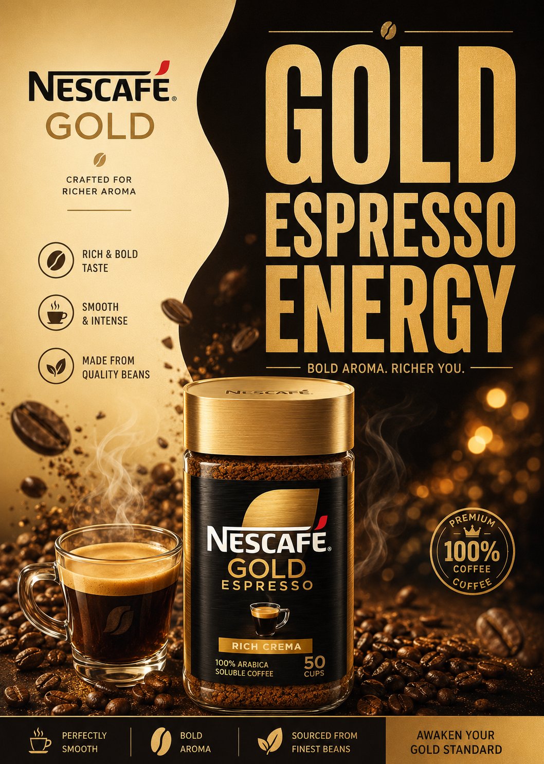
这个页面把案例媒体、完整 Prompt 和出处放在一起,方便你先看结果,再判断这条 Prompt 是否值得复制、收藏或加入对比。
案例解读
为了方便搜索、引用和后续复用,这里会把案例的适用场景、画面重点和 Prompt 结构拆成更容易浏览的说明。
这类案例适合用在什么场景
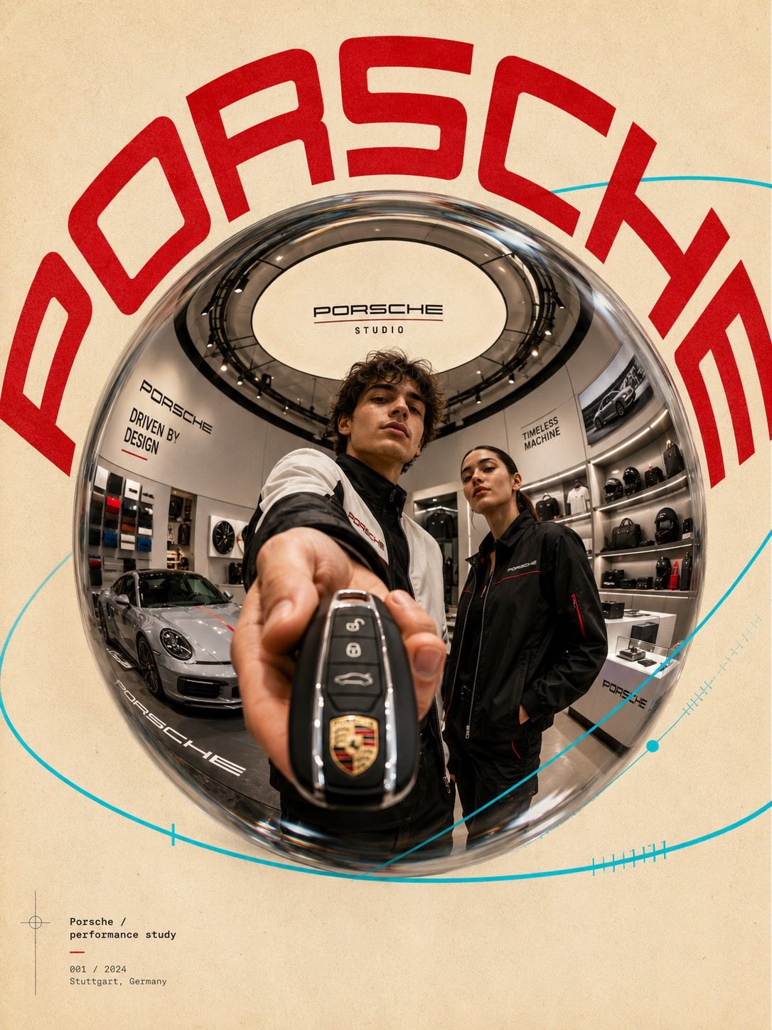
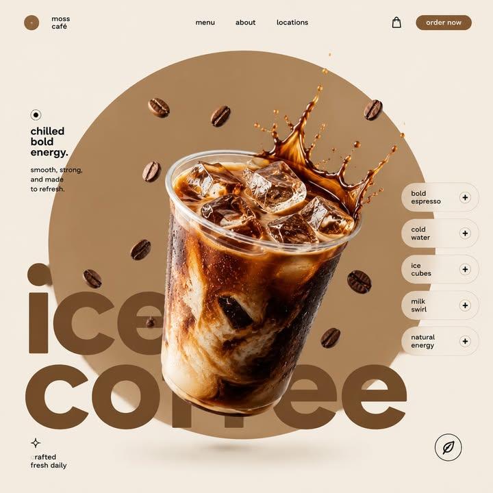
- 把它当作 UI 与社交媒体截图 的基准案例最合适,先看成片方向,再决定自己的 Prompt 要往哪边改。
- 如果你的目标也落在 电影感、时尚、海报 这些方向,这条案例特别适合先看图判断风格,再回头微调描述。
- 做 Prompt 对比时,也很适合作为控制组,只改一个变量去看结果变化。
画面重点与风格信号
- 这条案例最明显的风格信号集中在 电影感、时尚、海报,所以第一次改写时最好先保留这些关键词。
- 这类案例更值得先看界面密度、卡片层级,以及屏幕内容有没有先于文字讲清故事。
- 当前保留了 2 份媒体输出,适合顺手观察同一方向在多张结果里的稳定性。
Prompt 结构可以怎么理解
- 这条 Prompt 整体属于一条比较长、约束条件很多的 Prompt,很适合拿来判断这类方向到底需要写到多细。
- 关键词簇主要围绕 电影感、时尚、海报 展开,所以复用时可以先保留这组风格词,再替换主体、镜头、环境或文案信息。
- 最稳的改写方式通常是先保留结果方向和最强风格信号,只替换主体设定与场景块。
如果你是带着问题来的,可以先看这些角度
- 如果保留 电影感、时尚、海报,只换主体题材,结果最先变化的会是哪一部分?
- 这条结果里,哪些特征更像是 UI 与社交媒体截图 的结构特征,哪些又是标签风格本身带来的?
- 同分类的相关案例里,哪几条能给你更克制或更极致的相邻变体?
完整 Prompt
“BREWED ELEGANCE. CLEAN EUROPEAN CAFÉ ENERGY.” Create a premium minimalist FMCG coffee poster for Eilles Gourmet Café inspired by modern European supermarket campaigns, Scandinavian graphic design, and retro-modern café advertising. The design should feel: minimal, premium, clean, balanced, editorial, commercial, and distinctly European. Avoid: — cinematic luxury scenes — cluttered coffee explosions — heavy realism — busy café environments — excessive effects or textures The final result should resemble a modern premium FMCG print advertisement. LAYOUT Vertical 4:5 composition with: — smooth split-background design — oversized stacked typography — centered coffee composition — minimal floating coffee beans — clean geometric spacing — simple promotional UI blocks — strong negative space The layout should feel organized, stylish, easy to read, and commercially polished. SPLIT BACKGROUND Create a soft organic two-tone background split. Left Side — cream — ivory — latte beige Right Side — royal Eilles blue — espresso brown — matte navy The split should feel smooth, fluid, minimal, and modern. Use only: — subtle gradients — soft shadows — light glow accents Avoid dramatic textures or cinematic smoke. TYPOGRAPHY Use HUGE ultra-bold condensed sans-serif typography occupying 40–50% of the poster. Style inspiration: — Bebas Neue — Anton — Druk Condensed — Oswald Bold Typography should feel: bold, clean, retro-modern, premium FMCG. Example headlines: “PURE CAFÉ ENERGY” “BREWED TO PERFECTION” “BOLD AROMA DAILY” Use: — tight spacing — strong vertical stacking — thin divider lines — minimal captions — subtle gold accents Avoid decorative fonts or excessive styling. HERO COFFEE COMPOSITION Create a semi-realistic premium coffee setup with minimalist commercial styling. Include: — gourmet coffee cup or espresso — soft steam curves — subtle splash arcs — glossy ceramic reflections — clean liquid highlights The rendering should feel like premium vector-style FMCG artwork, not cinematic realism. FLOATING ELEMENTS Add only a FEW controlled floating elements: — roasted coffee beans — subtle coffee droplets — soft steam ribbons Keep everything balanced and intentional. PRODUCT PACKAGING Include realistic Eilles Gourmet Café packaging integrated naturally into the layout. Packaging should: — maintain the iconic royal-blue-and-gold branding — feel glossy but simplified — look premium and clean Placement: — lower foreground — beside the coffee cup — slightly overlapping typography Do not overpower the composition. LIGHTING Use soft commercial studio lighting with: — clean highlights — subtle reflections — minimal shadows — flat premium rendering Avoid dramatic cinematic contrast. COLOR PALETTE Use only 2–4 dominant colors: — royal blue — cream — espresso brown — subtle gold accents Colors should feel flat, coordinated, premium, and print-ad ready. FINAL STYLE Modern European FMCG coffee poster. Minimal split-layout composition. Huge condensed typography. Semi-realistic vector-commercial rendering. Clean editorial spacing. Instagram-ready commercial aesthetic. Premium supermarket campaign quality. Aspect Ratio: 4:5 Ultra-clean poster realism High-detail commercial rendering