案例媒体
案例说明
这个页面把案例媒体、完整 Prompt 和出处放在一起,方便你先看结果,再判断这条 Prompt 是否值得复制、收藏或加入对比。
案例解读
为了方便搜索、引用和后续复用,这里会把案例的适用场景、画面重点和 Prompt 结构拆成更容易浏览的说明。
这类案例适合用在什么场景
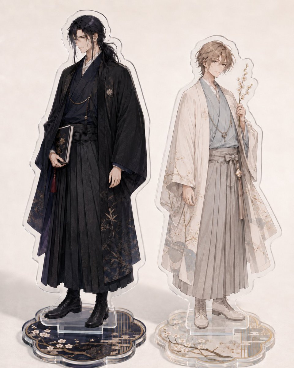
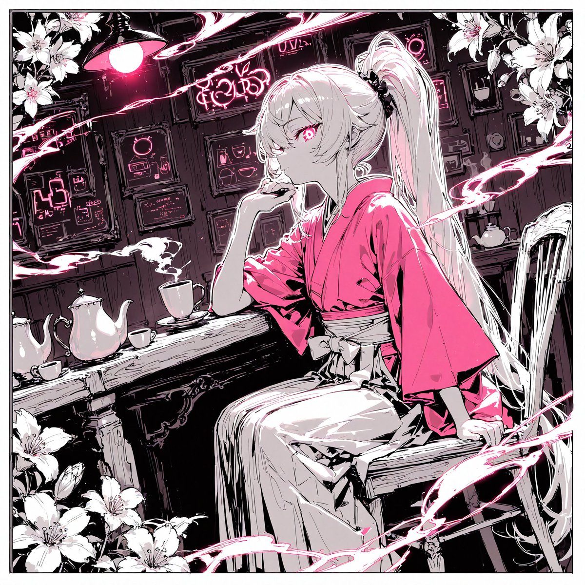
- 把它当作 UI 与社交媒体截图 的基准案例最合适,先看成片方向,再决定自己的 Prompt 要往哪边改。
- 如果你的目标也落在 插画、UI、截图 这些方向,这条案例特别适合先看图判断风格,再回头微调描述。
- 做 Prompt 对比时,也很适合作为控制组,只改一个变量去看结果变化。
画面重点与风格信号
- 这条案例最明显的风格信号集中在 插画、UI、截图,所以第一次改写时最好先保留这些关键词。
- 这类案例更值得先看界面密度、卡片层级,以及屏幕内容有没有先于文字讲清故事。
- 当前只有一张主图,所以第一张结果图就是最核心的参考基准。
Prompt 结构可以怎么理解
- 这条 Prompt 整体属于一条比较长、约束条件很多的 Prompt,很适合拿来判断这类方向到底需要写到多细。
- 关键词簇主要围绕 插画、UI、截图 展开,所以复用时可以先保留这组风格词,再替换主体、镜头、环境或文案信息。
- 最稳的改写方式通常是先保留结果方向和最强风格信号,只替换主体设定与场景块。
如果你是带着问题来的,可以先看这些角度
- 如果保留 插画、UI、截图,只换主体题材,结果最先变化的会是哪一部分?
- 这条结果里,哪些特征更像是 UI 与社交媒体截图 的结构特征,哪些又是标签风格本身带来的?
- 同分类的相关案例里,哪几条能给你更克制或更极致的相邻变体?
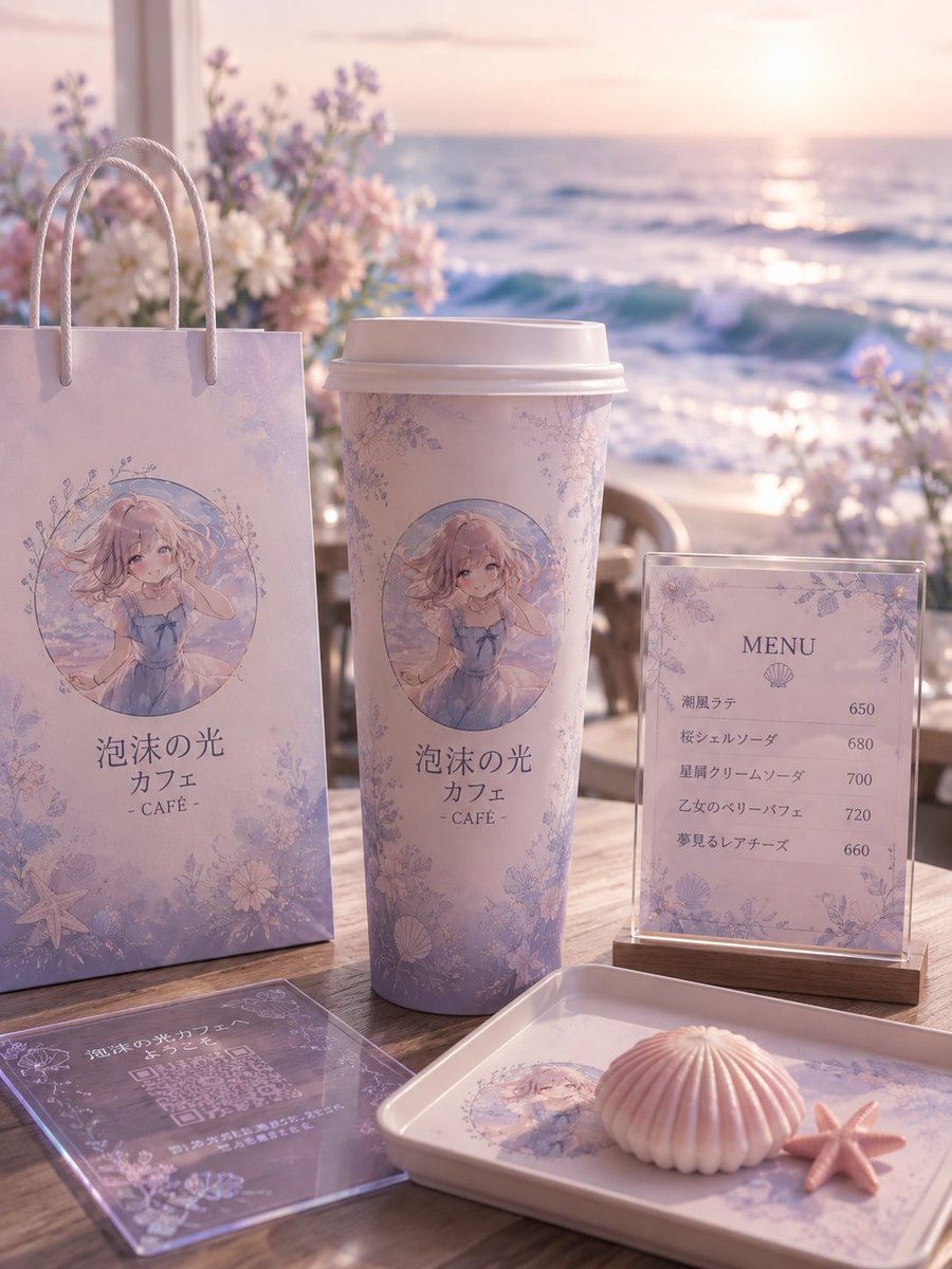
完整 Prompt
Goal: Create a dreamy seaside anime-themed cafe brand mockup for {argument name="cafe name" default="泡沫の光 カフェ"}, using a soft pastel lavender and pink palette, elegant floral borders, seashell motifs, and a gentle ocean-sunset atmosphere. Canvas: Vertical 3:4 composition, photorealistic product display with anime illustration printed on objects, shallow depth of field, warm backlit sunset glow, soft bokeh, high-detail textures. Setting: A wooden outdoor cafe table on a beach terrace at sunset. The ocean fills the background with sparkling waves and a low sun near the horizon. Add blurred pastel flowers behind the display, mainly white, blush pink, and lavender, with a romantic coastal cafe mood. Main branded elements: Show exactly 5 visible cafe merchandise/display pieces arranged on the table: 1 tall pastel paper shopping bag on the left with rope handles, 1 large takeaway coffee cup in the center with a white plastic lid, 1 upright acrylic menu sign on a small wooden base on the right, 1 transparent acrylic QR-code card lying flat in the front-left foreground, and 1 rectangular serving tray in the front-right foreground. Each item should share the same delicate lavender floral pattern and ocean-inspired branding. Character illustration: On the paper bag, cup, and tray, print a circular anime illustration of {argument name="character description" default="a soft blonde anime girl in a pale blue summer dress, sitting by the sea, with wavy hair, gentle eyes, and a shy hand-near-face pose"}. The illustration should look watercolor-like, airy, and pastel, framed by tiny flowers and sea motifs. Text content: Use Japanese branding text on the bag and cup: 「泡沫の光 カフェ」 with “- CAFÉ -” below it. The upright menu sign should have the heading “MENU” and a small shell icon, with exactly 5 menu items and prices: 「潮風ラテ」650, 「桜シェルソーダ」680, 「星屑クリームソーダ」700, 「乙女のベリーパフェ」720, 「夢見るレアチーズ」660. The flat acrylic card should contain a QR-code area and small decorative Japanese cafe text, but it may be partially unreadable due to perspective and reflections. Foreground props: Add exactly 2 small seaside props on the tray: 1 pale pink ridged shell-shaped dessert or shell ornament, and 1 small pink starfish beside it. Keep them neatly placed on the branded tray. Visual style: Soft romantic product photography, pastel anime cafe aesthetic, pearlescent highlights, translucent acrylic reflections, creamy lighting, elegant floral line art, delicate shells, starfish, and ocean foam motifs. Use realistic shadows on the wooden table and a softly blurred background. Constraints: Keep the composition clean and premium, avoid extra people, avoid modern corporate logos, avoid clutter, preserve the exact count of 5 branded display pieces, 5 menu items, and 2 foreground seaside props.