案例媒体
案例说明
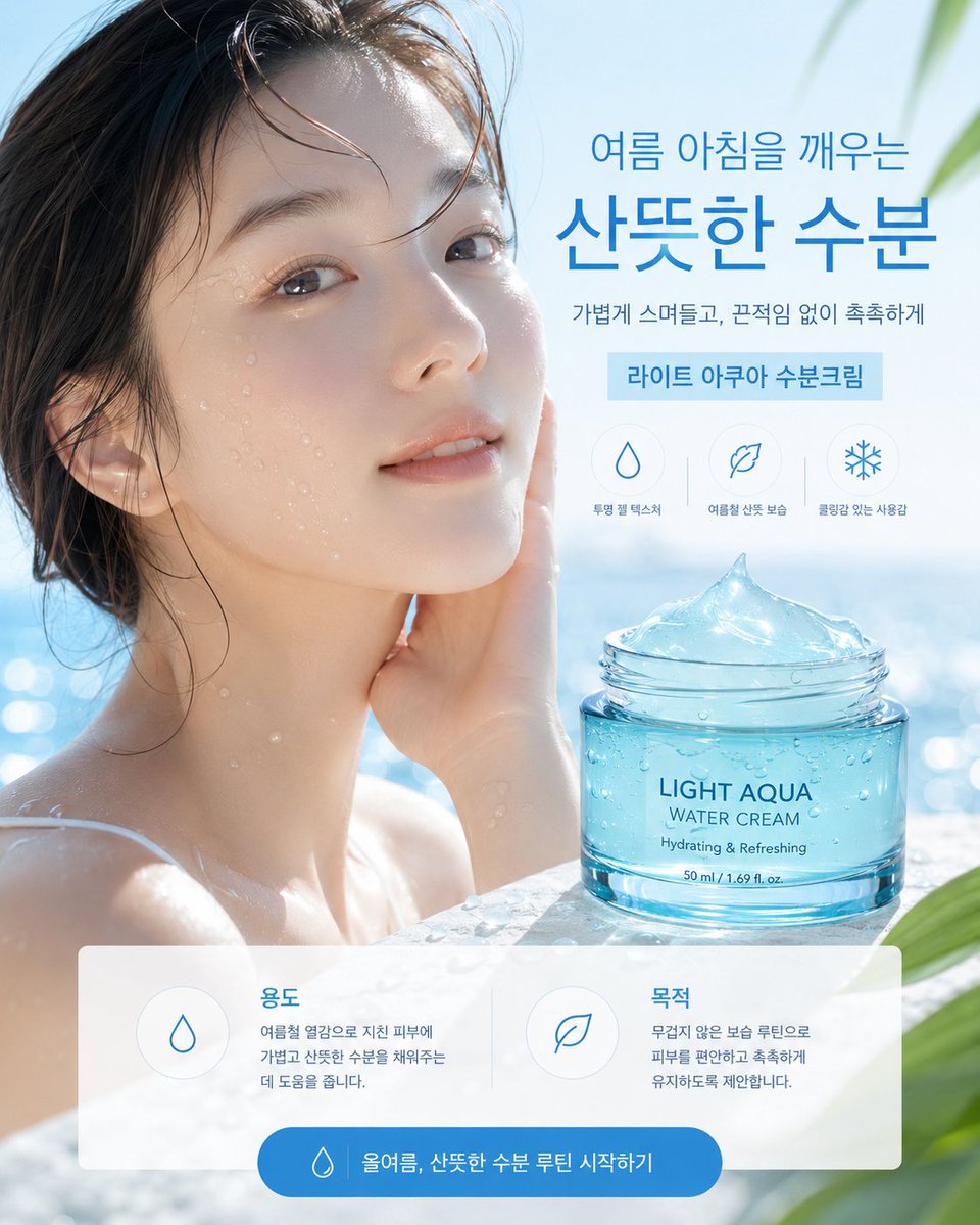
这个页面把案例媒体、完整 Prompt 和出处放在一起,方便你先看结果,再判断这条 Prompt 是否值得复制、收藏或加入对比。
案例解读
为了方便搜索、引用和后续复用,这里会把案例的适用场景、画面重点和 Prompt 结构拆成更容易浏览的说明。
这类案例适合用在什么场景
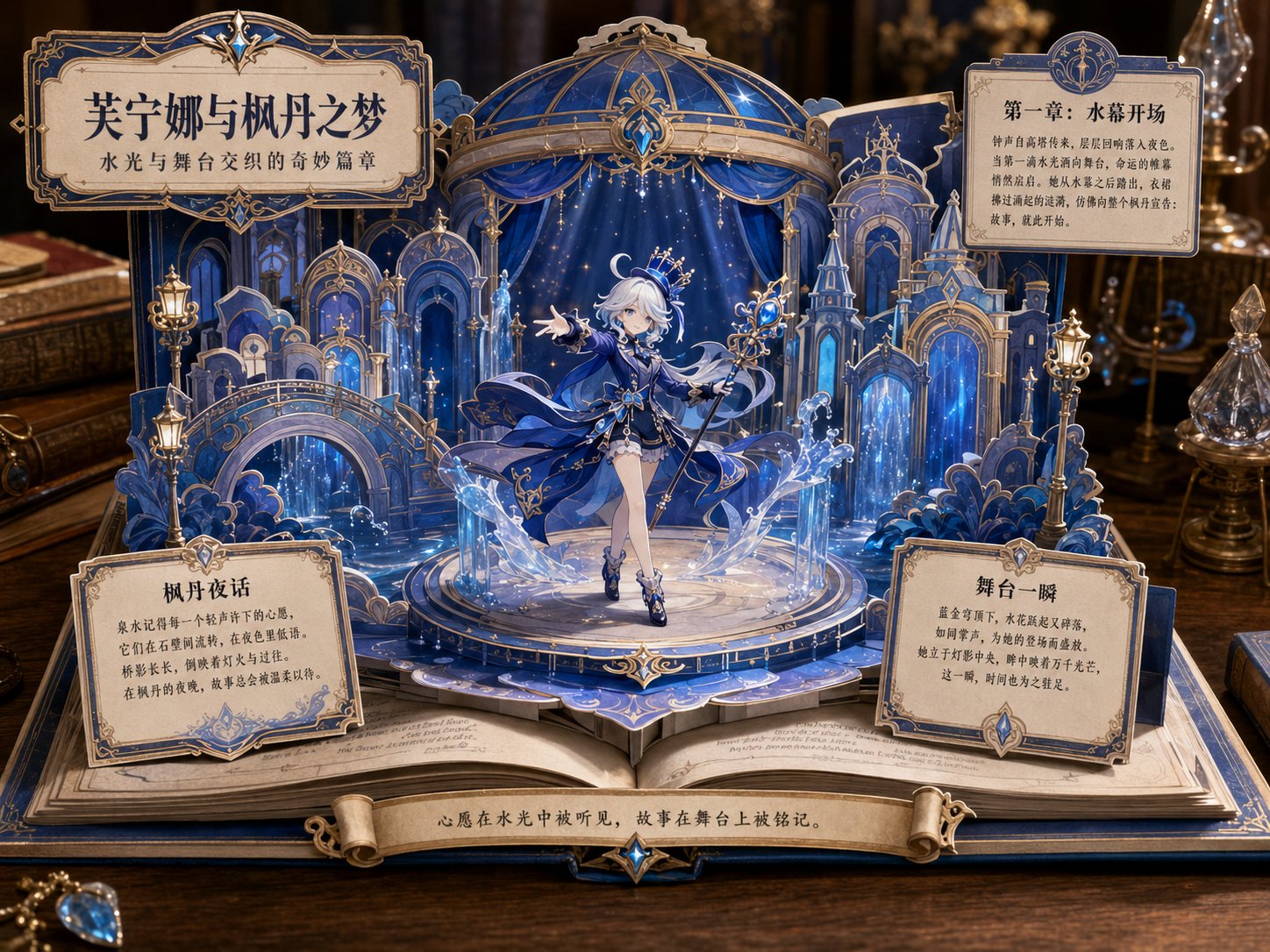
- 把它当作 UI 与社交媒体截图 的基准案例最合适,先看成片方向,再决定自己的 Prompt 要往哪边改。
- 如果你的目标也落在 海报、UI、截图 这些方向,这条案例特别适合先看图判断风格,再回头微调描述。
- 做 Prompt 对比时,也很适合作为控制组,只改一个变量去看结果变化。
画面重点与风格信号
- 这条案例最明显的风格信号集中在 海报、UI、截图,所以第一次改写时最好先保留这些关键词。
- 这类案例更值得先看界面密度、卡片层级,以及屏幕内容有没有先于文字讲清故事。
- 当前只有一张主图,所以第一张结果图就是最核心的参考基准。
Prompt 结构可以怎么理解
- 这条 Prompt 整体属于一条比较长、约束条件很多的 Prompt,很适合拿来判断这类方向到底需要写到多细。
- 关键词簇主要围绕 海报、UI、截图 展开,所以复用时可以先保留这组风格词,再替换主体、镜头、环境或文案信息。
- 最稳的改写方式通常是先保留结果方向和最强风格信号,只替换主体设定与场景块。
如果你是带着问题来的,可以先看这些角度
- 如果保留 海报、UI、截图,只换主体题材,结果最先变化的会是哪一部分?
- 这条结果里,哪些特征更像是 UI 与社交媒体截图 的结构特征,哪些又是标签风格本身带来的?
- 同分类的相关案例里,哪几条能给你更克制或更极致的相邻变体?
完整 Prompt
{"type":"Korean skincare advertising poster","format":"single vertical social media ad, 4:5 aspect ratio","style":"premium photorealistic summer beauty commercial, bright airy blue-and-white palette, clean Korean cosmetics layout, glossy water reflections, soft sunlight, shallow depth of field","scene":{"background":"sunlit outdoor pool or seaside spa setting with sparkling blue water bokeh, pale sky, soft green tropical leaves entering from the upper-right and lower-right corners","model":"young woman with wet dark hair and bare shoulders in water, positioned on the left half, hand touching cheek, dewy skin with water droplets, face covered by a large semi-opaque square privacy placeholder in muted beige-gray gradient, placeholder centered over the face and upper neck","mood":"cool, refreshing, hydrated, calm summer morning"},"product":{"item":"transparent turquoise cosmetic jar filled with aqua gel cream","position":"lower-right foreground on a wet stone or pool ledge","label text":"{argument name=\"product label text\" default=\"LIGHT AQUA\\nWATER CREAM\\nHydrating & Refreshing\\n50 ml / 1.69 fl. oz.\"}","appearance":"open glass jar with screw-top rim, blue-tinted water cream mounded into a glossy icy peak, condensation droplets on the jar, realistic refractions and highlights"},"typography":{"language":"Korean","font style":"modern clean sans serif, large bold blue headline with lighter supporting text","main headline":"{argument name=\"headline text\" default=\"여름 아침을 깨우는\\n산뜻한 수분\"}","subheadline":"{argument name=\"subheadline text\" default=\"가볍게 스며들고, 끈적임 없이 촉촉하게\"}","product ribbon":"{argument name=\"product ribbon text\" default=\"라이트 아쿠아 수분크림\"}"},"layout":{"top-right text block":"headline at upper right, subheadline below, light blue rectangular ribbon beneath","benefit icons":{"count":3,"position":"center-right above product jar","style":"thin blue line icons inside faint circles","items":[{"icon":"water droplet","label":"투명 젤 텍스처"},{"icon":"leaf","label":"여름철 산뜻 보습"},{"icon":"snowflake","label":"쿨링감 있는 사용감"}]},"bottom information panel":{"count":2,"position":"bottom third, translucent white rounded rectangle spanning almost full width","cards":[{"title":"용도","icon":"water droplet","body":"여름철 열감으로 지친 피부에 가볍고 산뜻한 수분을 채워주는데 도움을 줍니다."},{"title":"목적","icon":"leaf","body":"무겁지 않은 보습 루틴으로 피부를 편안하고 촉촉하게 유지하도록 제안합니다."}]},"call to action":{"position":"centered at very bottom inside blue rounded pill button","icon":"small water droplet","text":"{argument name=\"button text\" default=\"올여름, 산뜻한 수분 루틴 시작하기\"}"}},"composition":"model fills left side, product jar anchors lower right, headline occupies upper right, UI panel overlays bottom, all elements aligned with generous whitespace and polished ecommerce ad hierarchy","lighting":"high-key natural daylight, cool blue highlights, glossy reflections, realistic moisture and glass caustics","quality":"ultra-realistic advertising photography with crisp product rendering, readable Korean text, no extra logos, no clutter"}