案例媒体
案例说明
这个页面把案例媒体、完整 Prompt 和出处放在一起,方便你先看结果,再判断这条 Prompt 是否值得复制、收藏或加入对比。
案例解读
为了方便搜索、引用和后续复用,这里会把案例的适用场景、画面重点和 Prompt 结构拆成更容易浏览的说明。
这类案例适合用在什么场景
- 把它当作 UI 与社交媒体截图 的基准案例最合适,先看成片方向,再决定自己的 Prompt 要往哪边改。
- 如果你的目标也落在 电影感、时尚、UI 这些方向,这条案例特别适合先看图判断风格,再回头微调描述。
- 做 Prompt 对比时,也很适合作为控制组,只改一个变量去看结果变化。
画面重点与风格信号
- 这条案例最明显的风格信号集中在 电影感、时尚、UI,所以第一次改写时最好先保留这些关键词。
- 这类案例更值得先看界面密度、卡片层级,以及屏幕内容有没有先于文字讲清故事。
- 当前只有一张主图,所以第一张结果图就是最核心的参考基准。
Prompt 结构可以怎么理解
- 这条 Prompt 整体属于一条比较长、约束条件很多的 Prompt,很适合拿来判断这类方向到底需要写到多细。
- 关键词簇主要围绕 电影感、时尚、UI 展开,所以复用时可以先保留这组风格词,再替换主体、镜头、环境或文案信息。
- 最稳的改写方式通常是先保留结果方向和最强风格信号,只替换主体设定与场景块。
如果你是带着问题来的,可以先看这些角度
- 如果保留 电影感、时尚、UI,只换主体题材,结果最先变化的会是哪一部分?
- 这条结果里,哪些特征更像是 UI 与社交媒体截图 的结构特征,哪些又是标签风格本身带来的?
- 同分类的相关案例里,哪几条能给你更克制或更极致的相邻变体?
完整 Prompt
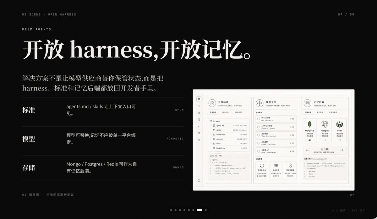
A premium dark presentation slide in a minimalist editorial tech style, widescreen 16:9 layout, matte black background with refined off-white typography and subtle gray divider lines. The overall mood is sleek, cinematic, and high-end, like a product keynote or design-forward AI startup deck. In the top left, place 2 small navigation lines of text: "UI SCENE · OPEN HARNESS" and below it "DEEP AGENTS" in thin uppercase sans serif with generous tracking. In the top right, add a small page indicator reading "07 / 08". The main headline dominates the upper left in large elegant serif Chinese and English mixed typography: {argument name="headline text" default="开放 harness,开放记忆。"}. Below it, add a 2-line Chinese body paragraph in smaller serif text: {argument name="body text" default="解决方案不是让模型供应商替你保管状态,而是把 harness、标准和记忆后端都放回开发者手里。"}. In the left-middle area, create 3 horizontal feature rows separated by thin gray lines, each row using a bold Chinese label on the left, a short Chinese description in the center, and a tiny uppercase English keyword aligned right. Row 1 label: "标准", description: "agents.md / skills 让上下文入口可见。", keyword: "OPEN". Row 2 label: "模型", description: "模型可替换,记忆不应被单一平台绑定。", keyword: "AGNOSTIC". Row 3 label: "存储", description: "Mongo / Postgres / Redis 可作为自有记忆后端。", keyword: "OWNED". On the right side, place a large embedded UI mockup inside a soft light-gray rounded rectangular frame with a subtle shadow, resembling a product dashboard screenshot. The mockup should be monochrome light beige and gray, highly structured, and divided into 3 main columns. Left column: a narrow vertical icon sidebar plus a project/file panel listing items such as "agents.md", "skills", "workflows", "memories", "tools", and a code editor block at the bottom. Center column: a section titled "模型无关" with 4 selectable model rows and small controls, plus 3 feature cards along the bottom. Right column: a section titled "记忆后端" with 3 database cards for MongoDB, Postgres, and Redis, and a lower panel titled "可迁移" showing a code snippet. Include another top card in the mockup titled "开放标准" with tab-like controls. At the bottom left outside the mockup, add a tiny caption line in Chinese and English reading "UI 情景图 · 三张同高画面板测试". At the bottom center, include a carousel indicator made of 8 small dots with the 7th highlighted as a short white pill and the others as dim gray circles. At the bottom right, place a small page number "07". Also add a faint tiny footer note near the lower right edge in Chinese and English, very subtle, such as a presentation metadata line. Use precise grid alignment, lots of negative space, understated luxury, Swiss-style composition, and a polished AI-product keynote aesthetic.