案例媒体
案例说明
这个页面把案例媒体、完整 Prompt 和出处放在一起,方便你先看结果,再判断这条 Prompt 是否值得复制、收藏或加入对比。
案例解读
为了方便搜索、引用和后续复用,这里会把案例的适用场景、画面重点和 Prompt 结构拆成更容易浏览的说明。
这类案例适合用在什么场景
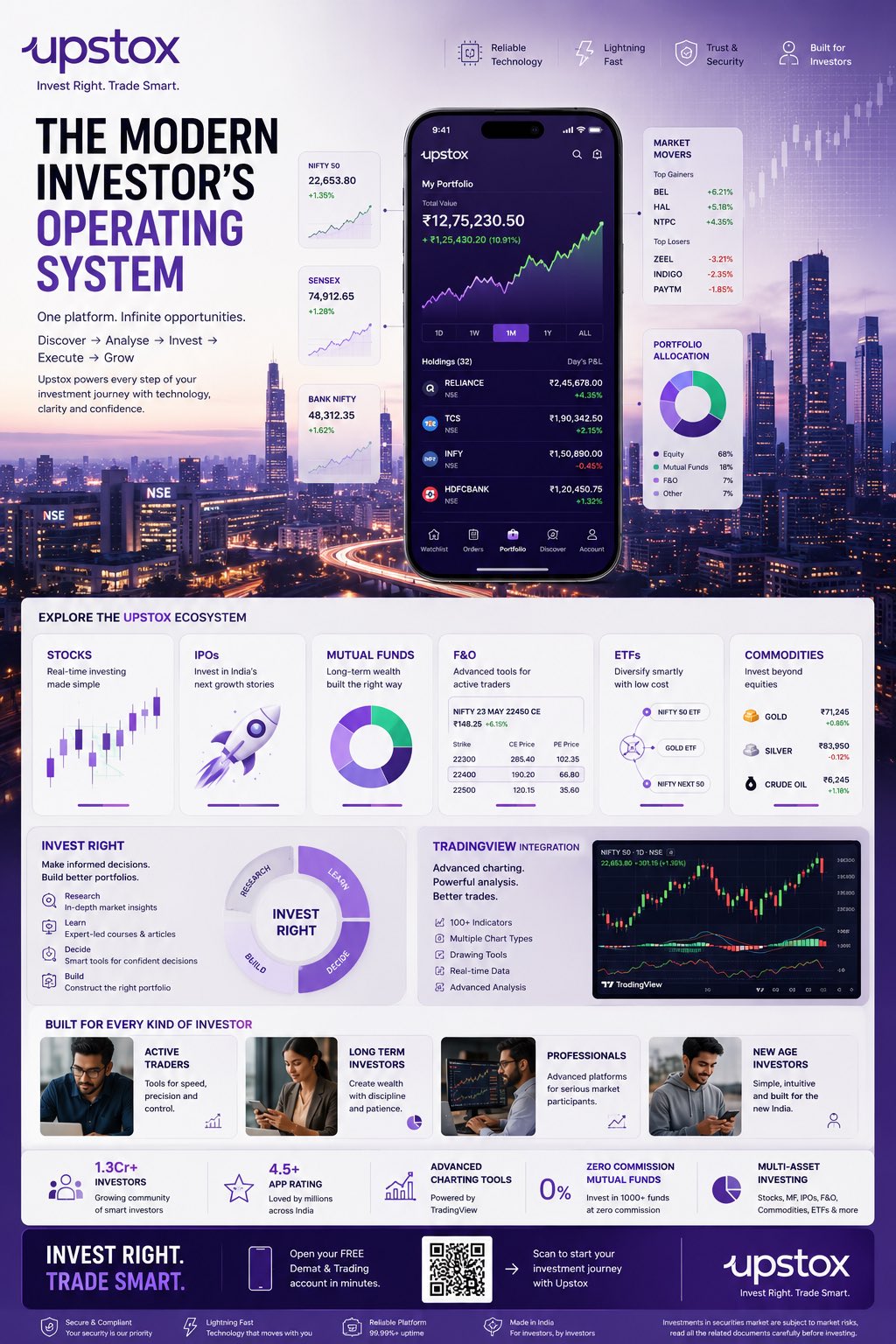
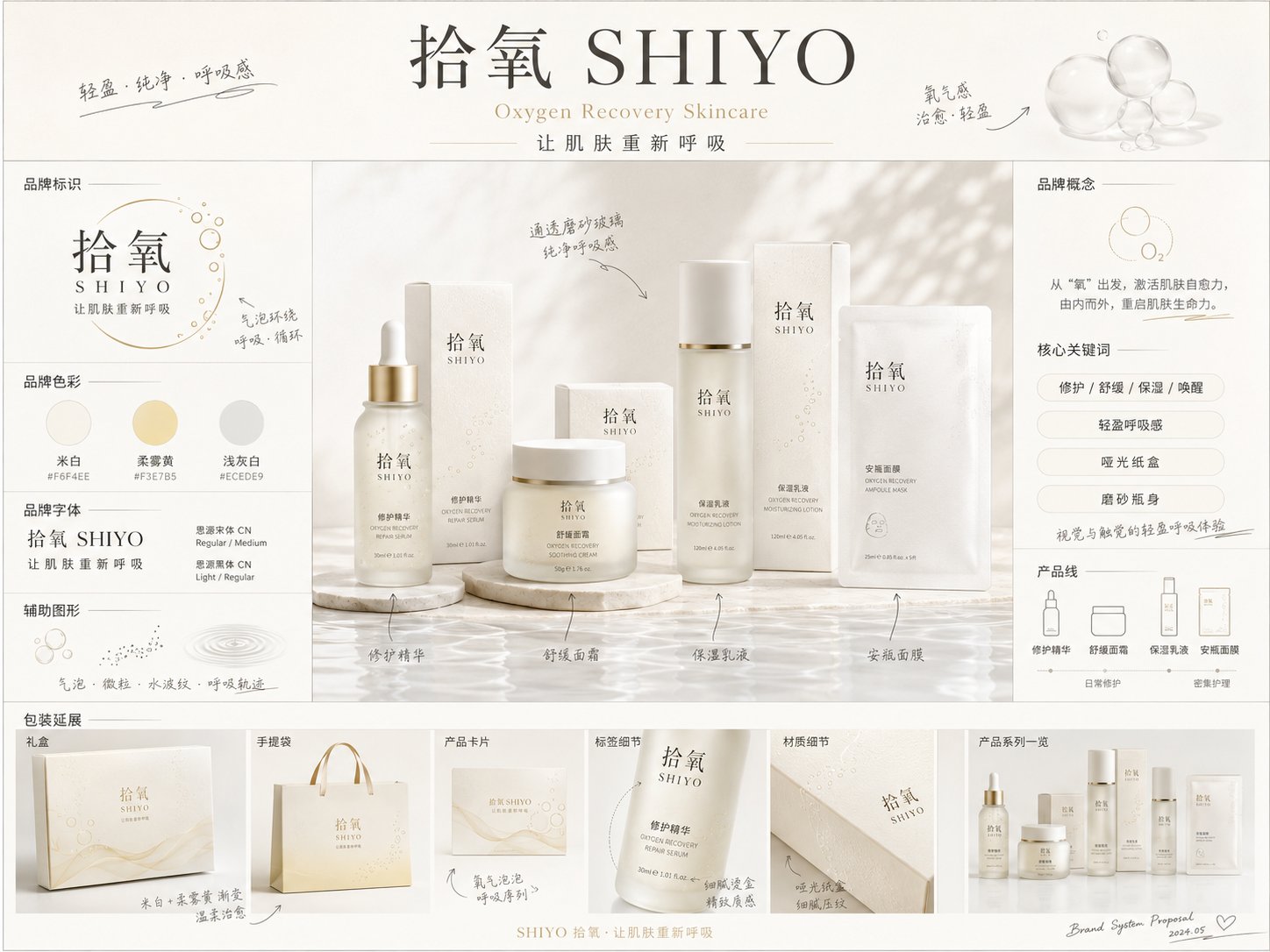
- 把它当作 UI 与社交媒体截图 的基准案例最合适,先看成片方向,再决定自己的 Prompt 要往哪边改。
- 如果你的目标也落在 时尚、海报、UI 这些方向,这条案例特别适合先看图判断风格,再回头微调描述。
- 做 Prompt 对比时,也很适合作为控制组,只改一个变量去看结果变化。
画面重点与风格信号
- 这条案例最明显的风格信号集中在 时尚、海报、UI,所以第一次改写时最好先保留这些关键词。
- 这类案例更值得先看界面密度、卡片层级,以及屏幕内容有没有先于文字讲清故事。
- 当前保留了 2 份媒体输出,适合顺手观察同一方向在多张结果里的稳定性。
Prompt 结构可以怎么理解
- 这条 Prompt 整体属于一条比较长、约束条件很多的 Prompt,很适合拿来判断这类方向到底需要写到多细。
- 关键词簇主要围绕 时尚、海报、UI 展开,所以复用时可以先保留这组风格词,再替换主体、镜头、环境或文案信息。
- 最稳的改写方式通常是先保留结果方向和最强风格信号,只替换主体设定与场景块。
如果你是带着问题来的,可以先看这些角度
- 如果保留 时尚、海报、UI,只换主体题材,结果最先变化的会是哪一部分?
- 这条结果里,哪些特征更像是 UI 与社交媒体截图 的结构特征,哪些又是标签风格本身带来的?
- 同分类的相关案例里,哪几条能给你更克制或更极致的相邻变体?
完整 Prompt
Please generate a highly finished "Brand Concept Proposal Board" in [Aspect Ratio]. [Basic Information] Brand Chinese Name: [Brand Chinese Name] Brand English Name: [Brand English Name] Brand Category: [Brand Category] (e.g., Skincare / Fragrance / Hair & Body Care / Cosmetics / Tea & Drinks / Dining / Pets / Home, etc.) Brand Core Concept: [Brand Core Concept] Brand Slogan: [Brand Slogan] Target Audience: [Target Audience] Price Range / Positioning: [Brand Positioning] Usage Scenarios: [Usage Scenarios] Product Line / Core Product: [Product Line / Core Product] [Visual Direction] Overall Vibe: [Overall Vibe] (e.g., premium, minimalist, gentle, vintage, futuristic, natural healing, urban, trendy, etc.) Primary Color: [Primary Color] Secondary Color: [Secondary Color] Accent Color: [Accent Color] Material Keywords: [Material Keywords] (e.g., frosted glass, matte paper box, embossed paper, gold foil stamping, transparent acrylic, metal hardware, etc.) Supporting Graphics Direction: [Supporting Graphics Direction] (e.g., geometric shapes, botanical line art, water ripples, bubbles, mist, linear flowing graphics, icon systems, etc.) [Visual Goal] This is not a standard product poster, an e-commerce detail page, or a single packaging render. It is a highly finished "Brand Concept Proposal Board". The visual should reflect the first-round holistic proposal feeling of the brand's transition from concept to visual realization, ideal for early-stage visual direction exploration. [Visual Elements to Include] 1. Brand Main Header Area: - Brand Chinese Name - Brand English Name - Slogan - A concise brand concept statement 2. Brand Identity Area: - Logo direction display - Typography styling - Brand colors / color palette swatches - Supporting graphics display 3. Central Key Visual Area: - Centered around the [Core Product / Product Line], showcasing a high-texture product packaging mockup set - Includes the main product, outer packaging box, and series combination - Product appearance, labels, typography, and materials should be unified, presenting a complete brand system feel - This serves as the visual centerpiece of the entire board 4. Information & Description Area: - Showcase product selling points / core keywords / usage scenarios / sensory experience - Keep info concise, clear, and presentation-like, avoiding clutter - Primarily in Chinese, with English as secondary support 5. Brand Collateral Extension Area: - Display brand collateral mockups, such as shopping bags, cards, stickers, gift boxes, promotional cards, menus, merchandise, labels, bottle stickers, social media tiles, etc. - Choose reasonably based on the brand category; do not force all items mechanically 6. Hand-drawn Annotations Area: - Incorporate a moderate amount of hand-drawn style annotations, arrows, sketch-like explanations, and small notes - Give it the feel of a designer's pitch board - Handwritten annotations should be clear, natural, refined, and not messy [Layout Requirements] - The overall layout is a horizontal or vertical brand proposal board, recommended aspect ratio: [Aspect Ratio] - The layout should feel designed, branded, presentation-ready, and editorial/magazine-like - Clear reading hierarchy: brand info at the top -> main product in the center -> information modules on left/right -> collateral extensions at the bottom - Balanced use of negative space, neither too empty nor too crowded - Information modules should be clearly distributed, resembling a concept board submitted by a professional design agency [Style Requirements] - Premium, clear, clean, and high-quality aesthetic - Text should be as legible, accurate, and natural as possible - No obvious gibberish characters, no low-quality textures, no cheap e-commerce styles - Avoid being overly flashy; do not make it look like a generic PowerPoint slide - It should present the feel of a real brand pitch rather than a simple collage [Additional Requirements] - Automatically match appropriate packaging forms, visual elements, and usage scenarios based on the [Brand Category] and [Brand Core Concept] - If the information provided by the user is incomplete, reasonably fill in the blanks without deviating from the direction - The overall output should resemble a "concept proposal board / visual mood board" rather than a complete brand guidelines manual