案例媒体
案例说明
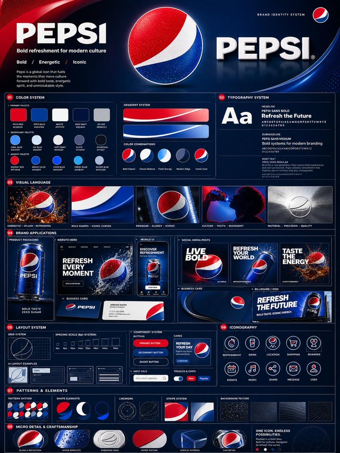
这个页面把案例媒体、完整 Prompt 和出处放在一起,方便你先看结果,再判断这条 Prompt 是否值得复制、收藏或加入对比。
案例解读
为了方便搜索、引用和后续复用,这里会把案例的适用场景、画面重点和 Prompt 结构拆成更容易浏览的说明。
这类案例适合用在什么场景
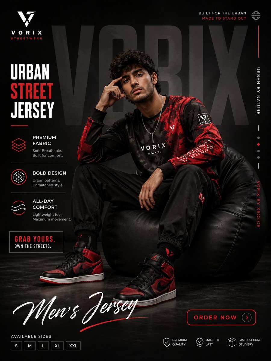
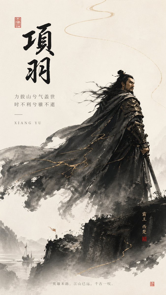
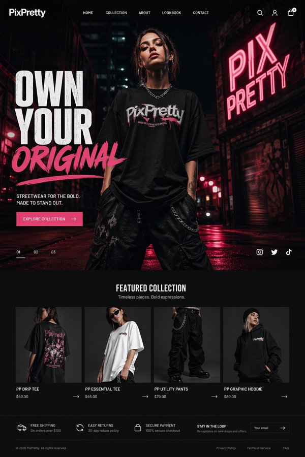
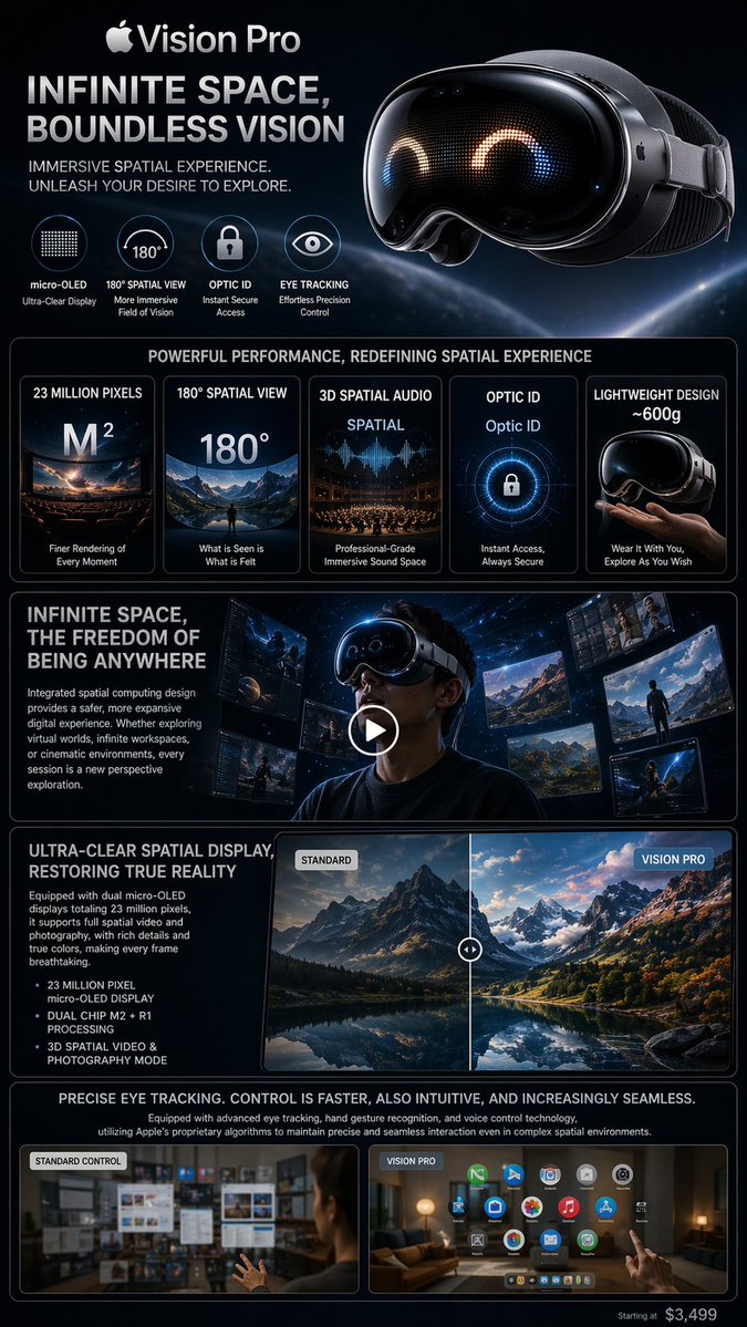
- 把它当作 UI 与社交媒体截图 的基准案例最合适,先看成片方向,再决定自己的 Prompt 要往哪边改。
- 如果你的目标也落在 电影感、时尚、海报 这些方向,这条案例特别适合先看图判断风格,再回头微调描述。
- 做 Prompt 对比时,也很适合作为控制组,只改一个变量去看结果变化。
画面重点与风格信号
- 这条案例最明显的风格信号集中在 电影感、时尚、海报,所以第一次改写时最好先保留这些关键词。
- 这类案例更值得先看界面密度、卡片层级,以及屏幕内容有没有先于文字讲清故事。
- 当前只有一张主图,所以第一张结果图就是最核心的参考基准。
Prompt 结构可以怎么理解
- 这条 Prompt 整体属于一条比较长、约束条件很多的 Prompt,很适合拿来判断这类方向到底需要写到多细。
- 关键词簇主要围绕 电影感、时尚、海报 展开,所以复用时可以先保留这组风格词,再替换主体、镜头、环境或文案信息。
- 最稳的改写方式通常是先保留结果方向和最强风格信号,只替换主体设定与场景块。
如果你是带着问题来的,可以先看这些角度
- 如果保留 电影感、时尚、海报,只换主体题材,结果最先变化的会是哪一部分?
- 这条结果里,哪些特征更像是 UI 与社交媒体截图 的结构特征,哪些又是标签风格本身带来的?
- 同分类的相关案例里,哪几条能给你更克制或更极致的相邻变体?
完整 Prompt
Using the uploaded logo, generate a highly detailed, premium brand identity system poster. GOAL: Create a complete, visually rich brand kit that looks like it was made by a top design agency. This must feel like a real professional brand guideline board, not a simple mockup. --- CORE RULE: Everything must be derived from the uploaded logo: - colors - style - tone - personality No generic outputs. --- STRUCTURE (VERY IMPORTANT): Vertical 4:5 poster Multi-layered grid system Dense but clean composition --- TOP SECTION: - Brand name (clean typography) - Short brand statement (max 6 words) - 3-word brand identity (e.g. “Modern / Bold / Minimal”) --- COLOR SYSTEM (ADVANCED): - Primary palette (3–5 colors) - Secondary palette (3–5 colors) - Accent colors For each: - large color blocks - HEX codes (short) - usage indicators (primary / highlight / background) Add: - gradient examples - color combinations --- TYPOGRAPHY SYSTEM: - Headline font style - Subheadline style - Body text style Show: - real text examples (short phrases) - hierarchy clearly visible --- VISUAL LANGUAGE: Define: - image style (editorial, cinematic, minimal, etc.) - lighting direction - texture / material inspiration Show: - 3–5 visual tiles (image-style previews) --- BRAND APPLICATIONS (VERY IMPORTANT): Show multiple realistic mockups: - product packaging - website hero section - mobile UI screen - social media posts (3 variations) - business card - billboard or ad Each must feel consistent with the brand. --- LAYOUT SYSTEM: - UI blocks - card components - spacing system Show: - buttons, cards, layout examples --- ICONOGRAPHY: - 6–10 icons in brand style - consistent line / fill style --- PATTERNS & ELEMENTS: - background patterns - decorative shapes - visual motifs derived from logo --- MICRO DETAILS (TO SHOW POWER): - shadows - material textures - reflections - depth layers --- VISUAL STYLE (CRITICAL): - modern editorial + tech design hybrid - extremely clean but information-rich - layered composition - strong hierarchy Typography: - bold titles - clean supporting text --- DEPTH: - 30–50 visual elements total - mix of large + small components - dense but organized --- IMPORTANT RULES: - no empty space - no generic placeholders - everything must feel intentional - all elements must visually connect --- FINAL FEEL: Like: - a Behance top project - a real agency brand guideline board - something clients would pay for NOT: - basic - minimal - template-like