案例媒体
案例说明
这个页面把案例媒体、完整 Prompt 和出处放在一起,方便你先看结果,再判断这条 Prompt 是否值得复制、收藏或加入对比。
案例解读
为了方便搜索、引用和后续复用,这里会把案例的适用场景、画面重点和 Prompt 结构拆成更容易浏览的说明。
这类案例适合用在什么场景
- 把它当作 UI 与社交媒体截图 的基准案例最合适,先看成片方向,再决定自己的 Prompt 要往哪边改。
- 如果你的目标也落在 海报、UI、截图 这些方向,这条案例特别适合先看图判断风格,再回头微调描述。
- 做 Prompt 对比时,也很适合作为控制组,只改一个变量去看结果变化。
画面重点与风格信号
- 这条案例最明显的风格信号集中在 海报、UI、截图,所以第一次改写时最好先保留这些关键词。
- 这类案例更值得先看界面密度、卡片层级,以及屏幕内容有没有先于文字讲清故事。
- 当前只有一张主图,所以第一张结果图就是最核心的参考基准。
Prompt 结构可以怎么理解
- 这条 Prompt 整体属于一条比较长、约束条件很多的 Prompt,很适合拿来判断这类方向到底需要写到多细。
- 关键词簇主要围绕 海报、UI、截图 展开,所以复用时可以先保留这组风格词,再替换主体、镜头、环境或文案信息。
- 最稳的改写方式通常是先保留结果方向和最强风格信号,只替换主体设定与场景块。
如果你是带着问题来的,可以先看这些角度
- 如果保留 海报、UI、截图,只换主体题材,结果最先变化的会是哪一部分?
- 这条结果里,哪些特征更像是 UI 与社交媒体截图 的结构特征,哪些又是标签风格本身带来的?
- 同分类的相关案例里,哪几条能给你更克制或更极致的相邻变体?
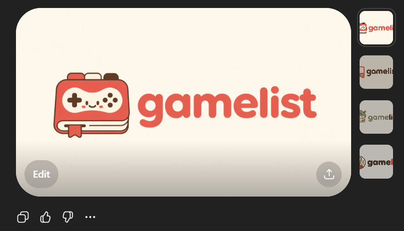
完整 Prompt
Create a clean flat vector app logo presentation on a dark UI background. Center a large rounded-rectangle preview card in warm light beige. Inside the card, place a cute minimalist gaming logo: on the left, a stylized handheld game console icon drawn as a rounded rectangular device stacked over 2 visible offset layers like pages or cards, with a small ribbon bookmark hanging from the bottom edge. The console body is coral red with cream screen details, thin dark brown outlines, and tiny dark brown controller symbols: 1 cross-shaped D-pad on the left, 4 small circular buttons on the right, plus 4 tiny decorative dots in the center forming a smiling playful face impression. To the right of the icon, place the lowercase brand wordmark {argument name="brand name" default="gamelist"} in thick rounded geometric sans-serif letters, colored coral red to match the icon. Keep the spacing balanced so the icon and text read as one cohesive modern startup logo. Use a soft, friendly, vector-only aesthetic with no gradients, no photorealism, no texture, and high SVG-friendly simplicity. The palette should be limited to 4 colors: {argument name="primary color" default="coral red"}, cream, dark brown, and warm light beige. Show 4 small vertical thumbnail variations aligned along the right side of the dark interface, each showing the same logo on slightly different light neutral backgrounds. Add subtle UI framing only: a circular gray Edit button at bottom left of the large preview card, a circular gray share/upload button at bottom right of the card, and small monochrome action icons below the card on the dark background. Overall composition should look like a screenshot of an AI image generation result showcasing an app logo concept.