案例媒体
案例说明
这个页面把案例媒体、完整 Prompt 和出处放在一起,方便你先看结果,再判断这条 Prompt 是否值得复制、收藏或加入对比。
案例解读
为了方便搜索、引用和后续复用,这里会把案例的适用场景、画面重点和 Prompt 结构拆成更容易浏览的说明。
这类案例适合用在什么场景
- 把它当作 UI 与社交媒体截图 的基准案例最合适,先看成片方向,再决定自己的 Prompt 要往哪边改。
- 如果你的目标也落在 霓虹、UI、截图 这些方向,这条案例特别适合先看图判断风格,再回头微调描述。
- 做 Prompt 对比时,也很适合作为控制组,只改一个变量去看结果变化。
画面重点与风格信号
- 这条案例最明显的风格信号集中在 霓虹、UI、截图,所以第一次改写时最好先保留这些关键词。
- 这类案例更值得先看界面密度、卡片层级,以及屏幕内容有没有先于文字讲清故事。
- 当前只有一张主图,所以第一张结果图就是最核心的参考基准。
Prompt 结构可以怎么理解
- 这条 Prompt 整体属于一条比较长、约束条件很多的 Prompt,很适合拿来判断这类方向到底需要写到多细。
- 关键词簇主要围绕 霓虹、UI、截图 展开,所以复用时可以先保留这组风格词,再替换主体、镜头、环境或文案信息。
- 最稳的改写方式通常是先保留结果方向和最强风格信号,只替换主体设定与场景块。
如果你是带着问题来的,可以先看这些角度
- 如果保留 霓虹、UI、截图,只换主体题材,结果最先变化的会是哪一部分?
- 这条结果里,哪些特征更像是 UI 与社交媒体截图 的结构特征,哪些又是标签风格本身带来的?
- 同分类的相关案例里,哪几条能给你更克制或更极致的相邻变体?
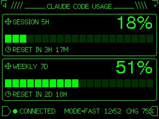
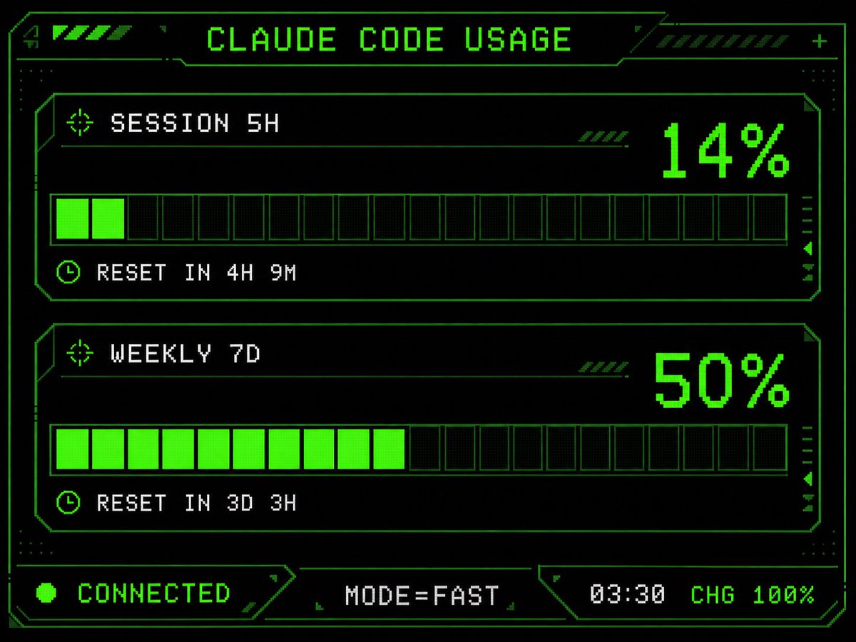
完整 Prompt
Using the provided reference image as the UI/data source, redesign it into a polished retro-futuristic monochrome green terminal HUD for an M5Stack-style display. Keep the same information and values unchanged: title {argument name="title text" default="CLAUDE CODE USAGE"}, two usage sections labeled {argument name="session label" default="SESSION 5H"} and {argument name="weekly label" default="WEEKLY 7D"}, percentages 14% and 50%, reset messages "RESET IN 4H 9M" and "RESET IN 3D 3H", and footer statuses "CONNECTED", "MODE=FAST", "03:30", "CHG 100%". Replace the plain bars with chunky pixelated segmented gauges: exactly 2 horizontal gauge panels, each with 20 rectangular segments, with the first showing 2 filled neon-green segments and the second showing 10 filled neon-green segments. Add a detailed sci-fi frame with angular borders, thin circuit-like linework, corner brackets, dotted texture, small arrow/target/clock icons, diagonal hazard stripes, and subtle CRT/pixel-grid glow. Use a black background, bright neon green outlines and fills, and white-green pixel text. Arrange the footer as exactly 3 bottom modules: left "CONNECTED" with a green status dot, center "MODE=FAST", and right "03:30 CHG 100%". Make it sharper, more stylish, and more production-ready than the reference while preserving the same dashboard function and data.