案例媒体
案例说明
这个页面把案例媒体、完整 Prompt 和出处放在一起,方便你先看结果,再判断这条 Prompt 是否值得复制、收藏或加入对比。
案例解读
为了方便搜索、引用和后续复用,这里会把案例的适用场景、画面重点和 Prompt 结构拆成更容易浏览的说明。
这类案例适合用在什么场景
- 把它当作 海报与插画 的基准案例最合适,先看成片方向,再决定自己的 Prompt 要往哪边改。
- 如果你的目标也落在 海报、插画、排版 这些方向,这条案例特别适合先看图判断风格,再回头微调描述。
- 做 Prompt 对比时,也很适合作为控制组,只改一个变量去看结果变化。
画面重点与风格信号
- 这条案例最明显的风格信号集中在 海报、插画、排版,所以第一次改写时最好先保留这些关键词。
- 重点多半在版式节奏、标题层级、插画材质和信息在画面里的摆放方式。
- 当前保留了 2 份媒体输出,适合顺手观察同一方向在多张结果里的稳定性。
Prompt 结构可以怎么理解
- 这条 Prompt 整体属于一条比较长、约束条件很多的 Prompt,很适合拿来判断这类方向到底需要写到多细。
- 关键词簇主要围绕 海报、插画、排版 展开,所以复用时可以先保留这组风格词,再替换主体、镜头、环境或文案信息。
- 最稳的改写方式通常是先保留结果方向和最强风格信号,只替换主体设定与场景块。
如果你是带着问题来的,可以先看这些角度
- 如果保留 海报、插画、排版,只换主体题材,结果最先变化的会是哪一部分?
- 这条结果里,哪些特征更像是 海报与插画 的结构特征,哪些又是标签风格本身带来的?
- 同分类的相关案例里,哪几条能给你更克制或更极致的相邻变体?
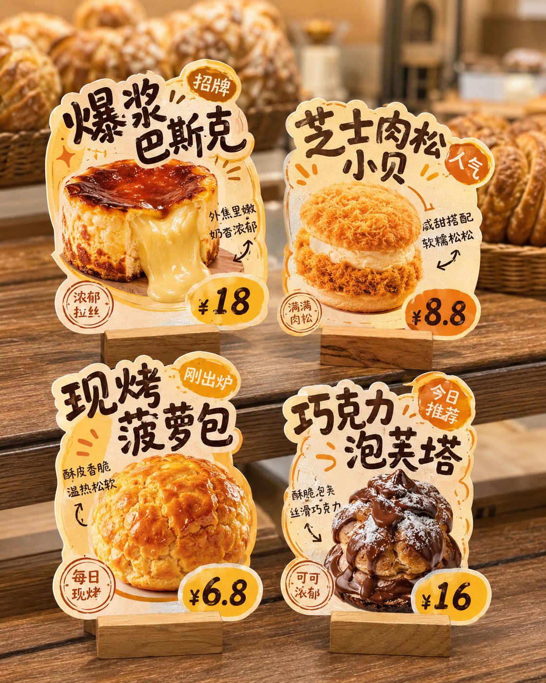
完整 Prompt
Please generate a 'store irregular table card' design display image. The background must be pure white, used for post-production cutout and separate splitting. Core Requirements: This is not a real-life store poster or a scene display image, but a white background layout. The image shows 4 independent 'store irregular table cards / dish recommendation inserts / hot item recommendation cards', convenient for cutting out each card individually later. Please design around the following content: Brand Name: [Brand Name] Store Type: [Store Type, such as Hot Pot Restaurant / Dessert Shop / Tea Shop / Bakery / Snack Shop / Cafe] Overall Style: [Style, such as Hand-drawn POP feel / Lively and Smoky / Fresh Fruit Drink / Hong Kong Style Dessert / Warm Bakery / Cute and Healing] Main Color: [Color Direction] Product List: 1. [Product Name 1] / [Price 1] / [Selling Point 1] 2. [Product Name 2] / [Price 2] / [Selling Point 2] 3. [Product Name 3] / [Price 3] / [Selling Point 3] 4. [Product Name 4] / [Price 4] / [Selling Point 4] Visual Requirements: 1. The whole image is a pure white background, clean, simple, unobstructed, no store environment, no tabletop scene, no handheld, no people, no prop backgrounds. 2. Show 4 independent store irregular table cards in the image, arranged in a 2x2 layout, neat and clear, with enough spacing between each other, no overlapping, convenient for separate cutout later. 3. Each table card must be presented completely, with clear edges, defined outlines, and a strong sense of irregular shape, not ordinary rectangular cards. 4. Each table card is based on a single product, highlighting the main visual of the food, product name, price, short selling points, and label information like Signature/New/TOP1/Popular. 5. The table card style should be like small recommendation inserts used in real stores, with a sense of commerce and practicality, not illustration posters or course assignment layouts. 6. The material of the table cards should be presented as thick cardboard die-cut cards, which can appropriately have a base, but the base should also be simple, complete, and easy to identify. 7. The font style leans towards hand-drawn POP, bold titles, friendly and lively, with a few arrows, stamps, annotations, small labels, and small decorative symbols added, but not too cluttered. 8. Each table card must have strong product recognition and different irregular outline changes, which can be designed according to the shape of the product, text flow, or ingredient elements. 9. The food should be appetizing, realistic, and look delicious, suitable for catering stores. 10. The overall visual needs to be exquisite, unified, and complete, like a set of small store irregular table card systems that can be directly delivered to customers for reference. Special Emphasis: - Background must be pure white - Show only 4 table cards - No real store scenes - No tabletop settings - No complex shadows - Do not assemble into a poster feel - The key is to let each irregular table card be used for individual cutout Final effect should be like: A design display image with a pure white background, with 4 independent store irregular table cards neatly placed on it, each complete, clear, easy to cut out, and can be directly split and used.