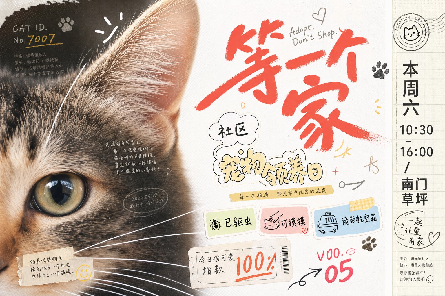
案例媒体
案例说明
这个页面把案例媒体、完整 Prompt 和出处放在一起,方便你先看结果,再判断这条 Prompt 是否值得复制、收藏或加入对比。
案例解读
为了方便搜索、引用和后续复用,这里会把案例的适用场景、画面重点和 Prompt 结构拆成更容易浏览的说明。
这类案例适合用在什么场景
- 把它当作 海报与插画 的基准案例最合适,先看成片方向,再决定自己的 Prompt 要往哪边改。
- 如果你的目标也落在 海报、插画、品牌 这些方向,这条案例特别适合先看图判断风格,再回头微调描述。
- 做 Prompt 对比时,也很适合作为控制组,只改一个变量去看结果变化。
画面重点与风格信号
- 这条案例最明显的风格信号集中在 海报、插画、品牌,所以第一次改写时最好先保留这些关键词。
- 重点多半在版式节奏、标题层级、插画材质和信息在画面里的摆放方式。
- 当前保留了 2 份媒体输出,适合顺手观察同一方向在多张结果里的稳定性。
Prompt 结构可以怎么理解
- 这条 Prompt 整体属于一条比较长、约束条件很多的 Prompt,很适合拿来判断这类方向到底需要写到多细。
- 关键词簇主要围绕 海报、插画、品牌 展开,所以复用时可以先保留这组风格词,再替换主体、镜头、环境或文案信息。
- 最稳的改写方式通常是先保留结果方向和最强风格信号,只替换主体设定与场景块。
如果你是带着问题来的,可以先看这些角度
- 如果保留 海报、插画、品牌,只换主体题材,结果最先变化的会是哪一部分?
- 这条结果里,哪些特征更像是 海报与插画 的结构特征,哪些又是标签风格本身带来的?
- 同分类的相关案例里,哪几条能给你更克制或更极致的相邻变体?
完整 Prompt
Generate a visual image with a strong sense of graphic collage around any subject: the subject enters the frame at an extremely close range, occupying the main visual weight on one side, revealing only the most recognizable partial edges, surfaces, outlines, or core details, while the other side retains a clean, airy background and includes a narrow information bar forming a spine-like sense of order. Overlay multiple sets of theme-derived text, symbols, and small graphic markers between the subject's surface and the negative space, like stickers, handwritten signatures, graffiti numbers, and miniature explanatory text floating on the same level; text size jumps significantly, the main identifier should have a quick, handwritten sweeping stroke, secondary text should be rounder, looser, and more bubble-like, and tiny text with low transparency is buried in the shadows or textures of the subject, providing only density and rhythm without stealing the main visual. The composition should make the first glance read the heavily cropped subject part and the largest handwritten identifier, and the second glance discover the surrounding sticker numbers, sidebar text, and semi-hidden information, forming a light pressure mix of youth magazine clippings, record liners, and journal stickers. Colors are extracted from the material, emotion, and cultural semantics of the subject: large areas of the background remain high-brightness, clear, and clean, the subject uses the main material color or structural color of the theme, text information uses clear light and dark scales to establish readable layers, and a small amount of high-saturation accent colors only fall on handwritten identifiers, numbers, or small stickers to create bright, lively moments; the overall feel should be bright and light, boundaries clear, dark parts kept clean, without old, cloudy, or gray-dirty processing. The image texture carries slight scanning dots, printing grains, and sticker edges, but the subject part remains fine and clear, with images and text blocking, interspersing, and overlapping each other, like carefully typeset casual scribbling rather than neat templates or ordinary information posters. ---- Recruitment scene: Make a 16:9 horizontal cover for a youth street dance club recruitment, the frame only closely crops the sneaker tip, loose pant cuffs, and floor reflections, making the action look like it just stepped into the frame. Main text processing: Large handwritten identifier says 'Come dance for a bit', sticker small text interspersed with 'Friday 7 PM', 'Zero foundation welcome', 'Rehearsal Room B1'. Needs to appear: A wrinkled-edge registration sticker, a circular team logo, and several graffiti lines like rehearsal numbers, with text pasted at the junction of the shoe edge and the blank space.