案例媒体
案例说明
这个页面把案例媒体、完整 Prompt 和出处放在一起,方便你先看结果,再判断这条 Prompt 是否值得复制、收藏或加入对比。
案例解读
为了方便搜索、引用和后续复用,这里会把案例的适用场景、画面重点和 Prompt 结构拆成更容易浏览的说明。
这类案例适合用在什么场景
- 把它当作 海报与插画 的基准案例最合适,先看成片方向,再决定自己的 Prompt 要往哪边改。
- 如果你的目标也落在 海报、插画、品牌 这些方向,这条案例特别适合先看图判断风格,再回头微调描述。
- 做 Prompt 对比时,也很适合作为控制组,只改一个变量去看结果变化。
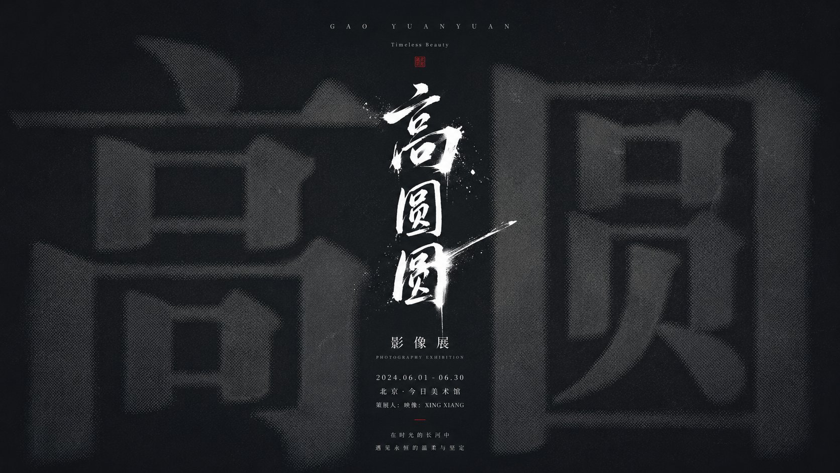
画面重点与风格信号
- 这条案例最明显的风格信号集中在 海报、插画、品牌,所以第一次改写时最好先保留这些关键词。
- 重点多半在版式节奏、标题层级、插画材质和信息在画面里的摆放方式。
- 当前保留了 2 份媒体输出,适合顺手观察同一方向在多张结果里的稳定性。
Prompt 结构可以怎么理解
- 这条 Prompt 整体属于一条比较长、约束条件很多的 Prompt,很适合拿来判断这类方向到底需要写到多细。
- 关键词簇主要围绕 海报、插画、品牌 展开,所以复用时可以先保留这组风格词,再替换主体、镜头、环境或文案信息。
- 最稳的改写方式通常是先保留结果方向和最强风格信号,只替换主体设定与场景块。
如果你是带着问题来的,可以先看这些角度
- 如果保留 海报、插画、品牌,只换主体题材,结果最先变化的会是哪一部分?
- 这条结果里,哪些特征更像是 海报与插画 的结构特征,哪些又是标签风格本身带来的?
- 同分类的相关案例里,哪几条能给你更克制或更极致的相邻变体?
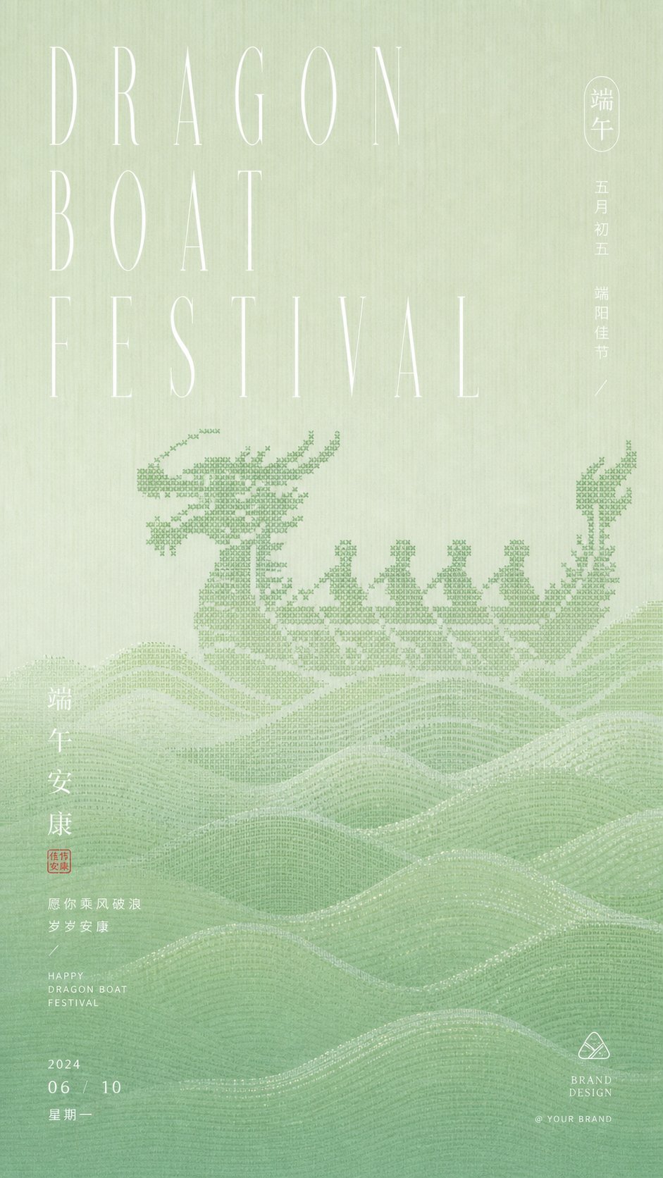
完整 Prompt
Generate a cold, solemn, and exhibition-style information visual around the subject Liu Yan: The image uses a large area of low-brightness theme base color as a structural field, with the base color extracted from the history, material, or emotion of the subject, maintaining a dominant relationship that is deep and clean, low saturation, and with little hue interference; in the background, an extremely enlarged core glyph, symbol, or information form of the theme is placed, making it occupy the main visual weight, but it recedes into the depths of the background through out-of-focus, halftoning, softened edges, and slight diffusion processing, forming a first-impression impact of being first suppressed by volume and then gradually recognized. In the center, a high-brightness, sharp, and strongly handwritten theme symbol or title stroke is superimposed, like a short and accurate white light cutting into the blurred giant shape; the lines have writing speed, ink breaks, and vertical tension, becoming the clearest focus of the entire image. The text system establishes a quiet order along the central axis, with sparse small English or Pinyin-style information at the top as a calm introduction, a small amount of clear titles in the middle to press down on the focus, and compact small text, dates, signatures, locations, or descriptions at the bottom to form a rhythmic decrease, with restrained letter spacing and stable line spacing, and information accurately placed like an archive. Color roles shift with the theme: the background undertakes the quiet structure, the giant background information uses a low-contrast grayscale slightly brighter than the background or a dark theme color, the central handwritten symbol and key text use the clearest high-brightness information color, and a small amount of logos or details can use derived theme emphasis colors as a finishing touch; the overall feel remains calm and precise, clean and low saturation, with clear light and dark levels and a weak grain texture, avoiding a decorative illustration feel, letting the overlay relationship between blurred weight and sharp writing become the main memory point. Subject: Liu Yan. Aspect ratio 16:9.