案例媒体
案例说明
这个页面把案例媒体、完整 Prompt 和出处放在一起,方便你先看结果,再判断这条 Prompt 是否值得复制、收藏或加入对比。
案例解读
为了方便搜索、引用和后续复用,这里会把案例的适用场景、画面重点和 Prompt 结构拆成更容易浏览的说明。
这类案例适合用在什么场景
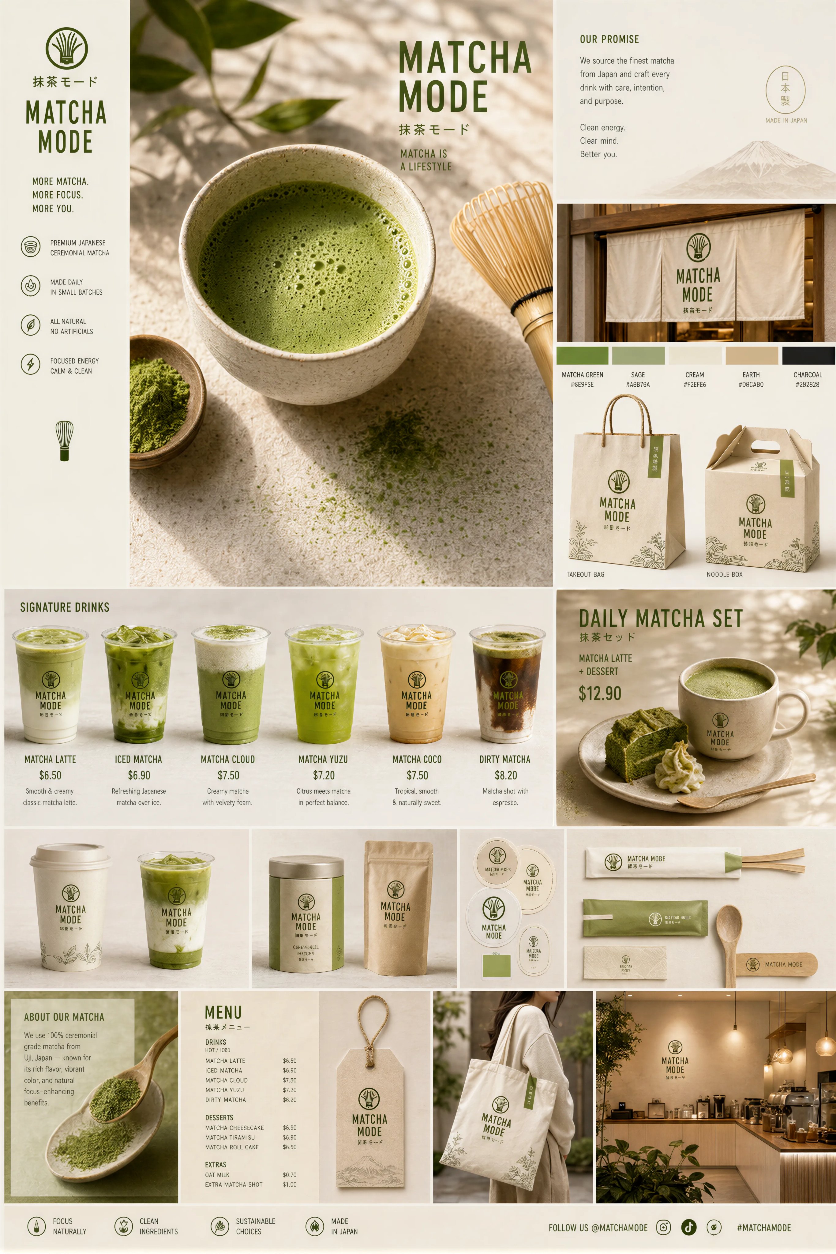
- 把它当作 海报与插画 的基准案例最合适,先看成片方向,再决定自己的 Prompt 要往哪边改。
- 如果你的目标也落在 海报、插画、极简 这些方向,这条案例特别适合先看图判断风格,再回头微调描述。
- 做 Prompt 对比时,也很适合作为控制组,只改一个变量去看结果变化。
画面重点与风格信号
- 这条案例最明显的风格信号集中在 海报、插画、极简,所以第一次改写时最好先保留这些关键词。
- 重点多半在版式节奏、标题层级、插画材质和信息在画面里的摆放方式。
- 当前保留了 2 份媒体输出,适合顺手观察同一方向在多张结果里的稳定性。
Prompt 结构可以怎么理解
- 这条 Prompt 整体属于一条比较长、约束条件很多的 Prompt,很适合拿来判断这类方向到底需要写到多细。
- 关键词簇主要围绕 海报、插画、极简 展开,所以复用时可以先保留这组风格词,再替换主体、镜头、环境或文案信息。
- 最稳的改写方式通常是先保留结果方向和最强风格信号,只替换主体设定与场景块。
如果你是带着问题来的,可以先看这些角度
- 如果保留 海报、插画、极简,只换主体题材,结果最先变化的会是哪一部分?
- 这条结果里,哪些特征更像是 海报与插画 的结构特征,哪些又是标签风格本身带来的?
- 同分类的相关案例里,哪几条能给你更克制或更极致的相邻变体?
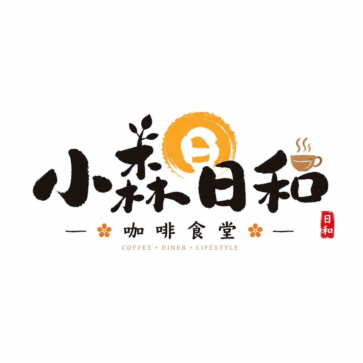
完整 Prompt
Based on the user's input [Brand Name / Project Name], [Type / Industry], [Brand Positioning], [Core Keywords], [Emotional Tone], [Layout Direction], [Main Color], [Secondary Color], and [Aspect Ratio], design a high-quality 'Japanese Brush Shop Wordmark.' Note: The goal is a commercially viable shop logo, not just general typography, poster titles, or pure calligraphy art. Focus on a brush-written feel, ensuring the main text has distinct variations in stroke thickness, press and lift techniques, subtle 'flying white' (dry brush) effects, and natural brush movement, while maintaining high legibility and recognition. [Main Text Requirements] 1. Use the brand name as the core subject, treated with a handwritten brush feel. 2. Strokes should exhibit clear thickness variation, rhythm, subtle dry-brush textures, ink density, and a sense of 'breathing.' 3. Certain key strokes can be moderately exaggerated to create a memorable focal point. 4. The font style does not need to be rigid or standard; it can incorporate natural deformation and shop-specific personality. 5. The focus is on a 'commercial shop wordmark,' not a traditional calligraphic exhibition piece. The overall vibe should be that of an authentic Japanese shopfront, signage, or noren (curtain). Discreetly include elements like small red seals, small vertical explanatory text, minimal Kana/Pinyin/English, or red-on-white blocks for embellishment. Keep the background clean so the main logo stands out. The final result should look like a high-recognition wordmark ready for use by a real Japanese restaurant, Izakaya, tea house, cafeteria, or Japanese lifestyle brand.