案例媒体
案例说明
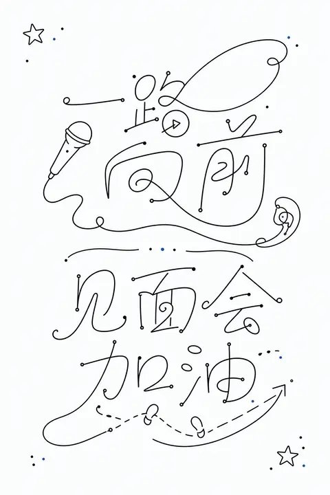
这个页面把案例媒体、完整 Prompt 和出处放在一起,方便你先看结果,再判断这条 Prompt 是否值得复制、收藏或加入对比。
案例解读
为了方便搜索、引用和后续复用,这里会把案例的适用场景、画面重点和 Prompt 结构拆成更容易浏览的说明。
这类案例适合用在什么场景
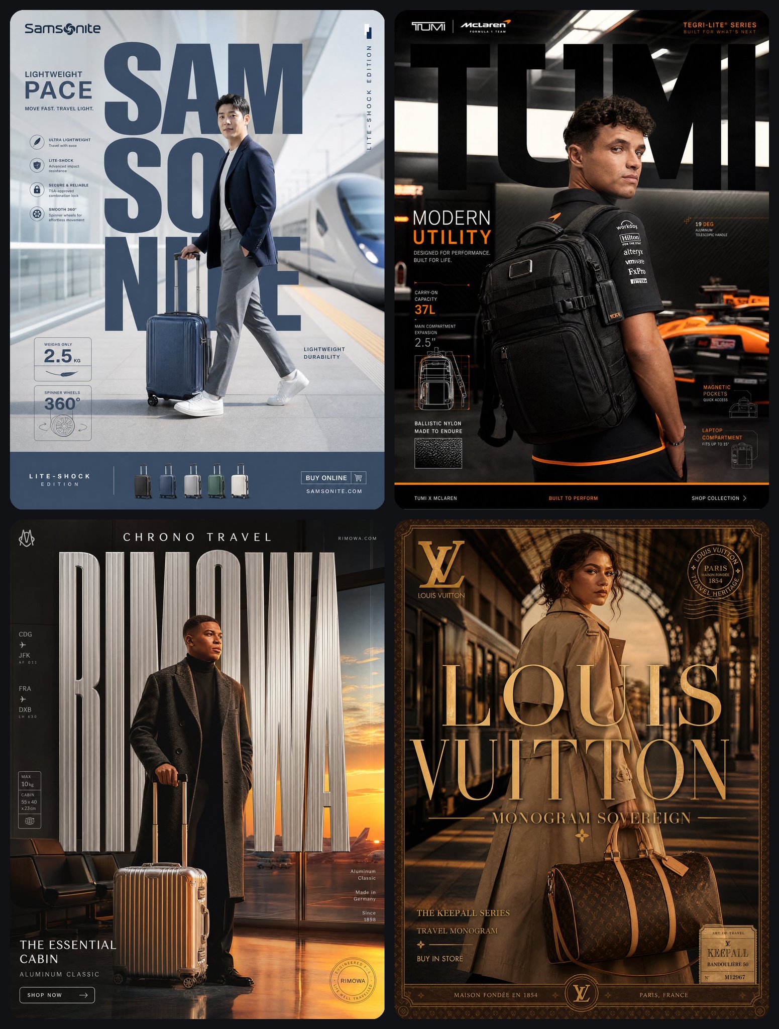
- 把它当作 海报与插画 的基准案例最合适,先看成片方向,再决定自己的 Prompt 要往哪边改。
- 如果你的目标也落在 海报、插画、截图 这些方向,这条案例特别适合先看图判断风格,再回头微调描述。
- 做 Prompt 对比时,也很适合作为控制组,只改一个变量去看结果变化。
画面重点与风格信号
- 这条案例最明显的风格信号集中在 海报、插画、截图,所以第一次改写时最好先保留这些关键词。
- 重点多半在版式节奏、标题层级、插画材质和信息在画面里的摆放方式。
- 当前保留了 2 份媒体输出,适合顺手观察同一方向在多张结果里的稳定性。
Prompt 结构可以怎么理解
- 这条 Prompt 整体属于一条比较长、约束条件很多的 Prompt,很适合拿来判断这类方向到底需要写到多细。
- 关键词簇主要围绕 海报、插画、截图 展开,所以复用时可以先保留这组风格词,再替换主体、镜头、环境或文案信息。
- 最稳的改写方式通常是先保留结果方向和最强风格信号,只替换主体设定与场景块。
如果你是带着问题来的,可以先看这些角度
- 如果保留 海报、插画、截图,只换主体题材,结果最先变化的会是哪一部分?
- 这条结果里,哪些特征更像是 海报与插画 的结构特征,哪些又是标签风格本身带来的?
- 同分类的相关案例里,哪几条能给你更克制或更极致的相邻变体?
完整 Prompt
Generate a set of minimalist handwritten glyph graphics around any subject, translating the theme content into single-line symbols between readable and unreadable: the main body consists of continuous strokes like fine black lines, with stable line thickness and rounded turns, strokes extending locally into loops, arcs, back hooks, and intersecting structures, making the graphics look like text, marks, or lightweight abstract patterns. The screen uses a large amount of clean white space to support the main body, the visual weight is concentrated near the central axis, multiple glyph units maintain clear spacing, forming a quiet reading rhythm vertically; inside each unit, a few dots are used as start, stop, pause, and emphasis of strokes, the dot area is very small but accurately positioned, strengthening the beat of the hand-drawn trajectory. Line edges are clean, no burrs, no shadows, no complex textures, overall looking like a restrained and precise handwritten design draft. Colors are extracted from the material and emotion of the theme itself, but only mapped to very few roles: a large area of high-brightness clear base color serves as airiness and cleanliness, the main body uses clear structural dark colors derived from the theme, and small dots can carry the same structural color or a small amount of theme accent color; maintain a bright, clean, well-ventilated emotion, relying on high contrast, low color volume, and clear color steps to establish memory points, without letting color overwhelm the main subject. The final effect should retain the visual surprise of lightweight line drawing, white space pressure, dot-line rhythm, and glyph superposition, avoiding becoming ordinary typography, decorative graffiti, or dense illustration. —————— Bookstore banner: horizontal version 16:9, theme of new book sharing session, several sets of single-line glyphs like open book pages, bookmarks, and a circled excerpt. Information printed in the picture: "Write the Days a Little Slower" Author Sharing, Saturday 15:00, Second Floor Small Hall. Detail reminder: Dots can be like pencil pause points, the main body is concentrated on the central axis, and large areas of white space are maintained around it suitable for public account covers.