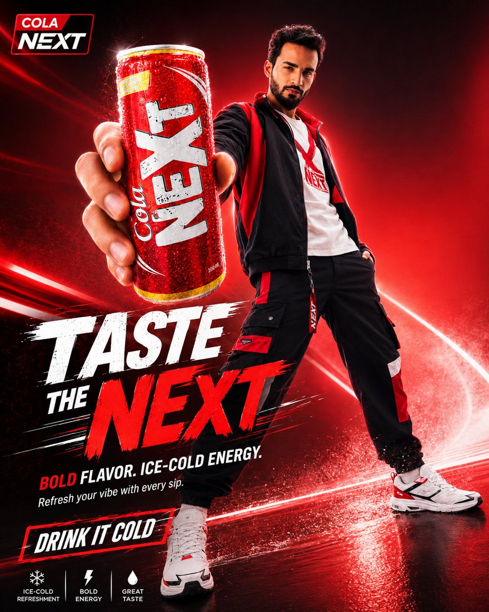
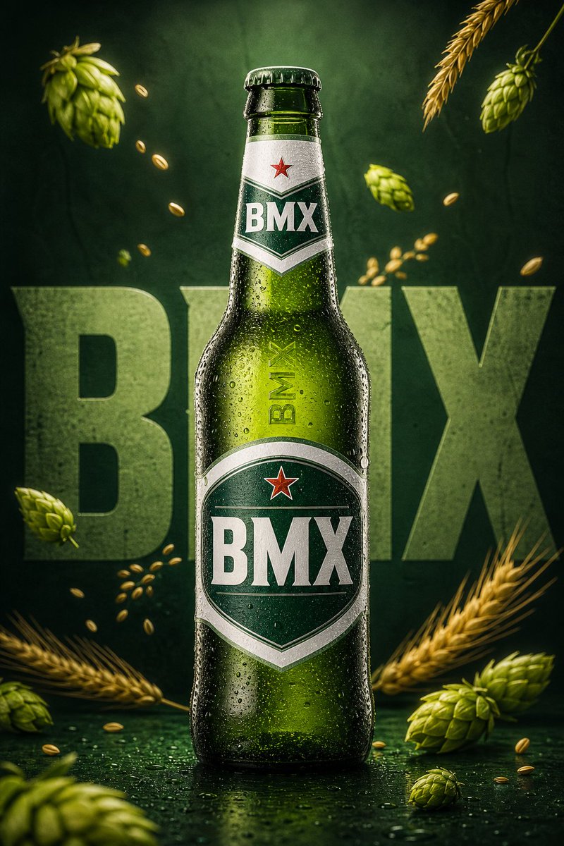
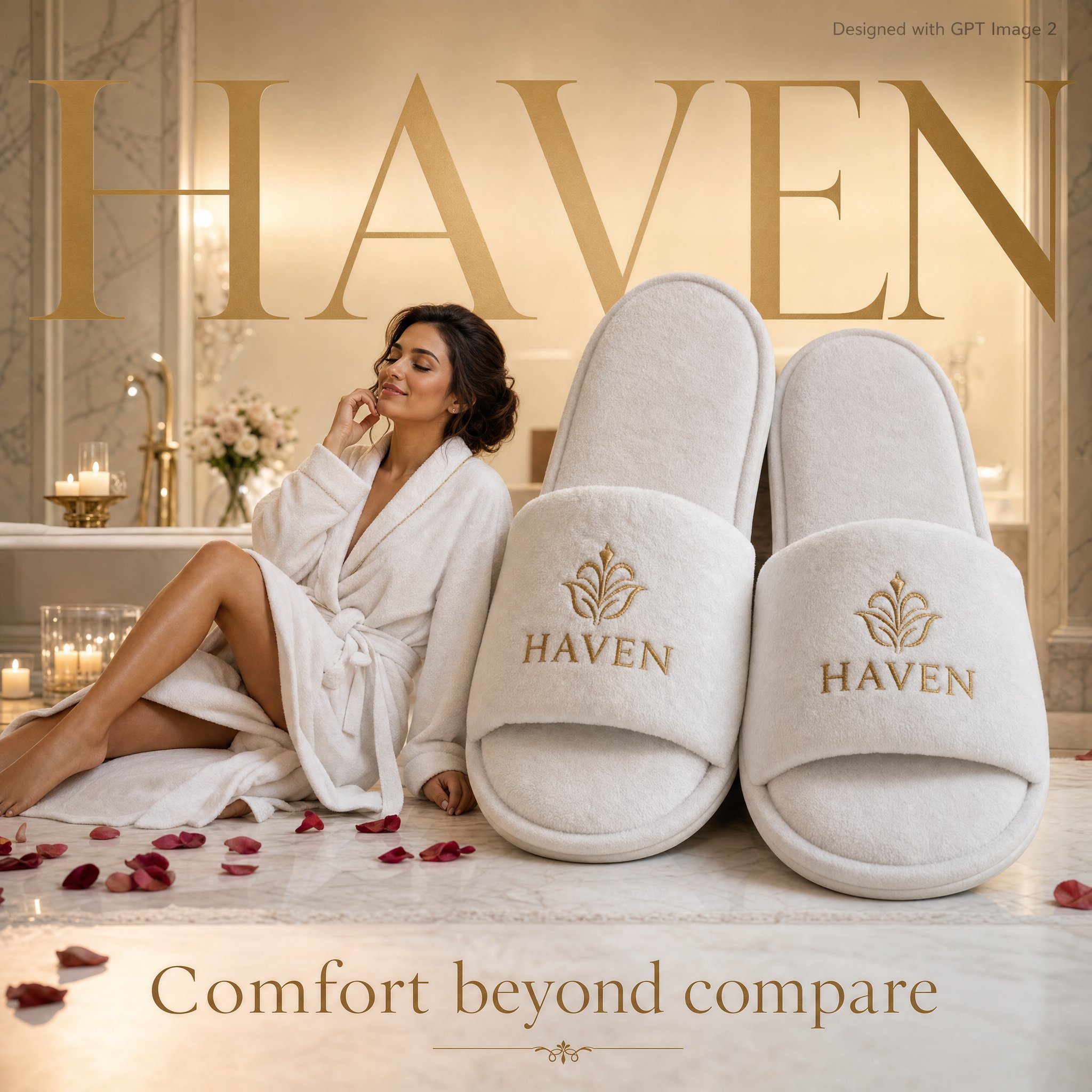
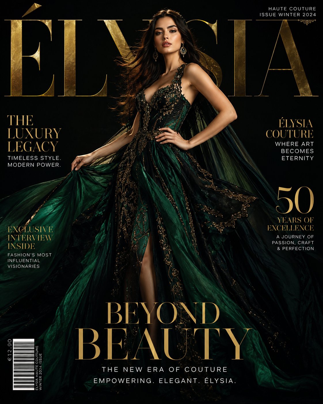
案例媒体
案例说明
这个页面把案例媒体、完整 Prompt 和出处放在一起,方便你先看结果,再判断这条 Prompt 是否值得复制、收藏或加入对比。
案例解读
为了方便搜索、引用和后续复用,这里会把案例的适用场景、画面重点和 Prompt 结构拆成更容易浏览的说明。
这类案例适合用在什么场景
- 把它当作 人像与摄影 的基准案例最合适,先看成片方向,再决定自己的 Prompt 要往哪边改。
- 如果你的目标也落在 人像、排版、品牌 这些方向,这条案例特别适合先看图判断风格,再回头微调描述。
- 做 Prompt 对比时,也很适合作为控制组,只改一个变量去看结果变化。
画面重点与风格信号
- 这条案例最明显的风格信号集中在 人像、排版、品牌,所以第一次改写时最好先保留这些关键词。
- 重点先看构图、光线方向、人物姿态,以及主体和镜头之间的距离感。
- 当前保留了 3 份媒体输出,适合顺手观察同一方向在多张结果里的稳定性。
Prompt 结构可以怎么理解
- 这条 Prompt 整体属于一条比较长、约束条件很多的 Prompt,很适合拿来判断这类方向到底需要写到多细。
- 关键词簇主要围绕 人像、排版、品牌 展开,所以复用时可以先保留这组风格词,再替换主体、镜头、环境或文案信息。
- 最稳的改写方式通常是先保留结果方向和最强风格信号,只替换主体设定与场景块。
如果你是带着问题来的,可以先看这些角度
- 如果保留 人像、排版、品牌,只换主体题材,结果最先变化的会是哪一部分?
- 这条结果里,哪些特征更像是 人像与摄影 的结构特征,哪些又是标签风格本身带来的?
- 同分类的相关案例里,哪几条能给你更克制或更极致的相邻变体?
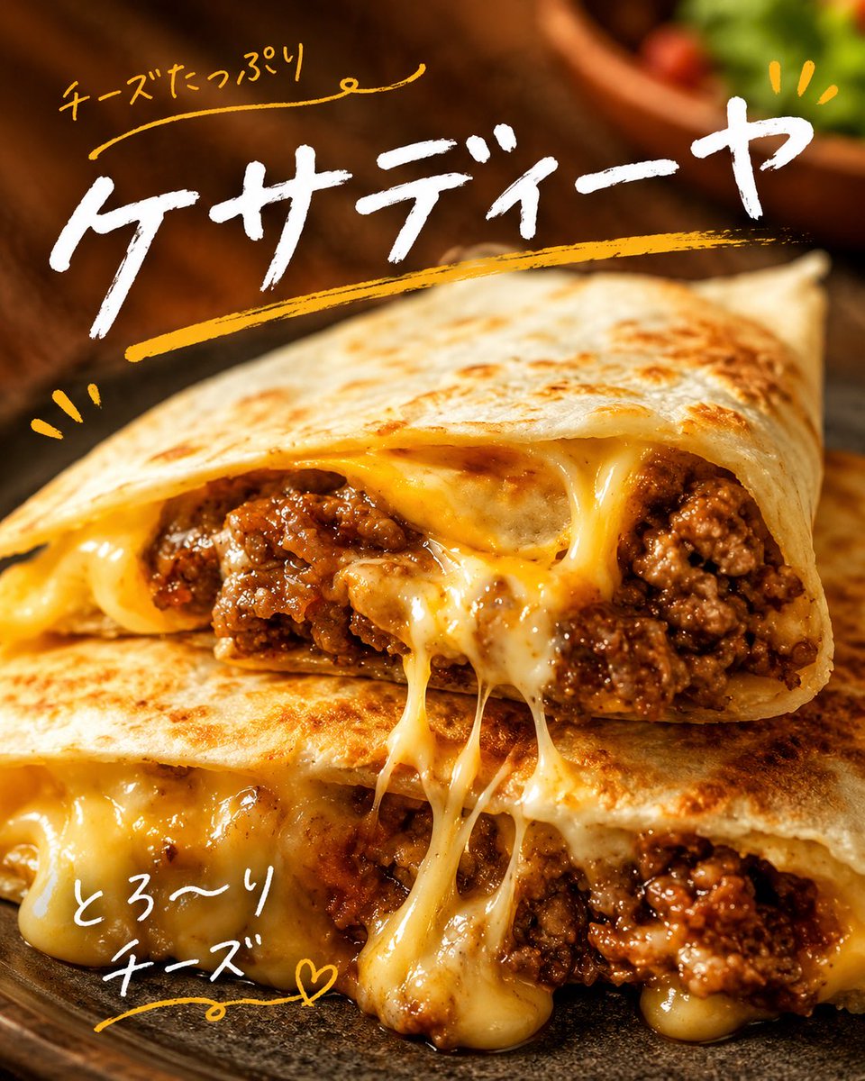
完整 Prompt
Create a square 1:1 close-up food advertisement photo of a cheesy quesadilla, shot in warm golden light with shallow depth of field. The foreground shows two stacked triangular halves of a toasted flour tortilla quesadilla on a dark rustic plate, cut open so the filling is highly visible: browned spiced ground beef, glossy sauce, and abundant melted yellow-white cheese stretching in long strands between the top and bottom pieces and dripping over the edges. The tortilla surface should be crisp with scattered golden-brown char marks and soft blistering. Use a dark wooden table background, softly blurred, with a small out-of-focus bowl of greens and cherry tomatoes in the upper right. Overlay energetic Japanese handwritten brush typography: exactly 3 text elements, consisting of 1 small orange handwritten line at the upper left reading {argument name="top handwritten text" default="チーズたっぷり"} with a curved underline flourish, 1 large bold white brush-script headline across the upper center reading {argument name="main headline text" default="ケサディーヤ"}, and 1 smaller white handwritten note at the lower left reading {argument name="bottom handwritten text" default="とろ〜り チーズ"}. Add exactly 4 orange doodle accents: a thick orange brush underline sweeping beneath the main headline, two short orange emphasis marks near the lower left edge, three short orange rays near the upper right of the headline, and a small orange heart beside the lower-left note. Make the typography look like casual hand-painted Japanese marker lettering, slightly imperfect and organic. Keep the food hyper-realistic, appetizing, high contrast, with saturated cheese yellows, rich beef browns, and a cozy restaurant-menu feel. No people, no logos, no watermarks, no extra text.