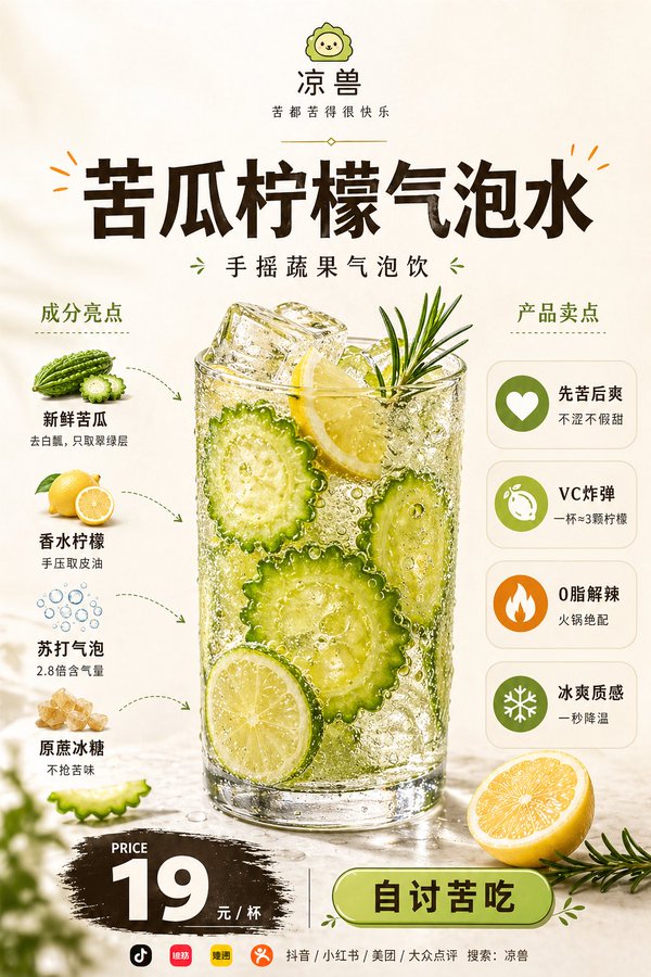
案例媒体
案例说明
这个页面把案例媒体、完整 Prompt 和出处放在一起,方便你先看结果,再判断这条 Prompt 是否值得复制、收藏或加入对比。
案例解读
为了方便搜索、引用和后续复用,这里会把案例的适用场景、画面重点和 Prompt 结构拆成更容易浏览的说明。
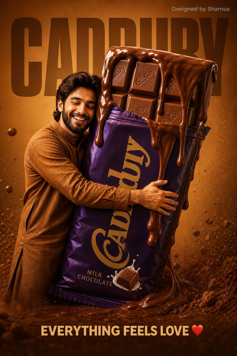
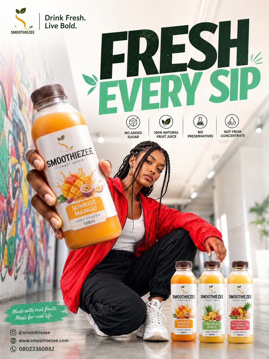
这类案例适合用在什么场景
- 把它当作 人像与摄影 的基准案例最合适,先看成片方向,再决定自己的 Prompt 要往哪边改。
- 如果你的目标也落在 人像、海报、排版 这些方向,这条案例特别适合先看图判断风格,再回头微调描述。
- 做 Prompt 对比时,也很适合作为控制组,只改一个变量去看结果变化。
画面重点与风格信号
- 这条案例最明显的风格信号集中在 人像、海报、排版,所以第一次改写时最好先保留这些关键词。
- 重点先看构图、光线方向、人物姿态,以及主体和镜头之间的距离感。
- 当前保留了 2 份媒体输出,适合顺手观察同一方向在多张结果里的稳定性。
Prompt 结构可以怎么理解
- 这条 Prompt 整体属于一条比较长、约束条件很多的 Prompt,很适合拿来判断这类方向到底需要写到多细。
- 关键词簇主要围绕 人像、海报、排版 展开,所以复用时可以先保留这组风格词,再替换主体、镜头、环境或文案信息。
- 最稳的改写方式通常是先保留结果方向和最强风格信号,只替换主体设定与场景块。
如果你是带着问题来的,可以先看这些角度
- 如果保留 人像、海报、排版,只换主体题材,结果最先变化的会是哪一部分?
- 这条结果里,哪些特征更像是 人像与摄影 的结构特征,哪些又是标签风格本身带来的?
- 同分类的相关案例里,哪几条能给你更克制或更极致的相邻变体?
完整 Prompt
Based on the food image uploaded by the user, create a highly polished "Food Hero Explainer Poster" suitable for social media publishing and food brand promotion. 【User Input】 Brand Name: [Enter Brand Name] Brand Subtitle / Slogan: [Enter a Short Slogan] Product Name: [Enter Product Name] Product Category: [Fast Food / Main Dish / Beverage / Dessert / Local Cuisine / Baking / Light Meal / Other] Left Ingredient List: [Enter 4–6 Main Ingredients, Each with a Short Description] Right Selling Point List: [Enter 4–5 Nutritional or Product Selling Points, Each with a Short Description] Price: [Enter Price] Price Unit: [Per Serving / Per Cup / Per Box / PER SERVING / PER CUP / PER BOX] Button Text: [Order Now / Buy Now / Place Order Now / ORDER NOW / BUY NOW] Bottom Guide Text: [e.g.: More New Products | Promotions | Brand Updates / Get New Product and Discount Info / Follow for More Benefits] Bottom Platform Icon Combination: [e.g.: Douyin + Xiaohongshu + Video Account + Official Account; or Douyin + Xiaohongshu + Meituan + Dianping] Bottom Search Guide: [e.g.: Search Across All Platforms: Brand Name / Search Brand Name: XXXX] Accent Color: [e.g. Orange / Red / Golden Yellow / Green / Strawberry Pink / Black Gold Orange] Aspect Ratio: [Portrait 2:3] 【Core Reference Rules】 Image A is the main food reference image uploaded by the user, and also the core main visual basis for this poster. Must strictly preserve the food's type, main appearance, overall structure, core plating method, main ingredient expression, color tendency, and realistic texture. Do not replace this dish with another food, do not regenerate a different dish, do not change to a different plating logic, do not make the food look distorted. While maintaining consistency of the main subject, moderately optimize lighting, clarity, shadow layers, spatial sense, and commercial photography texture to make it look more like professional food photography in high-end restaurant advertisements, but cannot change the product itself. The key point is: preserve the original dish's recognizability, only upgrade the poster packaging, layout design, and overall visual presentation. 【Overall Positioning】 This is not an ordinary menu image, nor purely food photography, but a commercial promotional poster integrating "high-end restaurant brand advertisement + food main visual + ingredient explanation + selling point information bar + price conversion zone". The overall temperament should present premium, clean, modern, polished, appetizing, realistic, professional food advertisement, suitable for new product promotion, delivery platform display, brand promotion, social media publishing, and restaurant single-item advertisement. 【Background and Overall Style】 Use soft warm off-white, cream white, light warm beige as the background, overall clean and simple, with a slight premium paper texture or soft studio shooting spatial sense. The image should have comfortable white space, balanced layout, fresh visual feel, reflecting modern restaurant brand sense, light luxury menu sense, and high-completion commercial advertisement sense. Do not use complex backgrounds, do not over-decorate, do not have a cheap feel, do not have cluttered colors interfering with the main subject. 【Layout Structure】 Adopt a stable portrait center composition, with clear information zoning, distinct primary and secondary elements, and a natural overall reading path: 1. Top Brand Zone - Place a clean brand logo / small icon centered at the top - Below is the brand name - Further below is a brand subtitle / slogan - A thin, delicate divider line or short decorative line may be added - Overall clean, modern, with brand recognizability 2. Upper-Middle Title Zone - Use a large bold title to display [Product Name] - The title is centered above the main dish - The font is heavy, eye-catching, modern, with a premium commercial advertisement feel - Color suggestion is dark coffee, dark brown-black, or near-black - A small number of small decorative lines, short dashes, or emphasis symbols consistent with the accent color may be added - The title must be clear and impactful, serving as one of the first visual focal points of the image 3. Central Main Visual Zone - The food corresponding to Image A is the core protagonist of the entire image - The main dish is placed in the center of the image, large in size, high in visual proportion, and strongly dominant - The food must present high-quality commercial food photography texture: realistic, tempting, clear, rich in detail, and highly appetizing - Preserve the original food type and basic plating logic, only optimize lighting, details, layers, and refinement - A small number of related garnishes may be added at the bottom or around the food, such as vegetables, herbs, fruit slices, sauce elements, etc., but must not overshadow the main subject - Do not generate ugly, distorted, cheap, or overly AI-looking food effects 4. Left Ingredient Explanation Zone - Set title: INGREDIENTS or Ingredient Highlights - Vertically arrange 4–6 ingredient modules - Each module contains: a real small ingredient image + ingredient name + a very short description - Small ingredient images are recommended to be in a clean cutout-style commercial photography style, with slight shadows - Use thin dashed arrows, curved arrows, or simple guide lines to establish a connection with the main dish - Information should be short and clear, do not write in long paragraphs - The left modules should overall be refined and orderly, not cluttered and stacked 5. Right Selling Point Explanation Zone - Set title: NUTRITIONAL BENEFITS / PRODUCT BENEFITS / Product Selling Points - Use simple, unified circular icons + selling point title + a short description - Vertically arrange 4–5 selling point modules - Icon style should be unified, modern, and simple, not complex and flashy - Selling points can be expressed around directions such as: high protein, rich in vitamins, energy replenishment, rich mouthfeel, refreshing and non-greasy, satisfying and filling, light burden, authentic ingredients - Expression should lean toward commercial marketing selling points, do not use exaggerated medical efficacy or treatment-oriented expressions - The right modules should be clear and readable, but cannot overpower the visual weight of the central main dish 6. Bottom Price and Conversion Zone - Set a PRICE or 价格 title centered at the bottom - The price uses eye-catching large font, placed on a dark brush-stroke style background board - The price needs to be very clear and prominent, with accurate currency unit - Below, supplement the price unit, such as PER SERVING / Per Serving - Further below, add a modern rounded-corner outlined button, with button text being [Button Text] - The button should be clean, have a clickable feel, and possess a commercial conversion sense - Overall, it should form a clear purchase guide, but should not look too much like a low-end promotional flyer 7. Bottommost Localized Social Guide Zone - Do not use "Follow Us" - Do not use overseas social platform logic such as Instagram, Facebook, TikTok, unless the user explicitly requests it - Do not simultaneously display the dual presentation of "platform logo + platform text name" - Do not repeatedly display platform names - The bottom only retains a simple three-layer structure: 1) One line of Chinese guide text 2) One row of small-sized platform icons 3) One line of Chinese search prompt - The first line uses Chinese guide text, e.g.: [Bottom Guide Text] - The second line only displays small-sized logo icons of 3–4 common Chinese platforms, no longer repeatedly writing platform text names - Platform icons are selected from [Bottom Platform Icon Combination], e.g.: Douyin, Xiaohongshu, Video Account, Official Account, Meituan, Dianping - Recommended priority combinations: A. Douyin + Xiaohongshu + Video Account + Official Account (more suitable for brand promotion and content dissemination) B. Douyin + Xiaohongshu + Meituan + Dianping (more suitable for local life and store conversion) - Platform icons should be small-sized, unified in style, simply arranged, and can adopt monochrome dark, low-saturation style or simplified brand recognition style - Icons only serve as a delicate bottom decoration, should not be too large, should not be eye-catching, and should not affect the overall premium feel - The third line uses Chinese search guide, e.g.: [Bottom Search Guide] - Do not use @accounts, do not make complex explanations, do not repeat platform names - The overall effect should be simple, refined, localized, and credible, like the lightweight closing information at the bottom of a real Chinese restaurant brand poster 【Color Control】 The overall base color is mainly warm white / off-white / cream white, creating a clean, premium, warm, and appetizing tone. The main text color is mainly dark brown, dark coffee, or near-black, forming a high-contrast reading experience. The accent color uses [Accent Color], uniformly used for logo details, decorative lines, button elements, title small decorations, local emphasis, etc. The natural colors of the food itself must become the core visual color source of the image, overall both unified and layered, cannot be gray-dirty or cheap. 【Texture Requirements】 The main food must possess the texture of premium food photography: - sharp details - rich colors - realistic texture - natural highlights - believable shadows - appetizing presentation - polished commercial finish The overall poster should look like a high-end promotional poster that a real restaurant brand would publish, rather than an ordinary AI collage image or a low-end menu page. 【Text and Information Density】 The image needs to have a certain amount of information, but must control clarity and readability. All small text should be short, accurate, and clear, not too long. The left ingredient explanation and right selling point explanation should both be concise and powerful, avoiding text stacking. Title, price, button, and brand name must be clear and eye-catching. Do not appear garbled text, typos, incorrect prices, incorrect brand names, disordered English, or unnatural copy. 【Restriction Requirements】 Do not replace the uploaded food. Do not generate another dish. Do not change the essential appearance and recognition features of the food. Do not let the left and right information zones steal the visual dominance of the central main dish. Do not excessively stack small text. Do not use messy fonts. Do not appear garbled text, typos, incorrect prices, or incorrect brand names. Do not let icon styles be messy and inconsistent. Do not make it into a low-end menu, cheap flyer, or overly templated poster. Do not appear ugly AI-looking food. Do not let the bottom social zone be too complex, do not repeatedly display platform information, do not let the bottom be more eye-catching than the price zone. Ultimately output a portrait 2:3 high-end restaurant product promotional poster with strong commercial feel, high appetizing feel, high completion, balanced layout, clear brand recognition, suitable for Chinese local restaurant brand promotion use.