案例媒体
案例说明
这个页面把案例媒体、完整 Prompt 和出处放在一起,方便你先看结果,再判断这条 Prompt 是否值得复制、收藏或加入对比。
案例解读
为了方便搜索、引用和后续复用,这里会把案例的适用场景、画面重点和 Prompt 结构拆成更容易浏览的说明。
这类案例适合用在什么场景
- 把它当作 人像与摄影 的基准案例最合适,先看成片方向,再决定自己的 Prompt 要往哪边改。
- 如果你的目标也落在 人像、电影感、时尚 这些方向,这条案例特别适合先看图判断风格,再回头微调描述。
- 做 Prompt 对比时,也很适合作为控制组,只改一个变量去看结果变化。
画面重点与风格信号
- 这条案例最明显的风格信号集中在 人像、电影感、时尚,所以第一次改写时最好先保留这些关键词。
- 重点先看构图、光线方向、人物姿态,以及主体和镜头之间的距离感。
- 当前只有一张主图,所以第一张结果图就是最核心的参考基准。
Prompt 结构可以怎么理解
- 这条 Prompt 整体属于一条比较长、约束条件很多的 Prompt,很适合拿来判断这类方向到底需要写到多细。
- 关键词簇主要围绕 人像、电影感、时尚 展开,所以复用时可以先保留这组风格词,再替换主体、镜头、环境或文案信息。
- 最稳的改写方式通常是先保留结果方向和最强风格信号,只替换主体设定与场景块。
如果你是带着问题来的,可以先看这些角度
- 如果保留 人像、电影感、时尚,只换主体题材,结果最先变化的会是哪一部分?
- 这条结果里,哪些特征更像是 人像与摄影 的结构特征,哪些又是标签风格本身带来的?
- 同分类的相关案例里,哪几条能给你更克制或更极致的相邻变体?
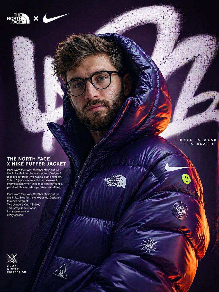
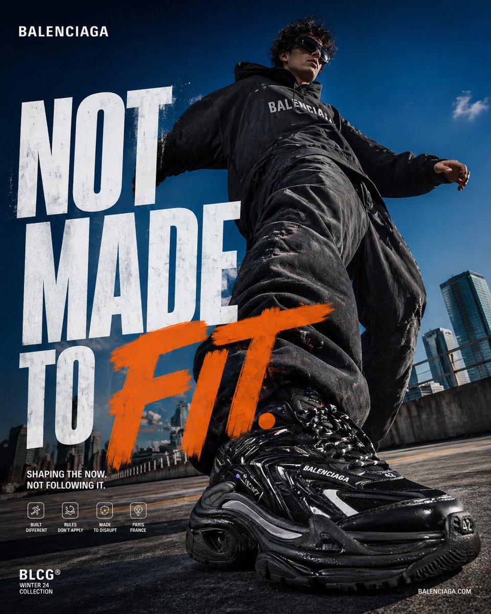
完整 Prompt
4:5 vertical poster, ultra high resolution, 8K, luxury fashion campaign, editorial + commercial hybrid, print-ready sharpness CORE IDEA: A bold, disruptive fashion statement where movement is exaggerated and dominant, but still feels controlled, raw, and premium. The subject doesn’t just move — they impose presence through scale and perspective. SCENE / ENVIRONMENT: Urban rooftop parking structure Background: * Deep blue sky with minimal clouds * Clean modern skyline (slightly blurred, secondary focus) Environment: * Concrete ground with subtle texture * Warm sunlight hitting surface (adds contrast against dark outfit) Mood: * Mix of realism + high-energy campaign aesthetic SUBJECT: Male fashion model in Balenciaga oversized streetwear Outfit: * Black oversized hoodie (Balenciaga logo visible) * Extremely baggy distressed black pants * Chunky Balenciaga sneakers (Track / Triple S style) * Dark sunglasses Pose: * Mid-step forward motion * One foot extremely close to camera (hero perspective) * Body slightly leaning forward * Arms relaxed but dynamic Expression: * Confident, detached, effortless dominance PRODUCT FOCUS: Sneaker dominates foreground * Ultra detailed textures (rubber, mesh, dirt, reflections) * Glossy + matte material contrast * Perspective distortion exaggerates size * Front shoe = tack sharp * Background shoe slightly softer TYPOGRAPHY: Primary Headline: NOT MADE TO FIT. Layout: * Left aligned stacked text * “FIT.” large and aggressive * Slight overlap with subject Font: * Bold condensed sans-serif * Distressed / grunge texture Color: * White for main text * Accent word “FIT.” in bold painted orange brush style SECONDARY TEXT: Placed bottom-left: “SHAPING THE NOW. NOT FOLLOWING IT.” Small icon row (minimal, premium feel): * Built Different * Rules Don’t Apply * Made to Disrupt * Paris France BRANDING: Top-left: BALENCIAGA (clean, minimal) Bottom-left: BLCG® Winter 24 Collection Bottom-right: balenciaga COLOR GRADING: * High contrast * Deep blacks + vibrant sky blues * Warm highlights from sunlight * Slight cinematic tone LIGHTING: * Natural sunlight (golden hour leaning toward daylight) * Hard shadows for depth * Specular highlights on sneaker CAMERA: * Ultra wide-angle (18–24mm) * Very low angle (ground level) * Forced perspective exaggeration Depth: * Foreground sharp * Background slightly blurred TEXTURE / FINISH: * Subtle grain (2–3%) * Slight sharpening on product * Micro contrast boost * Clean but not overly polished DESIGN INTENT (IMPORTANT): * Feels like Nike energy + Balenciaga attitude hybrid * Bold enough for social media * Premium enough for billboard * Immediate scroll-stopping impact