案例媒体
案例说明
这个页面把案例媒体、完整 Prompt 和出处放在一起,方便你先看结果,再判断这条 Prompt 是否值得复制、收藏或加入对比。
案例解读
为了方便搜索、引用和后续复用,这里会把案例的适用场景、画面重点和 Prompt 结构拆成更容易浏览的说明。
这类案例适合用在什么场景
- 把它当作 人像与摄影 的基准案例最合适,先看成片方向,再决定自己的 Prompt 要往哪边改。
- 如果你的目标也落在 霓虹、人像、城市视觉 这些方向,这条案例特别适合先看图判断风格,再回头微调描述。
- 做 Prompt 对比时,也很适合作为控制组,只改一个变量去看结果变化。
画面重点与风格信号
- 这条案例最明显的风格信号集中在 霓虹、人像、城市视觉,所以第一次改写时最好先保留这些关键词。
- 重点先看构图、光线方向、人物姿态,以及主体和镜头之间的距离感。
- 当前只有一张主图,所以第一张结果图就是最核心的参考基准。
Prompt 结构可以怎么理解
- 这条 Prompt 整体属于一条比较长、约束条件很多的 Prompt,很适合拿来判断这类方向到底需要写到多细。
- 关键词簇主要围绕 霓虹、人像、城市视觉 展开,所以复用时可以先保留这组风格词,再替换主体、镜头、环境或文案信息。
- 最稳的改写方式通常是先保留结果方向和最强风格信号,只替换主体设定与场景块。
如果你是带着问题来的,可以先看这些角度
- 如果保留 霓虹、人像、城市视觉,只换主体题材,结果最先变化的会是哪一部分?
- 这条结果里,哪些特征更像是 人像与摄影 的结构特征,哪些又是标签风格本身带来的?
- 同分类的相关案例里,哪几条能给你更克制或更极致的相邻变体?
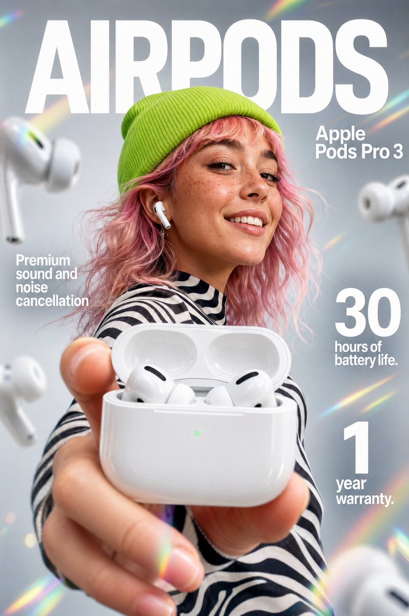
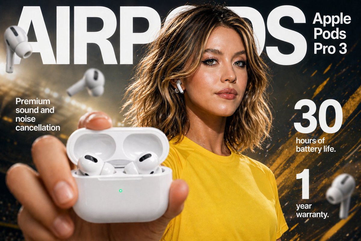
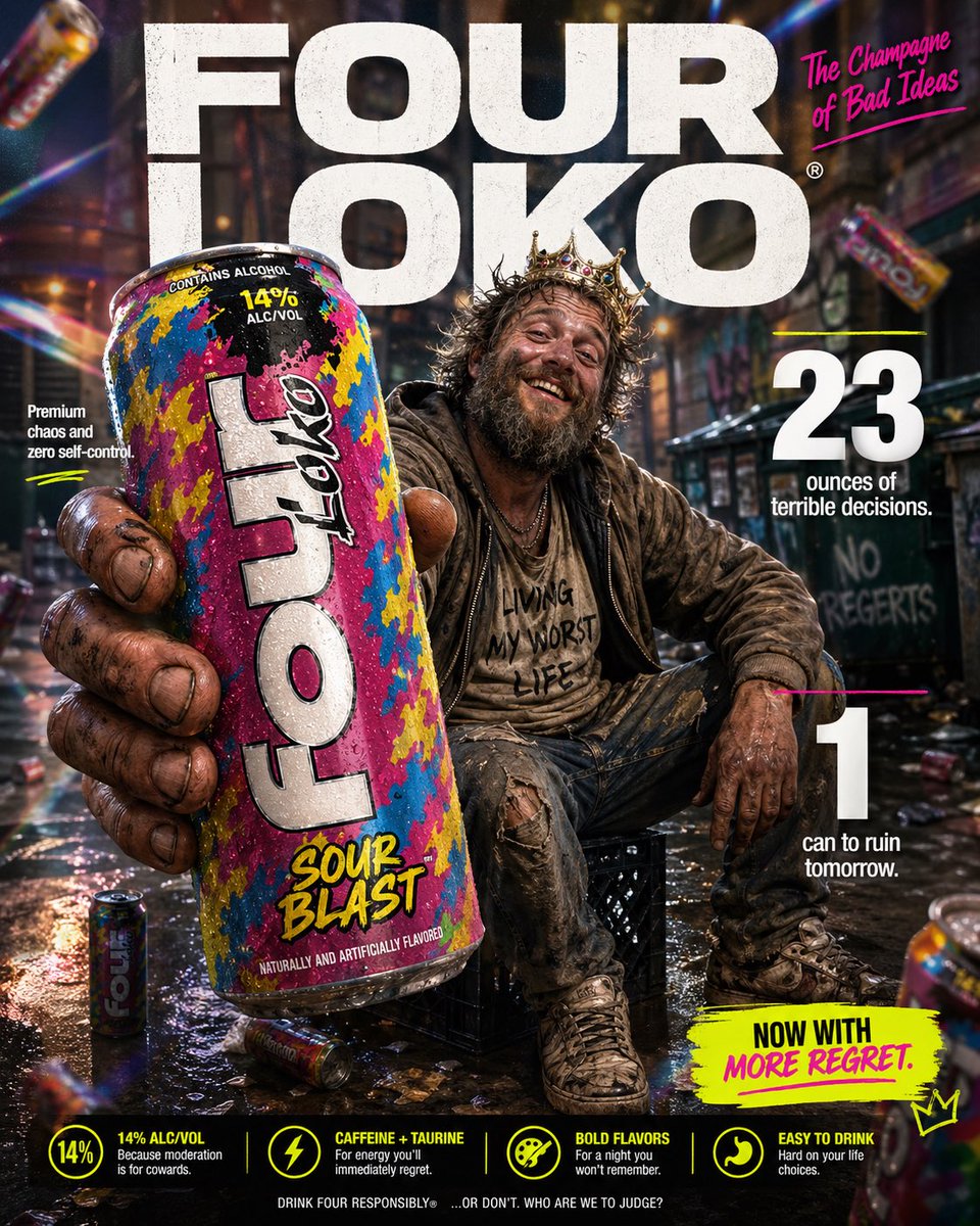
完整 Prompt
High-impact parody e-commerce infographic for “{argument name="product" default="Four Loko"}” malt beverage. Foreground: An extreme close-up of a rough, weathered hand holding a tall, brightly colored can of {argument name="product" default="Four Loko"} toward the camera. The can is slightly cold with visible condensation droplets and a loud, chaotic flavor design. The hand and can have a slight macro-lens blur for depth, with the can still reading clearly as the hero product. Central Subject: In the mid-ground, a funny, disheveled {argument name="subject" default="homeless-looking man"} sitting casually on a milk crate in an urban alley. He has a scruffy beard, messy hair, layered worn clothing, and a huge unbothered grin. He should look chaotic but oddly charismatic, like the accidental king of bad decisions. He is posed like a confident lifestyle-ad model, proudly showing off the can. Background & Lighting: A ridiculously polished ad-style backdrop mixed with a grimy city alley setting. Soft-focus urban textures, dumpster shapes, graffiti hints, and scattered clutter in the distance. Add dramatic studio lighting, soft glow, rainbow prism flares, and subtle light leaks to make the whole thing look way too premium for the subject matter. A few blurred {argument name="product" default="Four Loko"} cans can float artistically in the background for extra absurdity. Typography & Layout (Bold sans-serif, white and neon accent styling): Top Center (Background): Massive, bold text reading “{argument name="brand name" default="FOUR LOKO"}” positioned behind the subject. Top Right: Bold text reading “The Champagne of Bad Ideas”. Mid-Left: “Premium chaos and zero self-control” Mid-Right: Large, bold “23” with the text “ounces of terrible decisions.” Bottom-Right: Large, bold “1" with the text “can to ruin tomorrow.” Optional small callout text near the bottom: “Now with more regret.” Style: Ultra-detailed, 8k parody commercial photography, sharp focus on the can, shallow depth of field, vibrant trashy color palette, clean advertising composition, exaggerated premium product-ad aesthetic, funny visual contrast between polished branding and the wrecked subject.