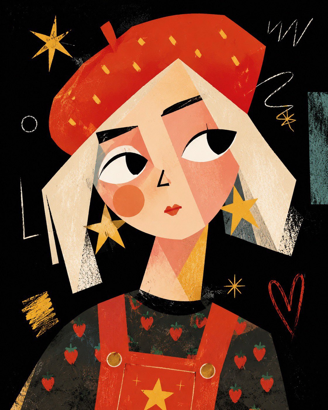
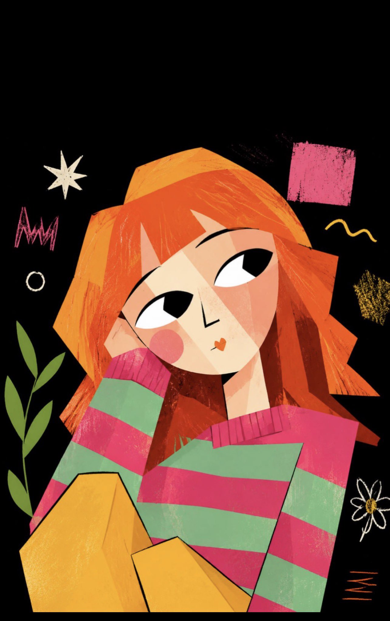
案例媒体
案例说明
这个页面把案例媒体、完整 Prompt 和出处放在一起,方便你先看结果,再判断这条 Prompt 是否值得复制、收藏或加入对比。
案例解读
为了方便搜索、引用和后续复用,这里会把案例的适用场景、画面重点和 Prompt 结构拆成更容易浏览的说明。
这类案例适合用在什么场景
- 把它当作 人像与摄影 的基准案例最合适,先看成片方向,再决定自己的 Prompt 要往哪边改。
- 如果你的目标也落在 人像、时尚、海报 这些方向,这条案例特别适合先看图判断风格,再回头微调描述。
- 做 Prompt 对比时,也很适合作为控制组,只改一个变量去看结果变化。
画面重点与风格信号
- 这条案例最明显的风格信号集中在 人像、时尚、海报,所以第一次改写时最好先保留这些关键词。
- 重点先看构图、光线方向、人物姿态,以及主体和镜头之间的距离感。
- 当前保留了 2 份媒体输出,适合顺手观察同一方向在多张结果里的稳定性。
Prompt 结构可以怎么理解
- 这条 Prompt 整体属于一条比较长、约束条件很多的 Prompt,很适合拿来判断这类方向到底需要写到多细。
- 关键词簇主要围绕 人像、时尚、海报 展开,所以复用时可以先保留这组风格词,再替换主体、镜头、环境或文案信息。
- 最稳的改写方式通常是先保留结果方向和最强风格信号,只替换主体设定与场景块。
如果你是带着问题来的,可以先看这些角度
- 如果保留 人像、时尚、海报,只换主体题材,结果最先变化的会是哪一部分?
- 这条结果里,哪些特征更像是 人像与摄影 的结构特征,哪些又是标签风格本身带来的?
- 同分类的相关案例里,哪几条能给你更克制或更极致的相邻变体?
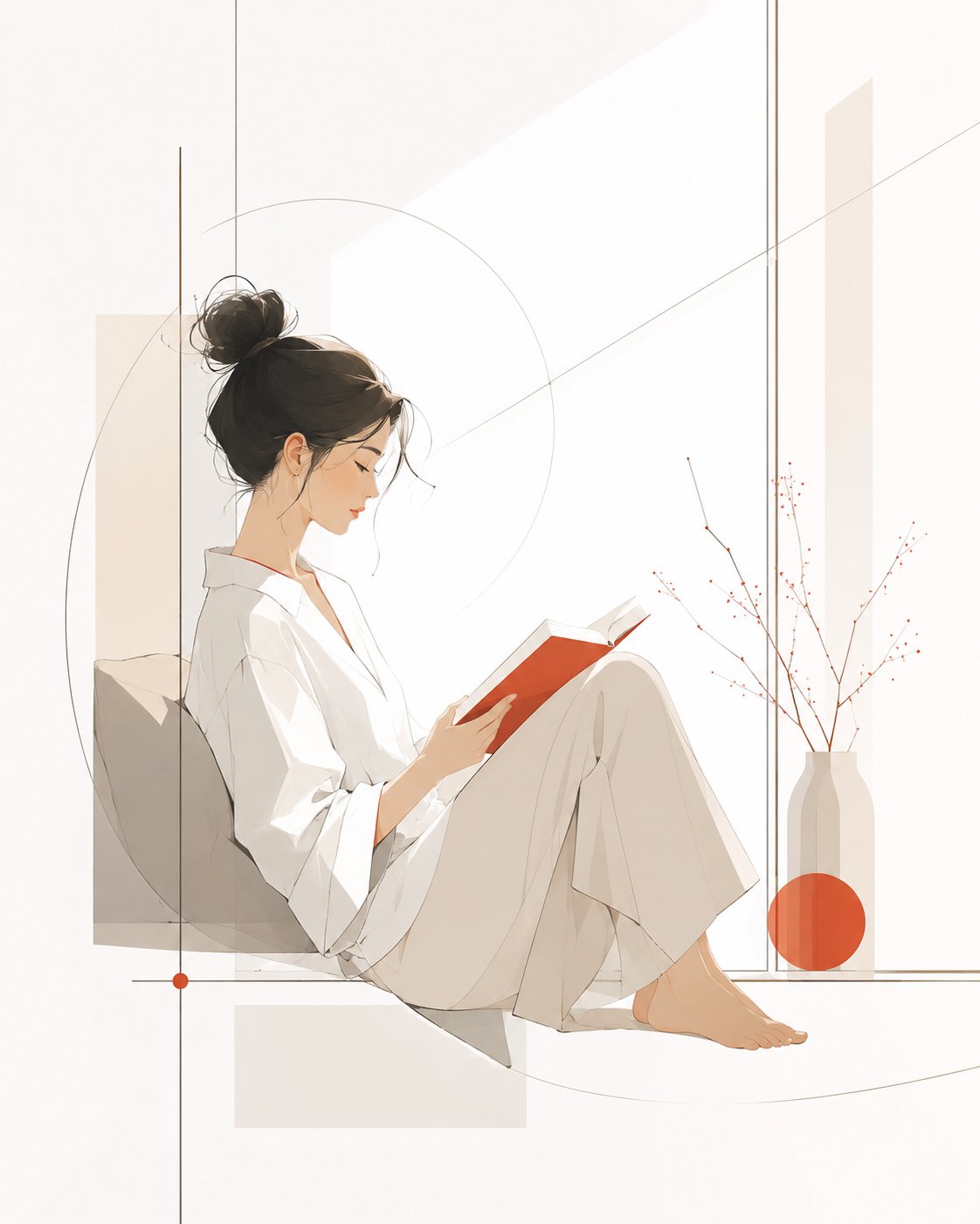
完整 Prompt
[System Name] Modern Minimalist Magazine Style Illustration Prompt Template | Premium Negative Space Edition [User Input Parameters] Subject Content: An elegant woman reading by a window Subject Temperament: Quiet, gentle, relaxed, modern Image Usage: Magazine inner page Main Tones: Creamy white, light gray, oatmeal Accent Color: Vermilion Aspect Ratio: 4:5 [Final Prompt] A modern minimalist magazine-style illustration, with the subject being {Subject Content}. The image adopts a premium editorial illustration style, shaping the subject's image with clean, smooth, and restrained lines. The contours are simple and clear, and the modeling possesses modern aesthetic beauty and artistic generalization power. It does not pursue complex details but expresses the subject's temperament through a small amount of precise lines and simple color blocks. The subject's temperament is {Subject Temperament}, and the overall visual is elegant, fresh, quiet, and restrained, with the texture of premium magazine illustrations, modern art posters, and lifestyle brand visuals. Human or object shapes should be simple but not hollow, lines naturally stretched, proportions coordinated, and postures with a slight sense of design, avoiding stiffness, cheapness, cartoonishness, or a children's illustration feel. The image background retains a large area of white space (negative space), the space is clean, transparent, and light, avoiding complex scenes and excessive decorative elements. The composition is exquisite and balanced, with the subject located at the visual center or slightly offset, creating a natural sense of visual breathing. The overall composition has a display feel like a magazine cover or an art gallery poster; the image is quiet but memorable. The color scheme is based on {Main Tones} as the primary color foundation. The overall colors are soft, low-saturation, clean, and durable, with a small amount of {Accent Color} added as a visual focus. Accent colors are only used in local key positions, such as clothing details, flowers, edges of objects, geometric color blocks, shadow transitions, or parts of the subject; do not spread them over a large area. Color relationships should be premium, restrained, and modern, avoiding gaudiness, clutter, and over-commercialization. The illustration style leans towards modern magazine inner pages, fashion editorial illustrations, minimalist art posters, and lifestyle brand visuals. The image should have a sense of light luxury, modernity, artistry, and premium negative space. The overall result is not a photo, not a 3D rendering, not a heavy oil painting, not a children's picture book, not a cute cartoon, and not cheap vector material. No text, no logo, no watermark, no border. High-definition quality, clean background, exquisite lines, balanced composition, soft colors, modern minimalist, premium magazine illustration texture, {Aspect Ratio}.