案例媒体
案例说明
这个页面把案例媒体、完整 Prompt 和出处放在一起,方便你先看结果,再判断这条 Prompt 是否值得复制、收藏或加入对比。
案例解读
为了方便搜索、引用和后续复用,这里会把案例的适用场景、画面重点和 Prompt 结构拆成更容易浏览的说明。
这类案例适合用在什么场景
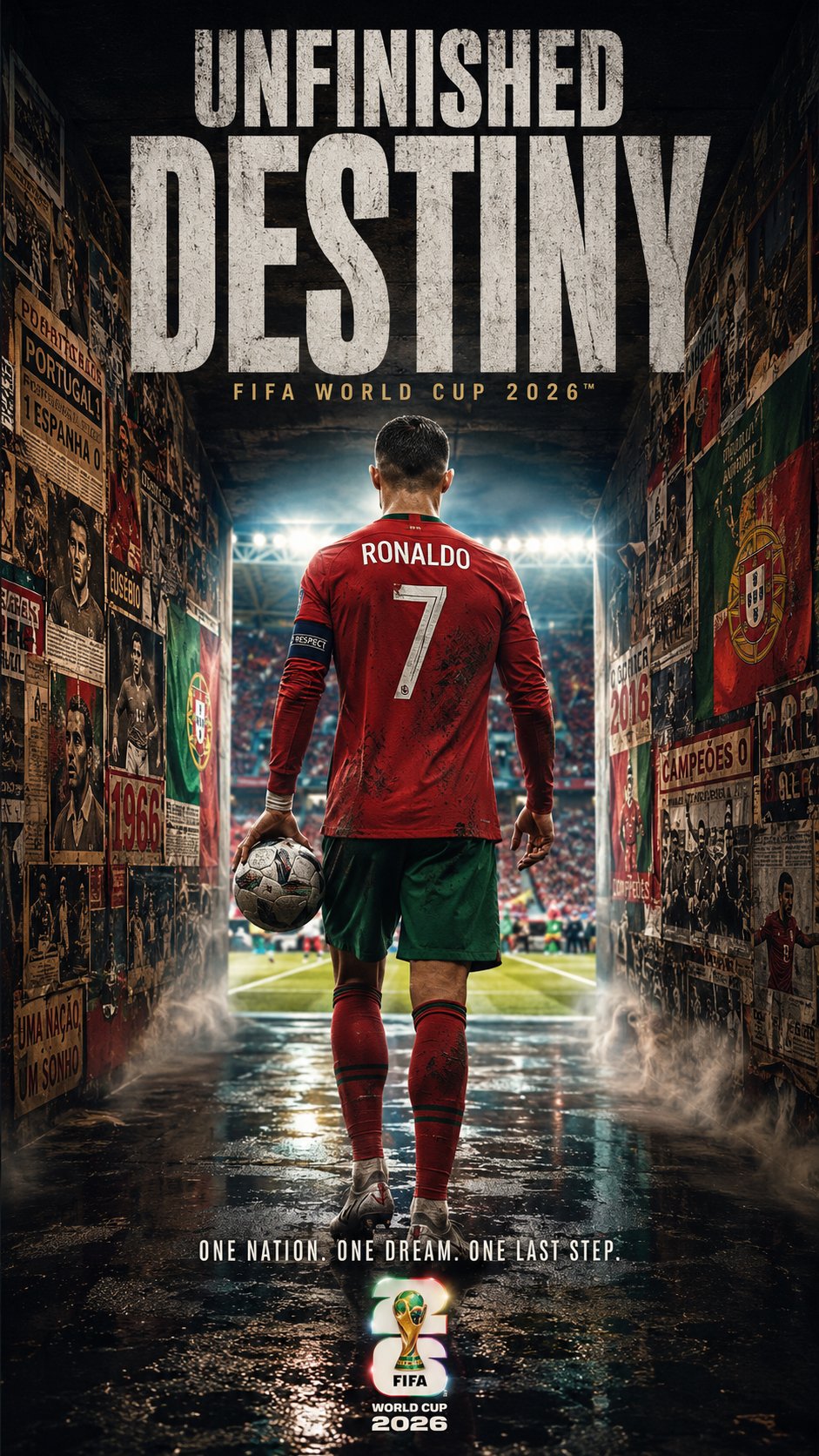
- 把它当作 人像与摄影 的基准案例最合适,先看成片方向,再决定自己的 Prompt 要往哪边改。
- 如果你的目标也落在 人像、电影感、海报 这些方向,这条案例特别适合先看图判断风格,再回头微调描述。
- 做 Prompt 对比时,也很适合作为控制组,只改一个变量去看结果变化。
画面重点与风格信号
- 这条案例最明显的风格信号集中在 人像、电影感、海报,所以第一次改写时最好先保留这些关键词。
- 重点先看构图、光线方向、人物姿态,以及主体和镜头之间的距离感。
- 当前只有一张主图,所以第一张结果图就是最核心的参考基准。
Prompt 结构可以怎么理解
- 这条 Prompt 整体属于一条比较长、约束条件很多的 Prompt,很适合拿来判断这类方向到底需要写到多细。
- 关键词簇主要围绕 人像、电影感、海报 展开,所以复用时可以先保留这组风格词,再替换主体、镜头、环境或文案信息。
- 最稳的改写方式通常是先保留结果方向和最强风格信号,只替换主体设定与场景块。
如果你是带着问题来的,可以先看这些角度
- 如果保留 人像、电影感、海报,只换主体题材,结果最先变化的会是哪一部分?
- 这条结果里,哪些特征更像是 人像与摄影 的结构特征,哪些又是标签风格本身带来的?
- 同分类的相关案例里,哪几条能给你更克制或更极致的相邻变体?
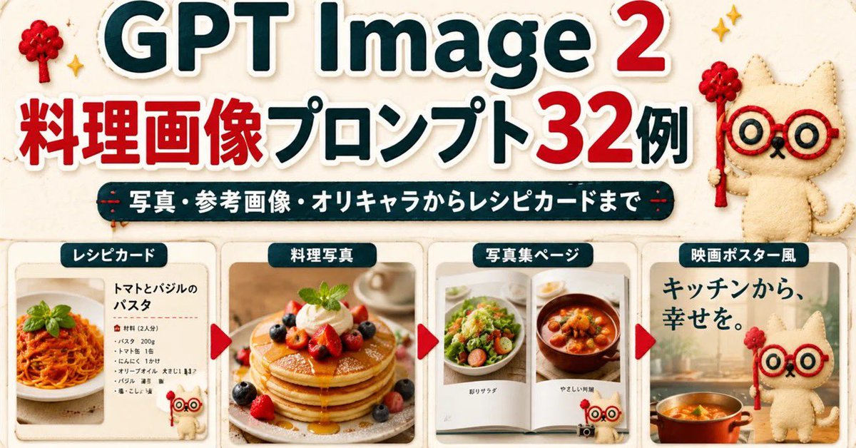
完整 Prompt
Goal: Create a wide Japanese promotional thumbnail/banner for {argument name="headline topic" default="GPT Image 2 cooking image prompts"}, designed like a cute handmade recipe-craft collage. Canvas: Horizontal 16:9-ish social media banner, warm cream paper background with subtle fabric texture, rounded sticker-like shapes, soft shadows, red and dark teal color palette, high readability. Main headline area: At the top, place a huge bold title reading “GPT Image 2” with “GPT Image” in dark teal and the number “2” in bright red, all with thick white sticker outlines and slight drop shadow. Below it, add a large Japanese headline reading “料理画像プロンプト32例”, with “料理画像” and “32” in red and the remaining text in dark teal, also outlined in white. Under the headline, add a dark teal rounded pill banner with white Japanese text: “写真・参考画像・オリキャラからレシピカードまで”. Mascot and decorations: Add exactly 3 appearances of a cute beige stitched cat mascot with red round glasses and a small red wand: one large mascot standing at the upper right, one tiny mascot near the bottom of the first recipe card, and one large mascot on the right movie-poster card. Add exactly 2 small red yarn-tree decorations near the top left and top right, plus small golden sparkle icons around the headline. Bottom layout: Create exactly 4 rounded rectangular showcase cards in a row across the lower half, separated by exactly 3 red triangular arrow markers pointing right between the cards. Each card has a dark teal label tab with white text at the top. Card 1: Label tab “レシピカード”. Show a clean recipe card layout with a photo of tomato basil pasta on the left and Japanese recipe text on the right. The title should read “トマトとバジルのパスタ”, followed by a small ingredient list with bullet-like lines. Include the tiny mascot at the lower right of this card. Card 2: Label tab “料理写真”. Show a warm professional food photograph of stacked pancakes topped with berries, whipped cream, mint, and syrup, centered in the card. Card 3: Label tab “写真集ページ”. Show an open photo book spread with exactly 2 visible food photos: a salad on the left page and a stew or soup bowl on the right page, with small Japanese captions beneath each photo. Card 4: Label tab “映画ポスター風”. Create a cinematic kitchen-poster style card with large Japanese copy “キッチンから、幸せを。” at the top left, a warm kitchen background, a pot of orange soup at the bottom, and the large cat mascot standing on the right. Visual style: Bright, cute, polished Japanese blog-thumbnail design; realistic food photos inside craft-paper frames; sticker outlines, rounded corners, subtle shadows, soft beige background, clean hierarchy. Keep the composition dense but readable, with no extra cards, no extra arrows, and no watermark.