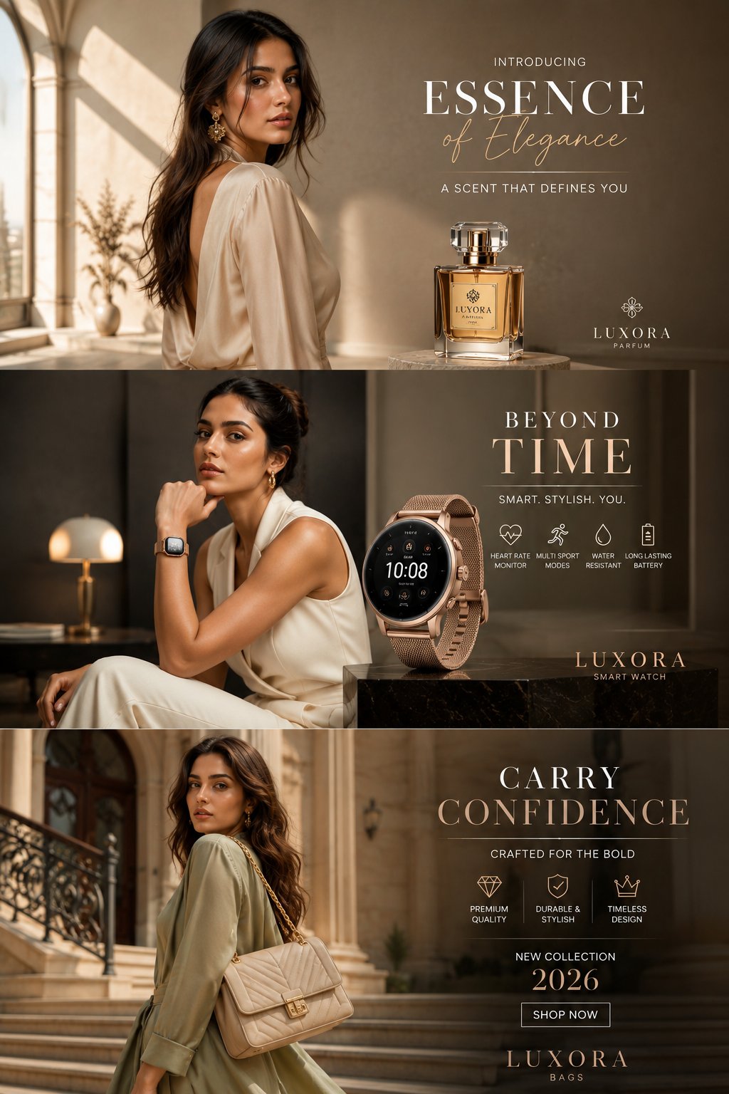
案例媒体
案例说明
这个页面把案例媒体、完整 Prompt 和出处放在一起,方便你先看结果,再判断这条 Prompt 是否值得复制、收藏或加入对比。
案例解读
为了方便搜索、引用和后续复用,这里会把案例的适用场景、画面重点和 Prompt 结构拆成更容易浏览的说明。
这类案例适合用在什么场景
- 把它当作 人像与摄影 的基准案例最合适,先看成片方向,再决定自己的 Prompt 要往哪边改。
- 如果你的目标也落在 人像、截图、排版 这些方向,这条案例特别适合先看图判断风格,再回头微调描述。
- 做 Prompt 对比时,也很适合作为控制组,只改一个变量去看结果变化。
画面重点与风格信号
- 这条案例最明显的风格信号集中在 人像、截图、排版,所以第一次改写时最好先保留这些关键词。
- 重点先看构图、光线方向、人物姿态,以及主体和镜头之间的距离感。
- 当前保留了 2 份媒体输出,适合顺手观察同一方向在多张结果里的稳定性。
Prompt 结构可以怎么理解
- 这条 Prompt 整体属于一条比较长、约束条件很多的 Prompt,很适合拿来判断这类方向到底需要写到多细。
- 关键词簇主要围绕 人像、截图、排版 展开,所以复用时可以先保留这组风格词,再替换主体、镜头、环境或文案信息。
- 最稳的改写方式通常是先保留结果方向和最强风格信号,只替换主体设定与场景块。
如果你是带着问题来的,可以先看这些角度
- 如果保留 人像、截图、排版,只换主体题材,结果最先变化的会是哪一部分?
- 这条结果里,哪些特征更像是 人像与摄影 的结构特征,哪些又是标签风格本身带来的?
- 同分类的相关案例里,哪几条能给你更克制或更极致的相邻变体?
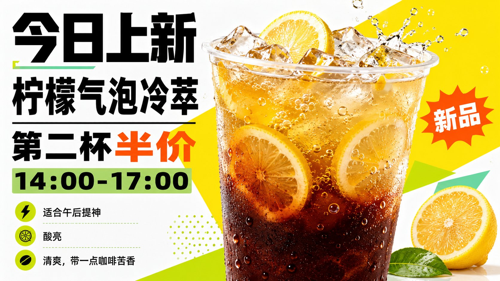
完整 Prompt
Generate a new product advertisement visual centered around a specific beverage theme: The core position of the visual is occupied by an ultra-large, close-up main drink at the first glance. The container and liquid must have a realistic commercial photography texture. At the top, clear layers of ice cubes, ingredients, and theme flavor materials are visible. The main subject appears to pop out from a flat graphic. Behind it, a high-saturation, fresh structural color plane derived from the theme is placed, with huge irregular geometric blocks pressed in diagonally to create a sense of speed, newness, and a strong figure-ground relationship; a large amount of high-brightness clean white space is reserved around it, making product outlines, condensation, transparent liquid layers, and ingredient edges clearly visible. The information layer uses an advertisement-style layout: the top main title is in extremely bold Sans-serif, with a high center of gravity, large typeface, and tight rhythm; small side badges, burst-shaped new product seals, and short selling point lists serve as rhythmic points. All text only carries the information provided by the user and does not use any existing brands or copy. Colors are extracted from the taste, material, and mood of the beverage theme. The background remains bright and clean, the main product retains clear and transparent liquid color scales, the geometric color planes use the freshest high-saturation structural colors that best represent the theme, the text uses clear dark colors to establish strong readability, and emphasis seals use a small amount of high-brightness warm or complementary bright colors. The overall feel is bright, clear, eye-catching, and light, with crisp boundaries, avoiding gray, dirty, old, and matte cloudy tones. The final result looks like real drink photography superimposed with bold graphic design, where the product, geometric color blocks, and heavy text squeeze each other without chaos. The first read is the impact of a new release, and the second read is the flavor and selling points. —————— Convenience store freezer banner: Horizontal 16:9. The protagonist is a large cup of watermelon mint ice tea. Ice cubes and mint leaves are piled at the cup mouth, with only a small slice of cut watermelon next to it for recognition. Visible text: Iced Watermelon Mint Tea / Low Sugar Large Cup / Just want something cold today Usage scenario: Posted on a summer store freezer, it should look like a real promotional image, with a price badge written as 9.9 Yuan.